HOME | DD
 bogo-d — Folder Replacement

Published: 2009-09-19 14:40:37 +0000 UTC; Views: 59138; Favourites: 241; Downloads: 18917
Redirect to original
Description
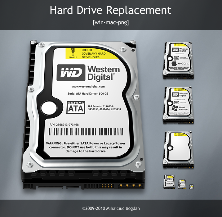
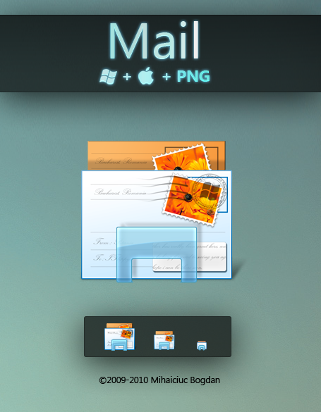
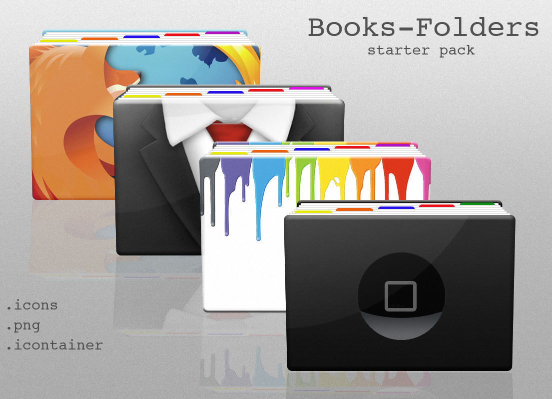
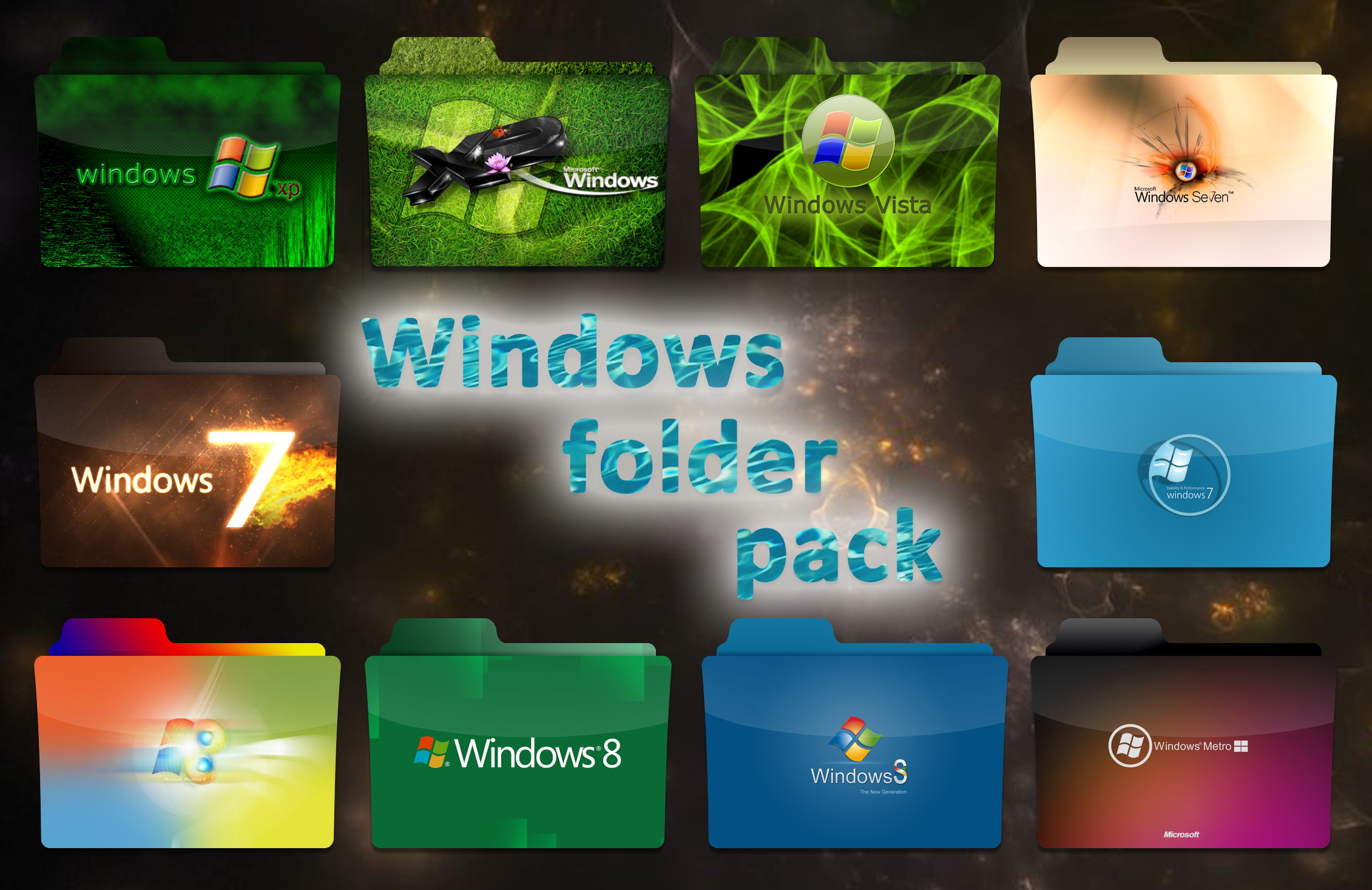
Folder Replacement icons.Compatible with Mac OS X (icns and pasted icons), Windows Vista/7 and others (png).
The glyphs were created by Laurent Baumann and can be downloaded here .
-----
©2009-2010 Mihaiciuc Bogdan
Related content


Comments: 80

:iconpurplebutterflyplz:¸¸♥´¯) Thank you so much!
(¸☆´ (¸.♥´´¯`•.¸¸.ღ •.♥ .•´¯`•.¸¸.••Ƹ̵̡Ӝ̵̨̄Ʒ
:iconsparklesplz:
Your Friend Always,
dove
")
👍: 0 ⏩: 1


They should since windows 8 still uses the .ico format, but I'm not sure what app is used to change icons nowadays.
👍: 0 ⏩: 0


 (Smile)")

These are the best icons EVER!!!! I accidentally erased some of the memory on my mac and the first thing i thought was "i hope i still have the epic folders "
👍: 0 ⏩: 1

your welcome. I have a question. What program do you use to make a Mac-compatible icon?
👍: 0 ⏩: 0


need the background wall , could you share it please?
👍: 0 ⏩: 1
Sorry, it's actually part of this wall .
👍: 0 ⏩: 1

Just awesome folder! Thank you very much for making them! Blue ones in use
One question, i used the standard folder and put on a own symbol for my Photoshop folder, but when i save it, it gets a lite bit more brighter or something?!
So the question is, what is the way/format to save it to when i save it from Photoshop?
👍: 0 ⏩: 1
It's an issue with ICNS. Icons will appear brighter than the images they're made from. As far as I know, when you export and open the images in Photoshop they are opened in their original brightness.
👍: 0 ⏩: 0


I also use Baumanns glyphs, but next project I have is NOT including the basic folder look... the glyphs will stay...forever...
Nice release Bogo... keep up the good work..
 (Wink)")
👍: 0 ⏩: 1

Hey! I love your work. Im actually building a new icon theme for linux, and i wanted to ask you if I can puclish it with your folders (i modified a little bit some of them) and used a lot of other user-themes too. So, please tell me what you think and if I able to use them. Here is a snap of my computer if you want to see what I did. [link]
👍: 0 ⏩: 1
Yes, but please add a line in your documentation, about (or whatever) that reads something along the lines of "Folder icons by Bogdan Mihaiciuc " (with Bogdan Mihaiciuc linking to bogo-d.deviantart.com ).
👍: 0 ⏩: 1

")


Fantastic quality even at small sizes. Love the black developer colour.
Whole set in black, we can haz?
👍: 0 ⏩: 1
Thanks. Brilliant, look forward to the release am using the blue ones at present.
👍: 0 ⏩: 1
I'll try to have them ready by tomorrow night.
👍: 0 ⏩: 1
What format do you need them to be in?
👍: 0 ⏩: 1
I'm a Mac user, so icns should be fine.
👍: 0 ⏩: 2
Wrong link, get them here instead.
👍: 0 ⏩: 0

Looks fine. I like your orientation, like the way you transformed the symbols over the folders. Very few even think of even doing that and keep 'em flat.
👍: 0 ⏩: 1
Thanks, I've always liked the original glyph idea, but the contrast on the default folders is way too low.
👍: 0 ⏩: 1
| Next =>