HOME | DD
 bramblepaws — Pixel Tutorial
#pixel #tutorial #pixeltutorial
Published: 2017-06-21 09:12:45 +0000 UTC; Views: 783; Favourites: 26; Downloads: 4
Redirect to original
Description
a lotta people seem to like my pixeling style, so i thought id put this together!finished result:
in case you can't read my handwriting, i'll type out each step.
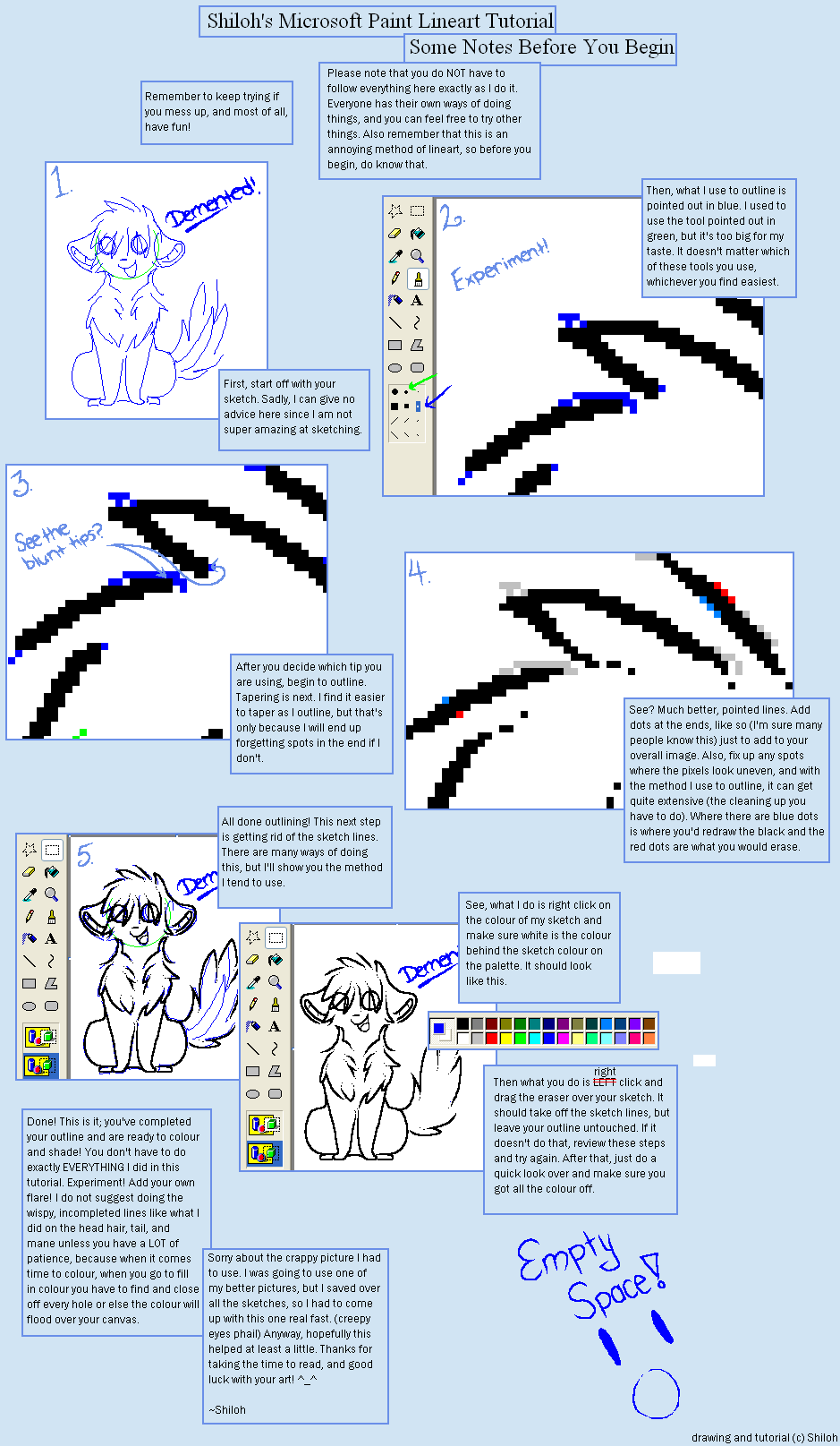
1. Start with a sketch.
Sometimes I do a couple of sketches to figure out what feels right / looks good. I ended up liking the first one well enough this time, so I went with that. I usually use the pencil tool and just draw as I normally would here.
2. Line it.
If your sketch is clean enough, you'll probably be alright with just tracing over it and removing the bits and pieces of clutter you included in the sketch. I had to mess with my lines a Lot because my sketch wasn't very clean, and i couldn't really get an idea of what placement looked best.
It's a good idea to make sure that your lines don't look too chunky (although don't use that as a 100% of the time rule, sometimes chunkyness is necessary).
3. Flip the canvas to check for mistakes.
I usually don't do this lol, but I was frustrated enough with the original lines that I ended up doing it this time! I mostly just moved stuff around or tweaked it slightly here.
4. Add base colors.
Pretty self-explanatory. Some people like to get fancy with this part, but I usually just haphazardly color it in and make sure that there aren't too many pointy edges.
5. Trace all lines not touching the "outside" with base colors.
I *always* do this, although sometimes I don't end up actually using this layer. You take the pelt/skin/etc color of whatever would be behind the line, and fill the line in with that. Sometimes I just use the second darkest color on the palette for all the inner lines. Sometimes I use the lightest. It all depends on how I want it to look! I recommend experimenting with this. One thing I never color over, though, are the lines for the eyes. It's always looked weird when I do it.
6. Shade - I like to use bright colors - and lower the opacity.
I generally use bright purple or pink (or sometimes teal) when I'm shading pixels! It makes it really pop and look interesting. I generally don't have this layer set to "multiply" as that makes it lose some of its color. This image isn't on any lowered opacity yet!
7. Add in darker shading. Change to "multiply" and lower the opacity.
This layer I usually use the same color as the previous, but set it to multiply and have it at a higher opacity % so it looks darker. I generally shade the areas that would be the darkest with this - especially places where something is layered over something else (the hand over the face, chin over neck, etc.)
8. Mess with the layer you created in step 5.
I sometimes just unhide the layer and leave as is (which works best with heavy shading). Other times I'll lighten the opacity a lot, just to give the inner lines a softer look without completely hiding them. I've recently reeeaaalllyyy liked setting it on dodge and messing with the opacity - it always results in such interesting colors.
And you're done! Hope this turns out to be helpful to someone :3 feel free to show me if you tried this out !!!
Related content


Comments: 3

ur comment inspired me to finally get around to making this >:3 so im glad heheh
👍: 0 ⏩: 1

i rlly appreciate it too! i love pixels and all but i always struggle w making the lineart for it *-* cleaning/coloring/shading isnt too bad though
👍: 0 ⏩: 0