HOME | DD
 bramLeech — davy jones

Published: 2007-07-24 11:22:50 +0000 UTC; Views: 4301; Favourites: 34; Downloads: 13
Redirect to original
Description
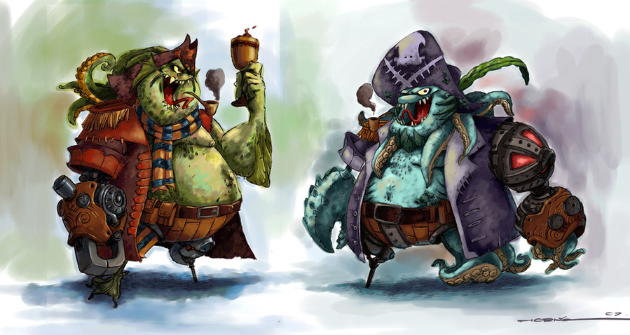
Color thumb i did for mt concept art final project with two of classmates. We are doing concept art for a sequel story we came out with for Peter Pan. This is the character that i have designed, Davy Jones, the new villain in Neverland. I was trying to make his design different from the one we had seen in Disney's Pirates of The Carribean. Comments please, still have no idea to use which design.Related content
Comments: 35

Both are great concepts and character designs, my fav would be the one on the right, the colder colour palette helps identify this creature with being more sinister and just downright more naughty....
Like em....
👍: 0 ⏩: 1

I think the green one is a better option--rather than having a robotic arm and a PotC style claw, his left hand looks like a fishman hand; but I like the blue one's hat.
👍: 0 ⏩: 0

try to make it as Moby Dick discribes him
xD
but looks great
really great
👍: 0 ⏩: 0

I'm quite liking the look of the blue one; if you're still looking for ideas, i'd suggest perhaps ditching the legs you have on it; and going with something more Ursula-esque (you already have it half there, but something just looks a little weird)
nice work though.
👍: 0 ⏩: 0

i chose him oso but planning to combine them 2geder, hhaaaaaaammmmmmmm ttttaiiiiiiiiiiiiii
👍: 0 ⏩: 1

wow dude!! that is one awesome davy jones design!! arghhhh matey!!!lol
👍: 0 ⏩: 1

great!!!i love the designs~~~~ !! 
👍: 0 ⏩: 1

thank you!!i am thinking da same thing, haha, great minds think alike ^____^
👍: 0 ⏩: 1

nice one, I like the right one for some odd reasons ; its just a 7th sense if u will... lol
I'd say tentacles as hand for the win!
👍: 0 ⏩: 1

haha, one more vote for da right wan, 2 againts 10,i lik him oso, but most ppl lik da left wan...
👍: 0 ⏩: 1

me? not really, been feeling s**tty lately, the sea is full of fishes rite? u say wan ma T_T
👍: 0 ⏩: 1

hahahahahhahahahahahahaha, lei dou yao kam yat la....y??kena dumped by gals??or same as me, da gal u lik is taken?? don b sad, God is sending u a message-- "don tackle gals, do ur work, u ham sap boy!!!"...lol....
👍: 0 ⏩: 1

muahaha, i am da master of bei lui phit.....or kau erm dou lui...or lai har mou xiang sek tin or yuk....or.....or..or...lei bei or sei laaaaa.............
👍: 0 ⏩: 0

thank you wor, i will call u leng lui this time, leng lui leng lui leng lui........
👍: 0 ⏩: 1

thank you, most of them choose da left wan, but i lik both la, thank you!!
👍: 0 ⏩: 0

pretty COOL...can c lots of detail+ing.
Thats awesome
👍: 0 ⏩: 1

thank you, it was so much fun painting it, that y i added quite some detail in it ^____^
👍: 0 ⏩: 0

awesome stuff yo! i luuuv the work you did on the mechanical hands of both your characters. I think the green guy's other hand can be a little bit more creative, but yeah i those mechanical arms are great. Although i like the one on the left better. The round mechanical thing on his shoulder isn't working as well as the other one thats covered with the shirts sleave. don't really like the green guys normal leg as much as the blue guys tentacle thingies. maybe u can mix and match? pick the best elements from both characters.
Good stuff bro 
👍: 0 ⏩: 1

thank you very much, i see, the green guy's leg was inspired by duck's leg....haha..thank you, i will
👍: 0 ⏩: 0

quite disney'ish.. i really like more the one on the left... he is kinda uglier. The blue one looks more "typical" to me.. it seems almost like a generic disney drawing
Anyway, kickass work, and good luck with that project
👍: 0 ⏩: 1

haha, yup, our art direction is to do something like Disney's, just that i dont want 2 make him too similiar to Davy Jones in POTC in term of design, thank you!!yeah, right one i was inspired by Disney's villains, do u notice that most of Disney's villains are wearing purple attires??haha...
👍: 0 ⏩: 0


