HOME | DD
 breakerr — Ligate

Published: 2004-10-09 07:56:28 +0000 UTC; Views: 977; Favourites: 16; Downloads: 303
Redirect to original
Description
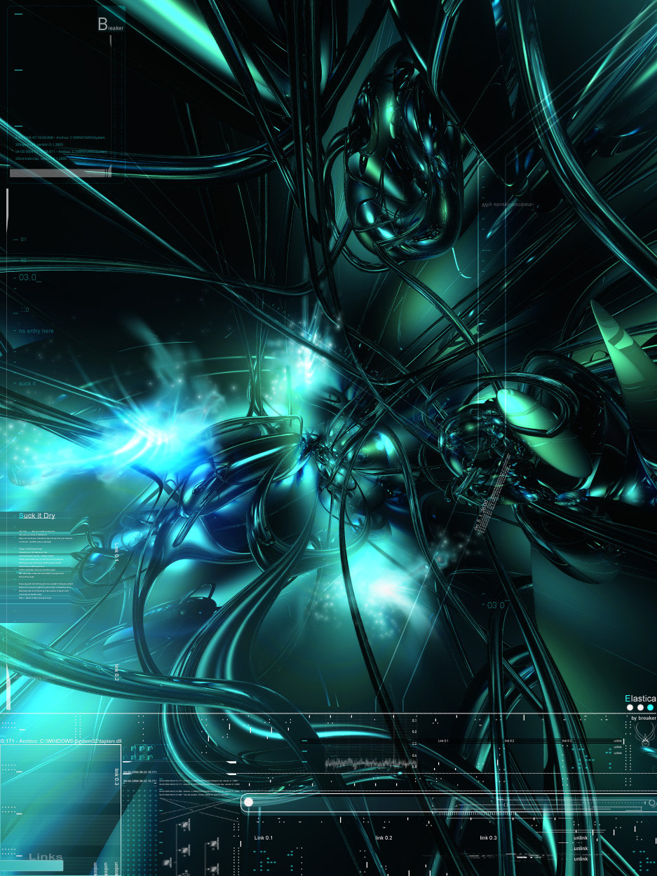
________________________________________ ________________________________________ _____Ligate_ By Hipócrates Rodriguez _______________________________Description inside the image
") ______Pretty OOOooLd BryceRender + Ps7______________Have a neato day
______Pretty OOOooLd BryceRender + Ps7______________Have a neato day 
Related content


Comments: 46

nice render.. i dnt quite love the brushing tho , but its very chaotic... and i think it hides most of the render.... maybe???
👍: 0 ⏩: 0

damn you and your skillz.
the render, the brushing, it all pwnz me.
colors and 2D are sweet too. i love BLUE!
damn another 
mP
👍: 0 ⏩: 0

awesome colors on this. also, i love the photoshop work... great job
👍: 0 ⏩: 0

I love the lighing effects and blurs in this one - adds a real sense of movement to the piece. As if life forces are being draw into that mechnisation in the centre of the image - cool work!
👍: 0 ⏩: 0


Woooowww... *___* So... shiny and blue.....
Great job, once again!
👍: 0 ⏩: 0

the colors and lighting are freakin awsome dawg good job, fav.
👍: 0 ⏩: 0

 (Smile)")

👍: 0 ⏩: 1

Te text in the corner as in many other works you'll see in the abtract category is called TYPOGRAPHY is when you use letters and phrases as an ornament to improve an image  (Wink)")
👍: 0 ⏩: 0

")

Very cool man, i like the brushing, and the blue fits well. nice one.
👍: 0 ⏩: 0


I like it but there is too much contrast twoards the middle, maybe tone it down and then use another shade of blue, light or dark tomake it stand out, but the white is killing me
👍: 0 ⏩: 1
I know what you mean. I just follow the rythm when I do my stuff, I didn't see the mistakes you pointed out 

👍: 0 ⏩: 1

fkn cool brushing there mate
👍: 0 ⏩: 0

i like it alot, the overall aspect is incredible, but the middle ''explosions'' are kinda weird, can't say why tho
but otherwise, it's a very nice image
👍: 0 ⏩: 0


I love the render and lighting effects, it's so unique, fresh to look at. ")

👍: 0 ⏩: 0


I like it all except the cloudiness, the greyness kinda disrupts the color flow, other wise aqwesome job
👍: 0 ⏩: 1


nice render with nice brushwork.. no other comment.. thats all..
good jobe done dude..
👍: 0 ⏩: 0
Thanks.............but IM affraid I have to answer your input saying: You Haven't seen nothing yet

👍: 0 ⏩: 1

artician? I am back too with the abstract things - have been submitting a lot of pictures of me skating, but now it is time for some abstract too.
👍: 0 ⏩: 1
YESSS 


👍: 0 ⏩: 1
nice what do you think of this wallpaper:
[link]
👍: 0 ⏩: 0


no mano, usted es el maestro!!
👍: 0 ⏩: 0

First reaction: Holy shit... Fantastic modelling, such stylish composition and lighting/colors...
But then the (in my opinion) crappy lyrics sorta broke it down for me and what I felt was an amazing expression of abstract emotion became categorized as typical angsty stuff... It would have made it into my favs if the lyrics were more interesting
👍: 0 ⏩: 1
Thanks for the input 
👍: 0 ⏩: 0

pretty nice work. Don't we all love those bryce renders ? I do
👍: 0 ⏩: 0

I'm a sucker for blue so imma gonna have to fav this, the top just seemed so mysterious, good old bryce!
👍: 0 ⏩: 0

Oh yeah, awesome, really awesome my friend. Love the flow in this work, the great colors and ur 2D and brushing is
Amazing work bud!
👍: 0 ⏩: 0


looking good ")
great job
👍: 0 ⏩: 0