HOME | DD
 BrianAW — Dr Who Original Sample Images

Published: 2010-05-22 14:50:07 +0000 UTC; Views: 12821; Favourites: 536; Downloads: 279
Redirect to original
Description
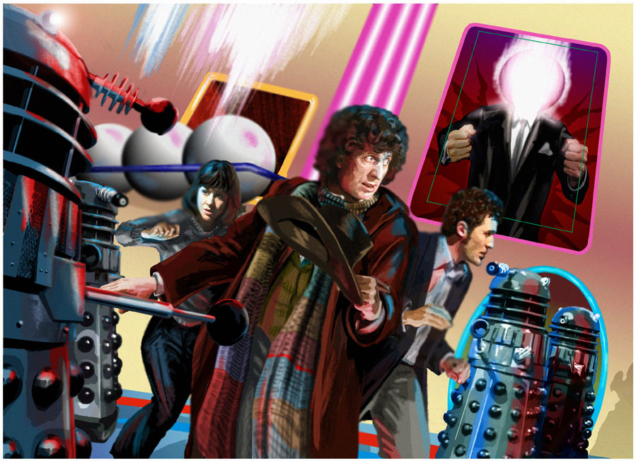
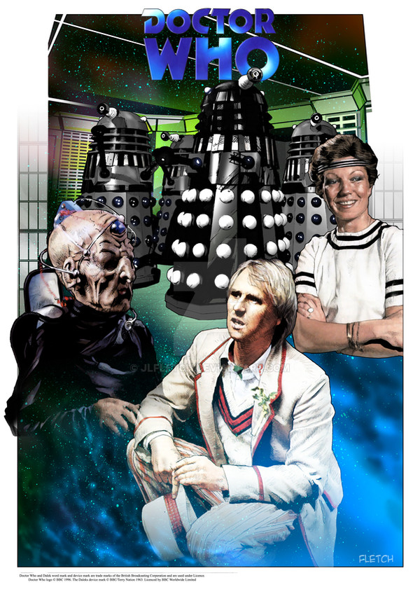
Just before David Tennant started his run as the Doctor the partwork publisher GE FABBRI asked me and a few other artists to come up with some sample images for a new trading card series to be called DR WHO: BATTLES IN TIME. The style I was assigned was "pulp" (Smile)")
When the images were put out to test for a jury of schoolkids they, in their infinite 8 yr old wisdom, opted for the photo-card option, little gits.
I took a shot and sent the samples to Panini's Dr Who Magazine and the very next day got a call from the editor offering me work on the Storybook. Lemons and Lemonade, I guess - sometimes things just work out!
Related content


Comments: 38


Vision
Originality

Impact
You are very good with color and the right contrasts. The green glowing off of Rose's skin draws the eye to the warm colors of her shirt.
The only problem is her head is weird in relation to ber back arm.
You are also great with expressions and making the art look like the characters with dynamic expressions.
The middle one is framed very well and make a on the floor shot look dynamic, again with good use of color. The third one is also another example of great color work.
Overall your work here on Deviantart has me wanting to search for your comics. Some comics overdo stylizing or use too much black and have characters very stiff, but yours is a delight for the eyes of vivid and appropriate color.
👍: 0 ⏩: 0

Originality
Technique
These are all extremely dynamic pieces. The eye is drawn up diagonally through each of them and the effect is striking. In the first one, the blue light of the "death ray" is reflected onto Rose's face and body in such a way that makes the viewer think she is just that close to dying. Her facial expression is perfect for the scene. In the second piece, the slant of the floor makes one think the Doctor is sliding or falling away from whatever he's doing. His face is extremely intense and the colors are brilliantly done. In the third, the fiery havoc the Daleks are wreaking pops out very well. Excellent work.
👍: 0 ⏩: 0

Well, you drew faces convincingly. I take my hat off to you, sir (madam?)
👍: 0 ⏩: 0


there are no words to describe your talent.
👍: 0 ⏩: 0

They're beautiful! And I love the art in the Storybooks.
👍: 0 ⏩: 0


superlative work. I've browsed your gallery and its all SO VERY FINE. With your talent, there is no sky and no limit. thanks for sharing.
👍: 0 ⏩: 0


Wow! This is great. 
I'm also very happy to see some great art of Rose Tyler.
")
👍: 0 ⏩: 0


That's 8 year olds for you.
👍: 0 ⏩: 1

woah, i'm SO loving your icon!
👍: 0 ⏩: 1
Heehee, wow! Thank you! I know, isn't she beautiful? I'm so proud of her. <3
👍: 0 ⏩: 0

👍: 0 ⏩: 0

The whole 'Lemonade out of Lemons' bit comes to mind with that.
This is bloody brilliant work!
👍: 0 ⏩: 0


This looks great! Love the colors and action shots!
👍: 0 ⏩: 0


Love this one too, but I do have a soft spot for tennant. Love the colours and yes thats 8yr olds for you.
👍: 0 ⏩: 1


I hear ya, man- Photoshop is the ruination of real illustration. I sent some of my stuff to the company that did the new Doctor Who role-playing game. They sent a very complimentary rejection letter saying that they weren't using illustrations for the game- just photos. Bah!
That middle pic ended up in the storybooks, didn't it? Pretty awesome outcome for something that started as a sample!
👍: 0 ⏩: 1

Yeah - it was pretty weird timing that they were able to use that image as the contents page. Because it was designed as a trading card there was a lot of dead space built in for gaming stats etc. In the original image for Fabbri there was a Slitheen cutting it's way through the back wall towards the Doc
BTW: Pertwee SEA DEVILS all the way, man!
👍: 0 ⏩: 0

