HOME | DD
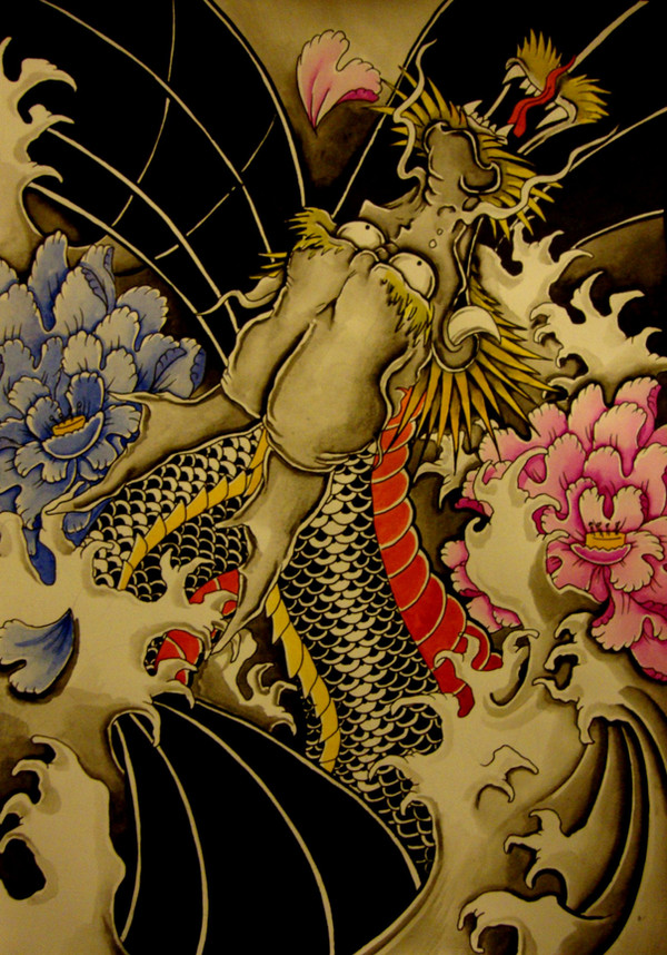
 brokenpuppet86 — Dragon beneath the river color

Published: 2007-11-01 22:48:17 +0000 UTC; Views: 35719; Favourites: 181; Downloads: 1615
Redirect to original
Description
The Birth of a dragon. Its legend that the Koi fish will become a dragon, hence the dragon beneath water and Koi, shows the evolution, beginning and after, the destiny of the koi fish. this took about 10 hours in total, done in water paints on A3 size paper. Once again I couldnt decide what I prefered better, the colour version or the black and white so I posted both, what do you guys think is best?Related content


Comments: 53

i really love the color one... even though the both pull u in but the color one really pulls you in... good work man
👍: 0 ⏩: 0

Beautiful colors, shapes, forms Keep up the brilliant work!
👍: 0 ⏩: 0

I really like this colored one more.
The colors add some feeling to it, specially to the water and sea flowers. The whole concept and story is really great, there is not anything bad to say. I really love the white flowing lines and detailed dragon scales.
Just Amazing work!!
👍: 0 ⏩: 0

I love the hints of colour. Makes the koi pop just a little more than the band white version.
👍: 0 ⏩: 0

I love this! I'm thinking of getting a tattoo like this!
👍: 0 ⏩: 0


I like how the koi stands out from the water.. or dragon.. or.. you know
👍: 0 ⏩: 0


That's crazy, I love it ")
👍: 0 ⏩: 0


hey man long time no speak. I really love this one the hint of colour is really nice and brings it out more. This is also coming from someone who loves black and white ^_^
👍: 0 ⏩: 0


Very beautiful. I would want a back-tattoo someday, but Im still unsure if I would be happy when Im old with it. If I decide too. Could you draw one for me?
👍: 0 ⏩: 1

No prob I could do that. Just let me know when you have an idea of what you thinking of an I'll draw up something from that.
👍: 0 ⏩: 0


wonderful design! Using both black & white and color is a neat effect
👍: 0 ⏩: 1
thanks, I wasnt too sure about it at first but I think it works
👍: 0 ⏩: 0

Nice design. I think I prefer this coloured version.
👍: 0 ⏩: 1


Wow, very cool. I love how you integrated the dragon into the design. Looks nice.
👍: 0 ⏩: 1
thanks. I wasnt to sure about it at first because its the first time I did a dragons head big scale but it mixed pretty well
 (Smile)")
👍: 0 ⏩: 0


OMG!!!! I love it so much, this is one of my favorite styles of artwork. I was never aware of the legend of the koi fish, but they certainly do look like a dragon !
Awesome

👍: 0 ⏩: 0

This reminds me of a Japanese painting. Great work, I like it!

👍: 0 ⏩: 1
thanks, thats the kinda look I was going for, really been into that japanese style lately
👍: 0 ⏩: 0

Thanks, Im pretty pleased with how it came out
👍: 0 ⏩: 0

lol thats a really cool compliment mate, glad you like it
👍: 0 ⏩: 0


cheers and big thanks for the fav
👍: 0 ⏩: 0

love the pic, i love the japanese tattoos. I wish i could have that on my back
👍: 0 ⏩: 1
lol would be a good back piece,think I'ld have to fix up the waves in the corner though.
👍: 0 ⏩: 1
its still so cool though i wish i could draw dragons that good
👍: 0 ⏩: 0


lol thanks, I do like the fishy
👍: 0 ⏩: 1

Awesome design man! I think this one is better because the isolated colors help the elements stand out, a quick glance and you see the koi and the flowers, then you see the dragon on the back. On the b/w piece it required a little more time to identify everything.
👍: 0 ⏩: 1
thanks man. I see what you mean, just always hard to decide to add colour because I'm a sucker for black and white and always do the black and whte shading first, never know if im gona ruin it or not
👍: 0 ⏩: 1
Yeah, black and white artwork can get pretty hard. Maybe you can try using different shading intensities to emphasise different elements, although I don't know how it would translate into tattoo artwork. But as long as you don't mess up on the client's skin, I think is good to experiment

👍: 0 ⏩: 0
| Next =>