HOME | DD
 brokenpuppet86 — Broken Puppet

Published: 2007-07-04 17:12:18 +0000 UTC; Views: 13791; Favourites: 37; Downloads: 2465
Redirect to original
Description
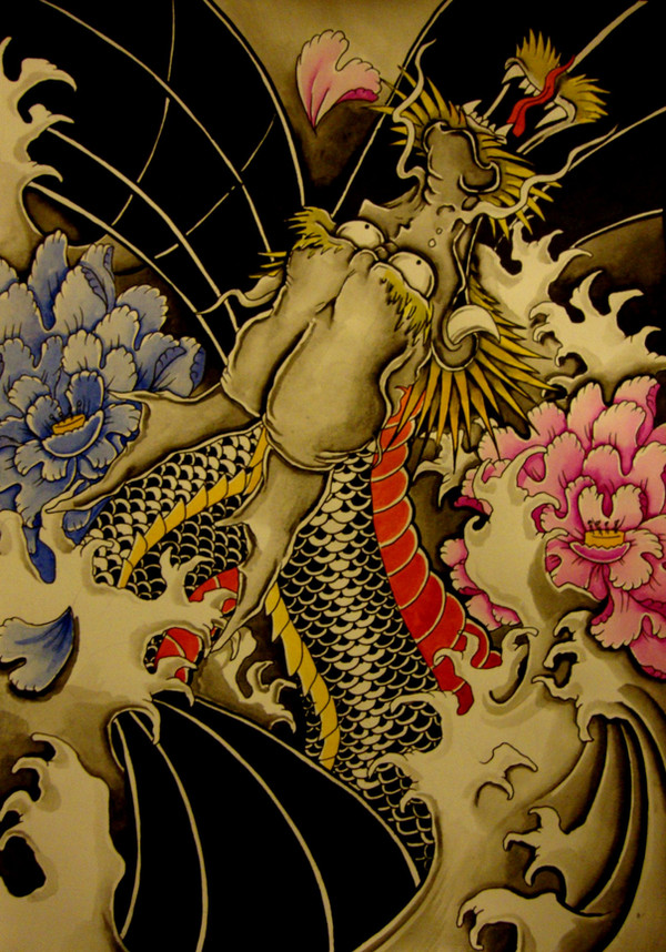
This design is pretty important to me, its the base design of a tattoo I want to do on my right thigh. Its the first sketch and thought I'ld put it on here to see what suggestions you guys have on making it better. any ideas are welcome. PLEASE let me know what you think?Related content


Comments: 17

i like the design and the different facial expressions on the masks.
👍: 0 ⏩: 0

")

thanks, should be tattooing it on my leg pretty soon, a few slight alterations but basically the same as this.
👍: 0 ⏩: 0

wow! soo freakin cool! how can u draw hands so right? I hate drawing hands ~_~
it looks like the doll had fallen loose from the owner's hand and now it's ready to rock! (like distroy) I think the dool is kind of psycological patient 2! u know probably.. IU dunno what it' called really freaky! me like !
👍: 0 ⏩: 1
hehe thanks, hands pretty much come from practice and they are one of my favourite thing to draw. The one in this picture was pretty rushed, I'll draw another hand and load it up.
👍: 0 ⏩: 0

 (Smile)")

I love this drawing man!!!
I love how you did the person's hand... I'm not a big fan of clowns but this one is well drawn.
Kudos!
zoe
👍: 0 ⏩: 1
thanks, should hopefully be tattooing it on my leg next week.
👍: 0 ⏩: 0

Superb sketch.
I can't think of anything to add, but I can't want to see it with color.
👍: 0 ⏩: 1
thanks, I should have a colour version going on in day or two.
👍: 0 ⏩: 0

I like it, very creepy design indeed. Well detailed and drawn.
👍: 0 ⏩: 1
thanks, anything you think i could improve on?
👍: 0 ⏩: 1
Your welcome.
Looking back, there is one thing i can see a bit off straight away, but i think it may be more of a scanning error. There seems to be a great deal of shading at the lower area as though the paper bubbles under the flat bed. Unless the shading is due to the wall he is sat on.
You could probably try adding a little more shading to give it a little more 3D appearance and then add a little shading around it as though its fading into the paper. (similar fading effect as i did with '
 (Wink)")
Seems i said alot but in honesty its just minor, i really like what you done and dont see anything really wrong with it. Your very welcome once again
👍: 0 ⏩: 1
The shading at the bottom is because of my scanner, its too small for the size of my books. thanks for the advice though, it's the sort of comments i'm looking for, I like to know what people think is off or wrong with my art. I appriciate it. think I might try puting some shading at the bottom to really make the stage stand out a bit more.
👍: 0 ⏩: 1
Yea i have had the same problem with scanners. Glad to know i could help.
Your very welcome
👍: 0 ⏩: 0