HOME | DD
 Caffeinated-Creator — Always Together
Published: 2012-01-10 14:36:51 +0000 UTC; Views: 831; Favourites: 18; Downloads: 17
Redirect to original
Description
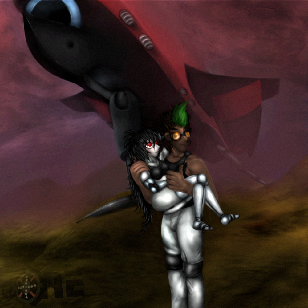
DA should have an achievement reward for sticking with a voluntary update schedule. :3I drew this for myself, basically its a motivational poster of my own you could say. (no not one of those horrible demotivators)
Basically I loved the idea of having this on my wall, above my comp so that whenever my tired eyes question my motives, whenever my nagging wrist is screaming at me to cease painting, I can look up and know its all worth it in the end; that I'm achieving something constructive.
I'm making a book in the end; but this was something for here and now; I intended to have this printed out for my birthday and placed on my wall, just above my work-station -as you could call it- and.. well, I did. ^^
Who better to signify my story than the cuddliest main characters ^^ they always look so cute together.
So there you have it, that's it :3 and I'll soon upload a photo-snap of what the finished, printed painting looks like :3
Edit; fixed some odds and ends here and there; especially Sim's face that's been pissing me off; it looks alright in the vectored, painted version, but the original, digital file looked.. ~meh!
Edit II; just some more tweaking, especially Sim's pose and anatomy.
Edit III; tired of the edits yet? I sure am, but I couldn't leave some things be; still not entirely happy with Sim's head and face, but I tweaked them some more now.
It might sound a bit weird, but I'm not ashamed of having the past version on my wall; not only does the vectorization add a particular style of its own to it, but its got its own charm somehow even if it is flawed and I like to see how much I've improved in such a short time. ^^
Edit IV; Seems every time I see this picture, I see something that needs correcting and every time its something minor like the little details I changed here and there this time just before I'm about to rush out towards an important appointment. Oh well; we'll see if I'll ever be satisfied with how this looks.
Edit V; This time, I owe this great addition to awesome feedback; I guess the original picture really was a bit too smooth so I went and "grunge-d" it up a bit; all in all, just two layers of noise added and faded over the foreground and background, giving a bit of a divider and an interesting look. Hope you guys like it too ^^
Oh and thanks for feedback; I always wanna improve more and more
Related content


Comments: 85

XD thanks man; thought you had seen it a long time ago 
👍: 0 ⏩: 1

Saw it today on your front page, awesome art!
👍: 0 ⏩: 1
Ooooo :3 well there you go Awww thanks man
👍: 0 ⏩: 0

Seeing that you're really into digital painting, I suggest adding a layer of texture to finish. Create a new layer, fill it with white, and set the layer to multiply (colour mode). Then add noise using the noise filter. This assumes you have Photoshop, but you can do it with any other image editor as well. Being on a different layer will allow you to erase portions or change the layer opacity to control the noise. Almost forgot -- use gaussian, monochrome noise.
You might even add more than just one layer of noise.
Noise gives it a grainy, classic look, and hides the areas that are too 'smooth'. When I look at this image, immediately I see a lot of "fluffy balls".
Use more noise, make it more grunge.
👍: 0 ⏩: 2
I can ad noise and alright, I shall try doing so right now ^^ thanks man; don't think I can find gaussian but I have monochrome.
Okay; will see if I can create a more 3D feel with separation between foreground and background for fun.
Grunge it shall be ^^ thanks again man
👍: 0 ⏩: 1
This is in reply to edit V: This is MUCH better... however, the version you sent me through email was a step further (even better!) Indeed, the foreground is definitely separated from the BG now, but... in a way that they seem two completely different things now. The foreground here had too little noise. I prefer the email version with more noise in the FG. Although the posterisation is a bit too much, you might combine the two to get the same posterisation but with a more controlled effect (put the posterised composition on a separate layer). The posterisation was a good move -- it adds additional brush-stroke textures.
In fact, the changes are so notable, you should do a before/after thingy of this.
👍: 0 ⏩: 1
Oh my, I would make a gif, but I don't really like spamming my gallery with things like that, might keep the original image in scraps. Anyway, you think I should keep doing this to all of my works? I'm not sure its the style I'm really after, especially in the book 
Anyway; gonna alter the image again, but this time my watchers won't be notified, cause I feel like its bordering on what's annoying, how often I keep coming back to it.
Also; sadly, I tried the foreground with more noise, but then the highlights looked grainy; removing this from the highlights made for sharp, "un-noised" edges and blending or fading these made everything look fuzzy; in the end, I only had two options; little to no noise on the foreground, in which case the characters look like they're standing in front of a backdrop, or noise on the foreground, in which case it looks like a filter has been applied over the whole picture or something's between the picture and the viewer, a disturbing film of noise.
I'll do the posterized and faded idea now, I know that'll look good, but if this isn't entirely what you thought it would be, please help me understand how I can make it look even better ^^
👍: 0 ⏩: 1
Well, you already noticed the effect it has for yourself -- it looks like they're standing in front of a backdrop. You already know what to do~! Follow your gut -- you know it's right!
Book? Books are for guidance, not rules. You make your own rules, I've already told you this. I'm writing a book on how-to-draw-anime and the ONE rule I point out in the intro is just that -- YOU MAKE your own rules. Don't let a book stop you, or don't think just because you don't have this and this requirement that you can't get the job done. Whatever you have -- that's all you need. My how to draw book isn't based on rules -- I'm trying to make it based on inspiring people to create their own ways of getting things done. Great artists aren't great because they're smart or know-how -- they're great because they make their own rules :3
Yes, it sounds flippant... but really -- that's the way it is. When you feel content and happy about your own style and method, that's when you start going places with your work
 (Smile)")
👍: 0 ⏩: 1
but I've tried and tried now; no matter what I do, the foreground and background are either too distant or too close to one another (I mean, if I add too much noise to the foreground, it only looks like a filter has been applied to the whole painting, too little and... backdrop)
no no MY BOOK the book I'm making; I'm not sure I want the pages to be grainy
Well; I was confident with what I had made, but you make me ask myself questions, especially with this; I never considered having a grain effect, I know it can look cool, but dunno how to apply it anymore, now I'm lost and dunno if I should go back and re-work all my previous works and maybe the pages of my book too, if I can get this to work; but still asking myself the question; do I really want them to be grungy??
I'm reminded of the work of Louis Royo who has been a great inspiration to me, but even though I love his weathered, digital artworks; I never wanted to replicate it.
Anyway; I'm just trying to get this to work now to see if then, I'll like the end result or not; as it is right now, I think it needs a lot of refinement and I don't know how to get there.
👍: 0 ⏩: 1
I wouldn't bother re-working your older stuff unless they were all part of this book you're doing. Obviously you'd have to rework them for consistency.
As for the foreground grit -- use the eraser at 50% opacity to erase the grain from the highlights, leaving the shadows with more grain. That said, I didn't think it looked too flat.
👍: 0 ⏩: 1
alright ^^
I tried it, but I can do it again and show you the result; what happens is that the foreground highlights, along with an "aura" around them, is free of noise, while the rest is grainy; Hayden's shiny pants, Simona's limbs, their faces, are all speckle free then, but the dark fabrics have speckles on them; this looks fake to me; so I erase that too, but at 25% of the eraser's perimeter; then the whole foreground looses more speckles and has less density than the background and they once again stand apart.
I just replicated this failure and am about to send it to you via email I think it looks horrible.
👍: 0 ⏩: 0
I mean grainy, GRUNGE look... not classic. You don't want 'classic' in this sci-fi setting. You want something worn and weathered. Noise does that nicely.
👍: 0 ⏩: 0

^^ Still looks great, baby. :3
Just...don't Lucas it, ok?
")
👍: 0 ⏩: 1
thanks babe XD and I'll try not to, but its hard not to come back to it now and then, there are still things that bother me about it; but I could've never held back and kept from uploading it till now :3
👍: 0 ⏩: 1
I know dear.
👍: 0 ⏩: 1
I think I just did
👍: 0 ⏩: 0
can you notice the changes? 
👍: 0 ⏩: 1

.3. uhhhh
👍: 0 ⏩: 1
XD I take that as a no
👍: 0 ⏩: 1

Gosh; hearing that from you ^^ I'm honored

👍: 0 ⏩: 0

^____^ I thought I was the only one who did that.
I have my big size RIN & Berri poster right on top of my monitor myself.
Good stuff man. & nice coloring.
👍: 0 ⏩: 1
Sweet, you should take a pic of that sometime.
Thanks mang; I keep coming back to it though to edit this and that now and again.
👍: 0 ⏩: 1


Thanks ^^ I sure hope so; that was the idea :3
👍: 0 ⏩: 0

Nice work, especially on the clothes O: You've really made them look realistic
The spaceship in the background just tops it all off, nice job!!
")
👍: 0 ⏩: 1
I did my best ^^ it still irks me in parts, but whenever I got nothing else to do; I go around tweaking some of my stuff.
Thanks, its a plane, not a ship, but I get that a lot XD thanks for liking it
👍: 0 ⏩: 1
Ohh I see, it's still funky though
It's a really dramatic piece

👍: 0 ⏩: 1
dawww, thanks for thinking so 
👍: 0 ⏩: 1
It doesn't come off as too simple 
👍: 0 ⏩: 1
thanks, that means a lot to me, hearing that :3
👍: 0 ⏩: 1

Thanks a lot; Sim was a bitch to tweak.
Sim:

👍: 0 ⏩: 1
XD i bet
👍: 0 ⏩: 0
thanks a lot; I had fun :3 - its a plane, but that's an honest mistake XD
👍: 0 ⏩: 1

Ah, sorry my bad. It looked very futuristic, maybe a future model!? : )
You`re welcome!
👍: 0 ⏩: 1
yep; since my book is a sci-fi story; that's pretty much a given, no?
^^
👍: 0 ⏩: 0

thanks a lot; yeah I noticed that Sim was looking really weird there where she hung in his grip :3
👍: 0 ⏩: 0
Excellent coloring man.
I'm really digging that fog-ish effect going on in the pix
👍: 0 ⏩: 1
Well I needed something that'd display the size of the plane and went with that sort of distance-effect. Anyway; keep checking your inbox; I'll be tweaking this some more later today ^^
👍: 0 ⏩: 1
I hope it looks even better now :3
👍: 0 ⏩: 1
| Next =>