HOME | DD
 CalebP1716 — Sky

#ponies #digitalart #fanartdigital #fantasy #landscapes #photoshop #scenery #mlpmylittlepony #painttoolsai #mlpfim #mylittleponyfriendshipismagic #calebp1716
Published: 2016-02-15 22:39:29 +0000 UTC; Views: 830; Favourites: 54; Downloads: 6
Redirect to original
Description
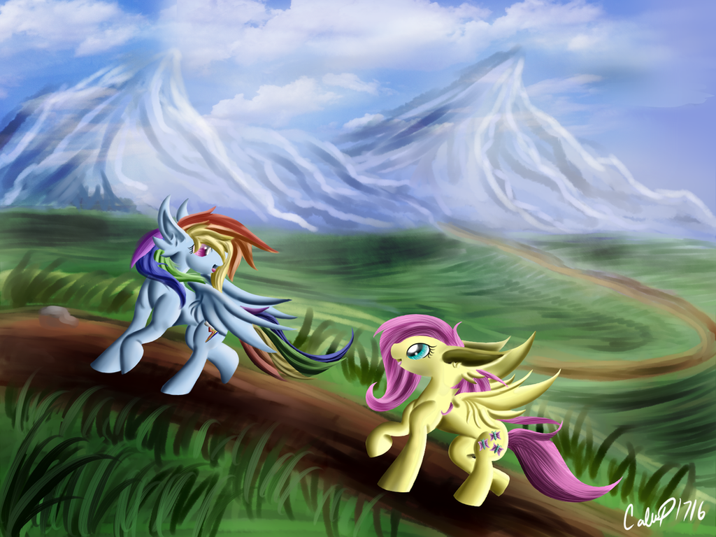
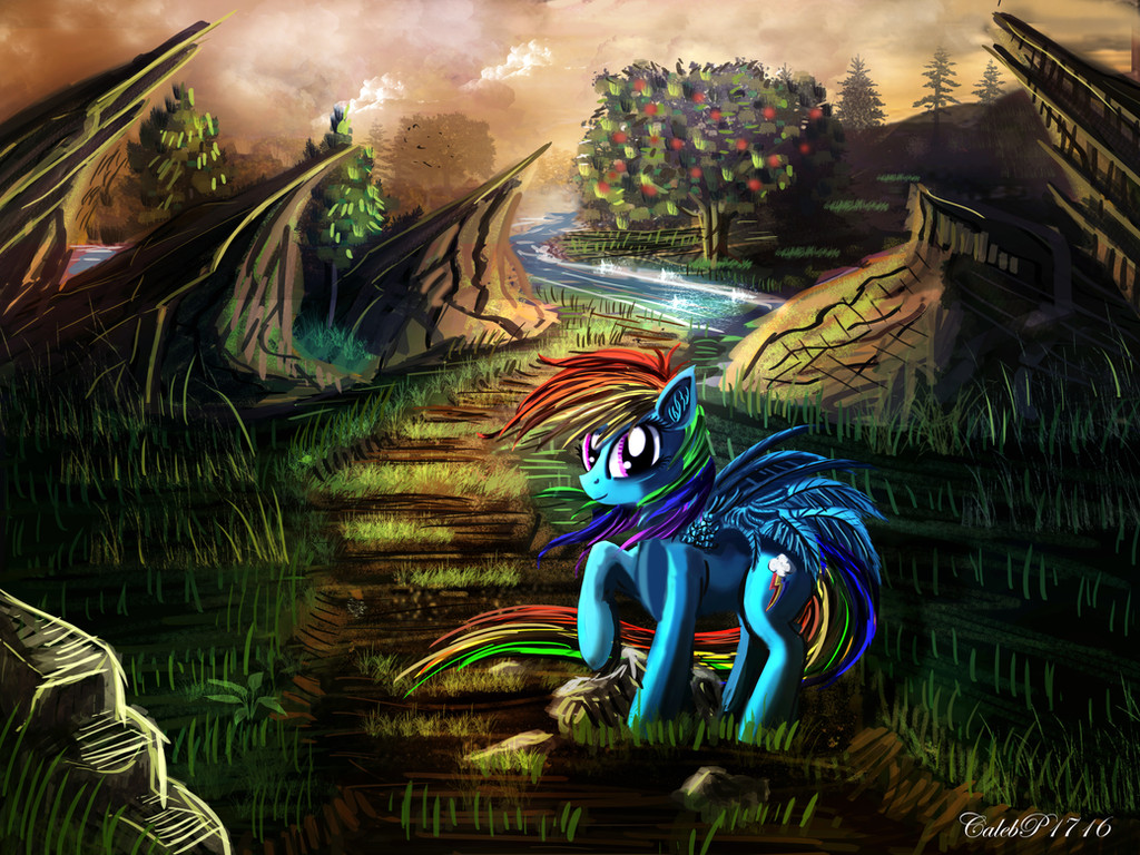
I'm finally finished! It took me a few months to do, unfortunately, I'm terribly sorry for the long wait for this piece to be finished. This piece goes to I really hope you like it, I looked for different ways to make improvements, and simply experimenting with Paint Tool Sai and Photoshop to make this image look the way I wanted.Thank you guys for checking out my work, feel free to give me a fave if you like it, and please leave a comment to tell me how I did, if you have any critiques, suggestions how I could improve in the future.
 (Smile)")
Related content


Comments: 29

Overall


Vision
Originality
Technique
Impact
This is a very good try. I can see where you were going with this, but unfortunately, your pony anatomy does need a little work. You could try making the chest a little less large, front legs could be wider at the top, and wings need to have a more solid connection to the body. Overall, your background and shading work are very nice, but what you could have done with the grass was use a (i don't know how to say this) dotty brush to give the grass a furry look without drawing each individual blade. BEAUTIFUL shading work though OMG.
👍: 0 ⏩: 1

Thanks for the critique, I really appreciate it!
I figured that my anatomy was pretty off, and I was debating whether or not to make this character in my previous styles with the actual hooves, and I guess a more realistic anatomy of an actual horse.
I'm not the best at anatomy, and I know that there is much to learn about it, but I guess I wasn't too concerned as I probably should have. I did my best though in trying to make it look right, and that's all that I care about right now, but I will do my best to learn more about anatomy and practice, practice, practice!
I'm glad you like my background, and the thing about the grass, well, that's another thing I'm not too good at. I don't know how to really make grass look like, well, grass! XD
I'll try your idea of using a fuzzy brush, or soft brush for the grass, and look up tutorials on how to make realistic grass.
Thank you again for the critique, I very much appreciate it, and I'll do my best to get better!
👍: 0 ⏩: 1
you're welcome, I was scared you would take offense!
👍: 0 ⏩: 1
Nah, I'm not offended at all! ^^ I appreciate honesty, and having honest criticism is the best way to learn I think. You gave some good points that I'll have to look into so I can try to make better art in the future.
So yeah, no offense taken my friend, and thank you very much for the critique!
👍: 0 ⏩: 1

Overall
Vision
Originality
Technique
Impact
1 there's no focal point in this picture it seems.there are no good perspectives going on. the anatomy are not good, u could say eh its just my style... but in order to get a good style you need to know the fundamentals. perspective,anatomy,values and form
for improvement study horse anatomy, build up your characters with forms like cylinders and make sure everything follows a perspective. i would make the foreground darker and the background lighter and slowly loosing both details and absorbing the color of the sky further away,
for 1 since the horizon is really high we need to see more of the overside of things
Its not bad. I like the colors of the grass and the use of more yellow greens where the light hits. as it should be. and that the subject stands out from the background. your fetting there just practice more.
👍: 0 ⏩: 2

We really need to get your grammar and spelling fixed up Zilvart, that is meant to be critique, but the lack of capitalization, and use of single letters instead of the full words can severely lessen the impact of the critique.
👍: 0 ⏩: 1
right. my spelling isn't the best^^
👍: 0 ⏩: 0
Well, sometimes I do okay, and sometimes I don't, but I think this is okay since I haven't really drawn in a long time, and I've been working on this a lot on and off.
I see what you're saying, and I agree with you, but unfortunately I haven't been studying/working on much art lately, due to me being busy and having other things to do.
I'm trying to get back into art, and I don't expect to improve a lot yet, because I seem to be in a rut in my skill level. I'll try to work harder at the fundamentals, and hopefully I'll be able to incorporate them into my art, which I find rather difficult sadly.
Anyway, thanks for the critique, I really appreciate it, and I hope to do better sometime!
👍: 0 ⏩: 1
your welcome^^ and ye its hard indeed. u can just simplify it tho
👍: 0 ⏩: 1
I'm looking into Ctrl Paint again, to see if I can learn how to improve my forms, my lighting, and many other things. I learned a great deal when I went through his video library, and maybe I'll learn some more, or just reinforce what I learnt and get better! ^^
👍: 0 ⏩: 1
sweet")
👍: 0 ⏩: 0

I just want to say thank you for all the comments and favorites, I really appreciate them, and especially those who took the time to give me critiques.
I want to say that, I do realize that there are a lot of things off in this painting, and part of that is because I'm a bit rusty, haven't been drawing in a long time, and I thought that this would be a good way to get back into it.
I'm sorry that my fundamentals aren't solid, I'm doing my best to try and pull off the best work that I possibly can. I also want to say, despite my lack in the fundamentals, I really like this piece, I thought it looked very good, was pretty much what I wanted it to look like, and I really like the lighting,, which took me a very long time to do, and well, I know it's not near to perfection, I still like it.
Working on this on and off for quite awhile, this painting probably took me almost eight hours or more to do.
Anyway, all that I wanted to say was that, despite the errors I did, I think that this turned out okay, I'm proud of it, because I know I worked hard and did the very best I could do. ^^
I also want to thank you guys again for your comments, favorites, and critiques, I really appreciate them!
Take care!
👍: 0 ⏩: 0

Thank you very much, I'm very glad you like it!
👍: 0 ⏩: 1

Thanks Beaded, I'm glad you like it!
👍: 0 ⏩: 1

Haha, thank you very much! ^^
👍: 0 ⏩: 0


my OC's signature move and your OC's cutie mark look very similar woodywoodwood.deviantart.com/a…
👍: 0 ⏩: 1
Oh wow, that's very similar. However, it's not my design, it belongs to Cryptic-91, who had requested me to draw his OC, Sky.
It's a very cool design, I really like it, and I think it fits the character perfectly.
👍: 0 ⏩: 0

Fantastic! I love the colour of the mountains and the way you draw wings has always made me a little jelly
👍: 0 ⏩: 1
I've always loved nature, and where I use to live there were mountains and hills everywhere, I guess that's why I draw so many of them. The wings, well I just drew as many of them as I could, and I'm still nowhere where I'd like to be, but it looks good enough so far! So yeah, i'm very glad you like how they turned out! XD
If you look at pictures of birds and try to copy their shapes you'll get a better understanding of how they are made! Hope that helps some.
👍: 0 ⏩: 0