HOME | DD
 Captainfusion — Statimul King
by-nc-nd
Captainfusion — Statimul King
by-nc-nd
Published: 2010-06-17 17:42:19 +0000 UTC; Views: 814; Favourites: 20; Downloads: 20
Redirect to original
Description
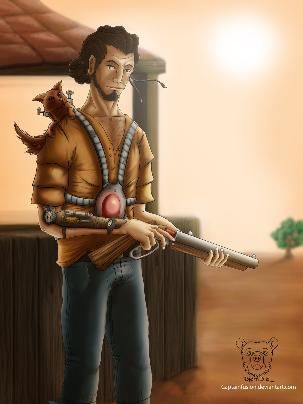
I don't have time for this with exams around the corner, plus I am working on a book cover for a friend. However I did this anyway.I appreciate critique - likes/dislikes and everything in between.
The character is something new I came up with. I wanted to expand my OC library a little.
Related content


Comments: 28


Thank you. The colours are very dull, but they help show off the lighting.
👍: 0 ⏩: 1

I really like it - especially the lighting with the very harsh sun in the background. Nice texture on the wood too, and the folds on his clothes are brilliant! Those are really hard to get right. Maybe the light on the sides of the man, gun and the furry thingie on his shoulder that are directly towards the sun should have a bit more light on them since the sun is so sharp?
But the picture generally looks great like this

👍: 0 ⏩: 1
Yes, thank you. You are right about the lighting. Thanks a lot for the feedback!
👍: 0 ⏩: 1
 (Smile)")

It's great, but if i had to find something to critique i would have gone with a higher contrast and saturation in the background and added in some golden hl to the figure in the foreground. But honestly, i would really just be nitt-picking.
👍: 0 ⏩: 1
Thanks, you are right, maybe the background should be more saturated in comparison to the foreground. I need to remember that.
👍: 0 ⏩: 1
Noy always, but it is a good way to make you figure seem to "pop" out of the background and grab the viewers attention.
👍: 0 ⏩: 0


The wood panels look incredible! I'm easily impressed by things I cannot do 
👍: 0 ⏩: 1

Thanks, I went for a dusty look. That's my favorite after all.
👍: 0 ⏩: 0

Congratulations! Your entry has been added to the brilliant gallery at keep up the good work!

👍: 0 ⏩: 0

Glad to hear that. It can be difficult to tell if it is all ok, so at some point you just end up saying to yourself "its finished."
👍: 0 ⏩: 1

I know what you mean, been there myself. Sometime it can take a while until you understand that nothing more needs to be done x) Although the picture is great: the background, line art, coloring and shading is really doing what it should (Love the hands of the man), I get the feeling he is a little bit stiff - his pose. His back is so straight and I feel that if he's reloading the shotgun he would probably look down while doing it. But then again, that doesn't mean you have to do it like that ^^
👍: 0 ⏩: 1
Thank you for the comment and the critique!
👍: 0 ⏩: 0

Danke, nichts neues, aber neu trotz dem.
👍: 0 ⏩: 0