HOME | DD
 Celsa — Tutorial: Painting
by-nc-nd
Celsa — Tutorial: Painting
by-nc-nd

Published: 2010-06-12 19:31:14 +0000 UTC; Views: 237954; Favourites: 4430; Downloads: 2358
Redirect to original
Description
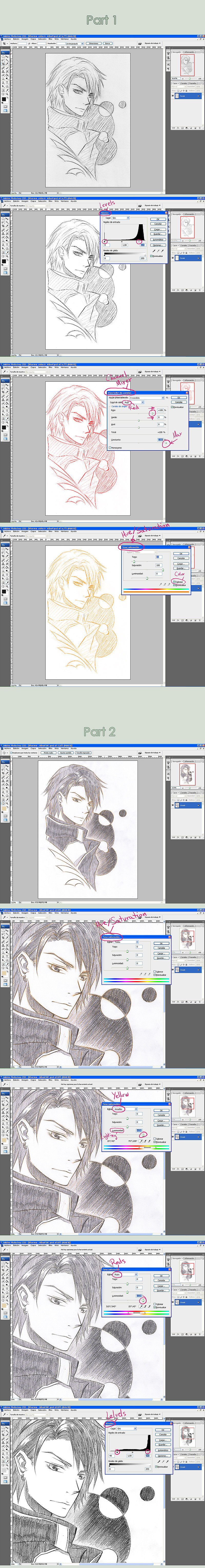
This is a tutorial explaining my coloring technique. I'm using SAI for painting here, but I think you can adapt to other programs as well if they have the right tools.Also, note this is NOT a SAI tutorial, so I won't explain the tools and so on. Just my coloring technique.
 1. Starting
NOTE:I'm sorry, I typed 'staring' instead of 'starting' in the image file. It's very troublesome to fix, so I fear it'll be left like that T_T
The very first thing to do is to open the sketch. For this technique you don't need it to be a clean lineart, since is a lineless or semi-lineless coloring. (You can use a clean lineart if you wan though, and adapt)
Set the sketch layer as 'Multiply, so you see what's happening below, and name it to something easy to recognize ('sketch' in my case) for organization's sake.
2. BackgroundThe first thing to paint it the BG. It's colors will influence everything else and create the general atmosphere, so choose carefully. It doesn'r matters if it's just some simple colors.
Make a new layer for it, below 'sketch', and again, name it.
In my case I choose warm colors, with bright red and pink since they create some 'agressive' mood.
3. Base colorsNext is the base colors. Make a new layer for it and name it too.
Here is where you add the base colors. Choose carefully, and take the BG colors into consideration, so it doesn't created a bad effect. You can test colors until you're satisfied; don't just add the first color that comes up.
Use a solid brush for it, not one that blends, or you may leave holes, or semi-transparent spaces.
It doesn't matter if you go out of the line, since you can erase later, but for the hair, is best to be careful, and paint it properly from the start, for it's some of the most troublesome parts.
You can 'blind' the 'sketch' layer to see how it's going anytime.
Also, make sure you save the base colors in the color grid. You will need to go back at them many times.
I do it in a way that i can add the different shades at the side later (I wish SAI had more grid space. But it's nice that you can order the colors)
Also, I never use back, white or grey. I prefer a very light or dark color, but ALWAYS with a percentage of color in it. This is to avoid dullness.
4. Adding shades of colorNext is choosing and adding the other color shades. I do on the same layer, but you can create another if you want (it'll be troublesome for erasing later though)
This part is VERY important. I don't just choose a darker variant of the base color; I choose a different hue too. Like, if the base skin color was a yellowish salmon color, the next shade with be a bit more orangeish, and so on. Again, this is to avoit color dullness as well.
Add the shades to the grid, but you don't need to make a full gradiation, since we can blend and so make sub-color automatically. Just choose the main ones.
Add the different shades to the picture, marking the shaded part in a basic way. We'll detail and polish later.
Next thing I do is choosing and adding the compensation colors. This are complementary colors from the base colors, to add some color life to it. The drawing will stand out more.
I usually add 2 shades of compensation colors, in the form of either a reflection in the shaded parts, or just extra color in the shadows.
This is kind of personal touch, so it's hard to explain =_=
I add this color in the corresponding grid line, but in the opposite side.
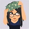
5. Detailing and LineartHere is where we start polishing the drawing. Close in, and start detailing and polishing where you need to.
I don't like to blend too much, since I prefer the rough painting look. It gives a more 'alive' look. Still, for the skin is best not to abuse the roughness, or it may look the character has some extrange disease, specially in the face XD
Use a brush with a blending effect for this part, btw. I don't use the blenders. I just apply the color with this brush and blends naturally. You can always go back to the lighter color if you need.
Also the blending level is variable. Just modify it as you need. I like to use a high 'persistence' for it drags the colors in a way I like.
Here is where I add the few lines I use as well. I make another layer for it, and use another brush for it. Make it in Multiply mode as well.
Also, I use colors for the lines instead of black. It looks softer, and so not that weird in comparation to the lineless areas. But it's up to each one to decide.
As for where to add lines, I usually consider the face a must, since it's usually the most important area and where people looks most.
I laso tend to add it in light areas of clothes, but it depends on the drawing.
Now, between the lines and the polishing, the figure shouls be more and more clear. I fade the sketch gradually as the painting progress, until I blind it completely.
In any case, it's good to blind it ocasionally to see how things are going without it.
5.1 The hairI'll mame a stop on the hair to explain it in more detail, since it's usually troublesome.
I usually prefer to paint it from dark to light, but it's pretty much a do, un-do and re-do thing.
First, remember I told you to put the base carefully? Well, thanks to that you can use the wonderful 'Preserve Opacity' option (if you're painting on the same layer, that's it)
This option avoids the transparent pixels automatically, so regardless of how careless you are, it'll stick to the base of color you did and nothing else.
Fir this illustration, I started by re-coloring the hair with the darker shade of the set colors I chose for the set.
Then I added the lighter parts witht he other colors of the set, to finally add some darker bits to create some 'hair shine' effect (a bit too soft in this drawing btw. They could be darker)
This effect is also used to paint metals; when you add a dark color near a light one veru abruptly, the contrast creates this 'metal' effect.
I finished by fixing the color compensation that was lost (the green/blue touches)
6. FinishingTake a genearl look, and finish wathever need to be finished. You never know what you may forget I do tend to make important things =_=
Also, it's time for cleaning. You should have the sketch layer in blind mode by now; you can make it viewable again to help with the erasing of the parts that went out of the 'line'
Once it's done make the sketch layer blind again, and save. It should be pretty much done.
7. EditingIf you need to make edits of any time, this is the time. In my case, I still needed to add Dino's tattoos, since I made them separately.
For editing, I recomend to switch to Photoshop if possible. It's awful for coloring, but it's the best for editing.
Well, now it's definitely finished
") 8. Tips
8. Tips-Save a LOT
Seriously, save as often as you can. You never know what can happen. A blackout, and your progress is lost forever T_T
 Save in .PSD file format
Well, not necessary, but you can open in Photoshop more easily (PS doesn't accepts certain formats, like Painter's own format)
This is a format that won't make a quality loss like .jpg and such
Don't merge the layersEven if you're finished, don't do it. You never know if you'll need to go back to it. If it's the file size that's bothering you, just make a .jpg copy of it for easier use, but keep the original .pst intact.
Use high resolutionSince it allows for more detailing. But not too big, or you'll computer will drag.
Also, take into consideration the drawing you're painting; a face shot wouldn't need that much of a big canvas.
Adapt the brushesDon't just stick to the defeault ones. Is best to experiment with the options, and see what suits you best. It's good to have your own set of personal brushes.
RotateSAI and Painter have a rotation tool that's easy to use. Abuse it! It's easier to paint some parts in different positions, since your hand can't rotate 180º
Use a different palette for each drawingDon't stick to the same colors. Clean the grid, and choose new ones for each picture. You'll tend to use similar colors, but that doesn't means you have to use the exact same shade.
More realistic doesn't means betterEven the great ancient artsists didn't just 'copy' reality. They interpreted it.
Is best to have a personal style that makes your art unique and interesting.
Reference doesn't means copyIt's OK to use reference, but that means that you use several images to learn how something is, and later build soemthing new. Not just copy a photo. (actually, you should have a clear idea of what you are going to make BEFORE looking for reference).
Also, use photos as ref, not illustrations or drawings, or you'll end up just copying that particular artists style AND mistakes.
And if you can take the photos yourself, the best.
Well, I think that's all. If i'm forgetting something, or you need to ask anything, just comment here.
Related content


Comments: 200

Hm. Making the background first...stupidly, I never thought of that. Very useful tut!
👍: 0 ⏩: 0

Is this a free program? It's hard to find a tutorial for the photoshop that I have and I would LOVE and easier program to use so my poor brain can process it. lol. This is really awesome. It would be great if I can try this on my own. I love the tattoos on him.
👍: 0 ⏩: 1

Hello. i think I made this tutorial with Painter wich is not free, but now I'm painting with SAI wich has all the good things from Painter, bwing MUCH more simple, and even though it's not free, is very cheap.
👍: 0 ⏩: 0

Omg I love the tattoo LOL .
nice tutorial btw ^^
👍: 0 ⏩: 0

This is a great coloring tutorial.
👍: 0 ⏩: 0

")

This was really helpful.  (Smile)")

👍: 0 ⏩: 0


he looked cooler without tatoos lol just kidding but really awesome drawing invu u can draw really AWESOME!
👍: 0 ⏩: 0


I know right? eue
👍: 0 ⏩: 0


BlankStray [2011-05-17 03:54:17 +0000 UTC]
What sort of resloutions do we use for a picture? Does it vary?
👍: 0 ⏩: 1
Wathever you see fit. Depends what are you going to use the art for. For printing 300dpi is usually OK
👍: 0 ⏩: 1

Well, you put my coloring in PaintoolSAI obsolete.
👍: 0 ⏩: 0

Thank you a lot! Especially the tip for rotating. I debute with photoshop and found it very hard to make some hand movements.
I'll try your software
Anyway Thank you!!!
👍: 0 ⏩: 1
Completely. The way it handles color is very different; more paint-like. It mixes colors instead of adding them up. But it's specifically meant for painting after all, while PS is more for editing (and great at it) And SAI is WAY cheaper too.
👍: 0 ⏩: 1
Oh since I'm new to this I don't know very well how to do paint-like art on PS
Thank you
👍: 0 ⏩: 1

at first i was thinking: Is that dino? can't be! there are no tattoos! but he looks a lot like dino. . .
then I reach the last part! it IS dino!!! XD
anyway, this is great~~~ <3 I'mma use this for reference!!! thanks for the tutorial!
👍: 0 ⏩: 0

Thank you Celsa san. I really liked your magnificent style in coloring. Hope I can make a unique style for myself as well...currently learning it from you and my other senpai. Really grateful for this tutorial :joy:
👍: 0 ⏩: 1
I'm glad that's being usefull
And it's good that you're aiming for your own style, and learning from several people. I think that's the best way to learn

👍: 0 ⏩: 0


wowww.w.... WOWWWWW i love your comments/instructions, everything was explained so clearly and precisely, i was hooked on every word, there are so many things to learn!! if more ppl could explain things the way you do, wow, there would be way less confusion.
👍: 0 ⏩: 1
I'm glad you liked my explanations
👍: 0 ⏩: 1
HEHEHEHE THEY WERE EXCELLENTT
👍: 0 ⏩: 0

wao you draw a very good Dino!
and btw isn't the tattoo on Dino's arm is ACCA?
👍: 0 ⏩: 0

O.O How do you give your brushstrokes that "rough" look? I tried using just a normal brush but I can't seem to make it work right/
👍: 0 ⏩: 1
I think it was the density what controlled that (the more the rougher) But the blending and such also have something to to (but I change that all the time depending on my needs) The best is testing all the controls there first and making a duplicate brush with your prefered options.
👍: 0 ⏩: 0

Don't worry about the typo on number one. We were all staring.
👍: 0 ⏩: 0

I love the background and well... everything! When you first put staring, I did, because he's freaking hot! XD
Nice tutorial, I'm one of those people who learn by watching. ^^
👍: 0 ⏩: 1

Thank you very much for this tutorial!
👍: 0 ⏩: 0


I wonder how long it takes you to draw a picture?

👍: 0 ⏩: 0


o_o you only use 5 layers total????
and all your coloring goes on one layer??? o_o
correct me if i'm wrong here. o_O
really helpful tut btw : )
👍: 0 ⏩: 1
Depends on the drawing, but more or less yeah XD
Yes, I usually make the character's coloring all in the same layer. It need some practice, but in the end is more convenient!
Glad it helps!
👍: 0 ⏩: 1


This...this is AMAZING! It was extremely helpful! So thank you
👍: 0 ⏩: 0

Don't worry about the 'staring' thing. I actually stared at it. o ¬o Nice tutorial~
👍: 0 ⏩: 0


Great tutorial! This was very helpful...
I hope you don't mind my asking...why is Photoshop awful in coloring?
👍: 0 ⏩: 0

Thank you for the wonderful tutorial. Very informative!
👍: 0 ⏩: 0
| Next =>