HOME | DD
 charfade — April 1st Speed Paint Challenge
Published: 2012-04-04 02:41:51 +0000 UTC; Views: 1232; Favourites: 32; Downloads: 32
Redirect to original
Description
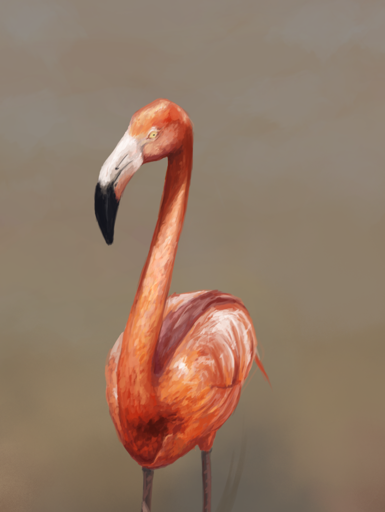
Fancy Smug Flamingo mmmmmmFor Sparkyyy's April Speed Paint challenge [link]
This month is Animals! ^^
I did spend most of my time trying to get the right colors D: this one was tough. body is way off I see now looking back and forth to the original ref. I know this month I need to really hunker down and work on that. hmmm also Smug Flamingo is very smug.
Also I do think my chalking 2 weekends in a row had an effect on my speed painting. I'm lying down my colors as I would layer soft pastels, where I would naturally blend them in. I dont have that option to really blend in here. I need to try and retrain my brain not to have splotches of color all over the place.
2hrs Photoshop CS3
Original Ref image
Charfade's Flamingo army!!! Combating the General Whiskers
Like Mez on FB [link]
Related content


Comments: 10

I think you did a great job on the flamingo. You might see it as a bad thing that your chalking is influencing that way you paint in Photoshop, but I think it adds a little something extra! I actually really like the splotchiness, it gives it a lot of texture! And you know how I love texture. XD Now that I really think about it, it does actually look like you did this with pastels or something. I think its wonderful. As far as critique goes, I think you could have gone a little darker in the shadow area that goes across the birds back. I kinda went too light as well. Still, you did great on this!
Also, nice flamingo army you got there! ;D
👍: 0 ⏩: 0

Nice job with the colours especially, I think you got the shades very close. I was gonna say the first thing that struck me is it looks like the style of your pastel drawings, then I see you mentioned it ")
👍: 0 ⏩: 0

I really love the structure on the neck.
Gives it a loose traditional feeling that i really like.
👍: 0 ⏩: 1

^^ thanks I really did spend a lot of time on that neck... the body of the bird I could have spent more time on I think.
👍: 0 ⏩: 0


thanks for hanging out Tomcat!^^
👍: 0 ⏩: 0