HOME | DD
 ChaseConley — Sentry test

Published: 2009-11-05 22:33:15 +0000 UTC; Views: 9870; Favourites: 179; Downloads: 324
Redirect to original
Description
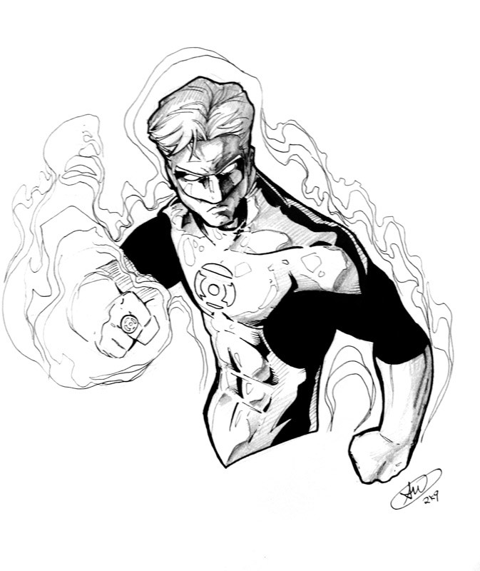
Just some more experimenting for this Marvel submission.I'm getting there u guys, I just need some backgrounds to make things pop.
suggested to draw the Sentry
suggested more color variation....That one ill have to figure out...
Related content


Comments: 18

Sic...I gotta ask how is everything going...tell me you got a gig some where and a wise company is utilizing your skill set...
👍: 0 ⏩: 0

real nice
i can like this 1 alot my name is atlanta
👍: 0 ⏩: 0

namor and sentry are two of my top favorite characters of marvel. i really like how you tinted namors skin green, coooool.

👍: 0 ⏩: 0

You have a really awesome way of cleanly rendering shadows with the pencil, it looks very smooth and nice, and you can still tell that it's a pencil drawing. Could you please do a tutorial about color pencils like that in Photoshop someday?  (Smile)")
👍: 0 ⏩: 0


see, this is why you need to work in this style, it helps make the colors be more natural and realistic, we need more of that in comics=]
👍: 0 ⏩: 0

dynamic, anatomically accurate, beautiful work...I hope Marvel signs you up
👍: 0 ⏩: 0


Really likin the hues you chose for Namor's skin. Just a suggestion, but maybe a few subtle reds in the face to contrast the greens and indicate some SSS?
👍: 0 ⏩: 0


Nice color, muscles, clothing, hair. The one part that jumped out to me as not quite as awesome as the rest is the diagonal lines coming down from the corners of the yellow guy's eyes and nose: they look a little too hard and straight, and don't quite fit with the rest of your naturalistic rendered curves.
👍: 0 ⏩: 0

Love it, but Sentry's skin is a bit too yellow... it get's lost with his hair and costume. But your pencils are sick!
👍: 0 ⏩: 0

o bejeeberz. If you do comics for Marvel I would have to buy everything with your name on it.
👍: 0 ⏩: 0

great detail on this piece. what are you using to color your picture?
👍: 0 ⏩: 1

Photoshop, the best software known to man lol
👍: 0 ⏩: 1


These are looking great man - real professional. I really hope you stick with your realist pencils, bring your own stamp to Marvel I think you'll really wake some of these characters up
👍: 0 ⏩: 0