HOME | DD
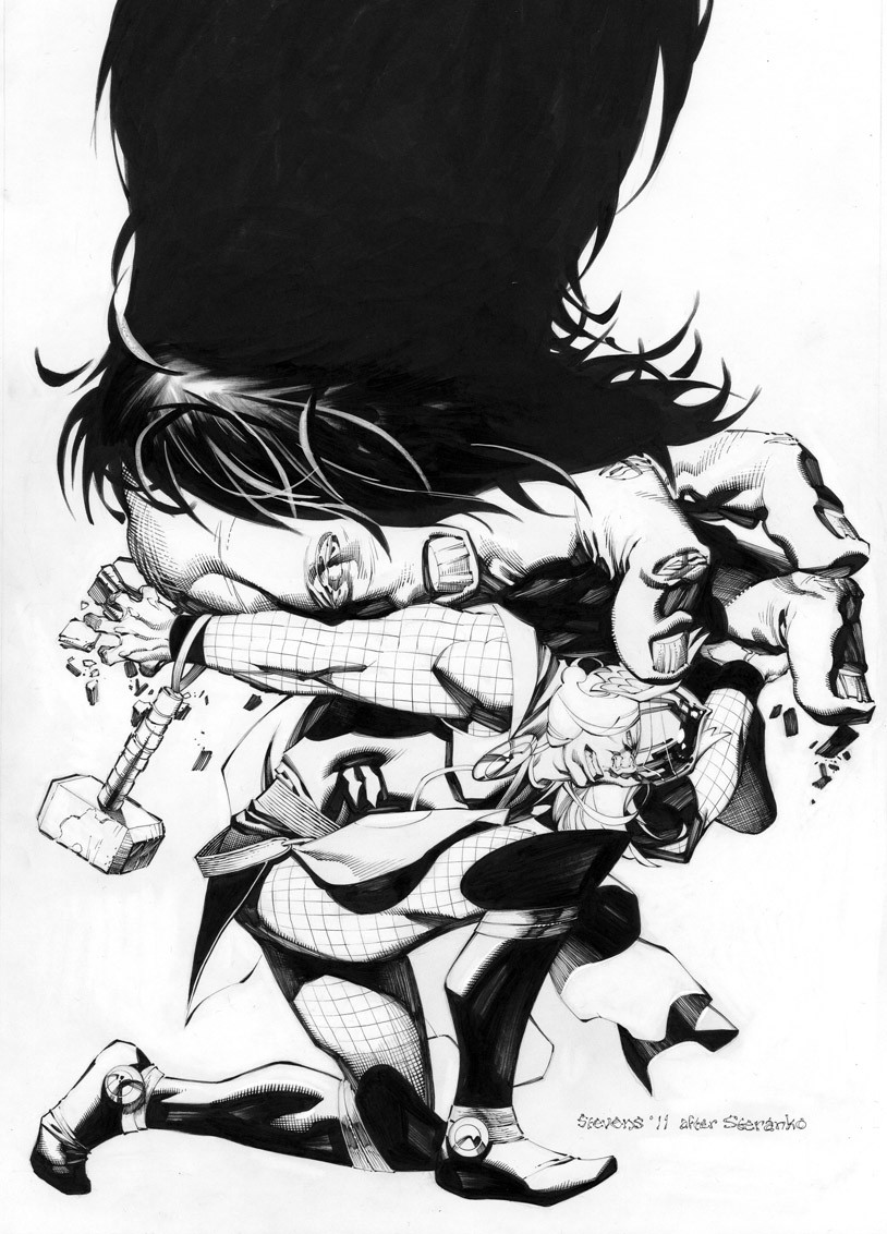
 ChristopherStevens — Hulk vs Thing

Published: 2010-06-30 22:23:53 +0000 UTC; Views: 42661; Favourites: 1092; Downloads: 1333
Redirect to original
Description
Yep..another Hulk piece. You won't hear me complaining though. He's always a blast to draw. Ben can be tedious with all those damn rocks, but I love the character and the results are always kinda cool, so I'm happy to do another one. This was my attempt at a Bernie Wrightson layout. Everything piled up on the left side and totally vertical. It was a fun piece.Prismacolor/Copic markers with color pencil and watercolor on vellum bristol board.
Hulk and Thing ™© Marvel Comics
Related content


Comments: 135

AGREED! Gorgeous composition, and the contrasts are so sharp in some areas and then subtle in others. This really is an incredibly well done piece of art. Chris, I don't know how you do this stuff, but I'm a huge fan.
👍: 0 ⏩: 1

Thanks (Smile)")
👍: 0 ⏩: 0

You are nuts dude! AWESOME! LOVE YOUR COLOR WORK!
👍: 0 ⏩: 0


Great flow! The face you have for the Hulk really makes him look brutish, and is one of my favorite renditions of him. Awesome job on the Thing too, especially the way you do the rocks which is well worth the effort.
Joe
👍: 0 ⏩: 1
Thanks. My Hulk is loosely based on Kirby's. Yeah the rocks are a pain in the ass, but kinda fun at the same time. Go figure.
👍: 0 ⏩: 0

Homes.. You oughtta get a graphic novel started if u haven't already..
👍: 0 ⏩: 1
Hehe, nah not yet. I would love to do a one shot story in marker some day though.
👍: 0 ⏩: 1
Get on that..
Don't sleep on it, ANY LONGER.
Lol.
👍: 0 ⏩: 0

You'll hear no complaints from me either. Great piece!
👍: 0 ⏩: 1


I love the sense of falling. And the power behind the two creatures. Well done, I say. Well done.
👍: 0 ⏩: 0


You are a god in waht you do. They should have used you instead in their silly marker commercials. Btw is it ok to ask which brand are you more pleased with? And how do they feel different?
👍: 0 ⏩: 1
Marker commercials? Thank you much.
I prefer the Prismas for figure work and the Copics for background stuff. I don't care much for the standard wide tip on the copics, but I like how "juicy" they are and being refillable is sweet. That being said, I'd stick exclusively to the Prismas if money wasn't an issue.
👍: 0 ⏩: 0

I was going to make a Wrightson-esque comment. Very cool, as usual.
👍: 0 ⏩: 1
Thanks, yeah I've always wanted to try this layout, but didn't have the right piece. This one seemed to fit the bill.
👍: 0 ⏩: 0

thing never seems to have an edge in this fight. nice image. the posing feels spiderman like but works for hulk considering he'll leap at opponents once in awhile.
👍: 0 ⏩: 1
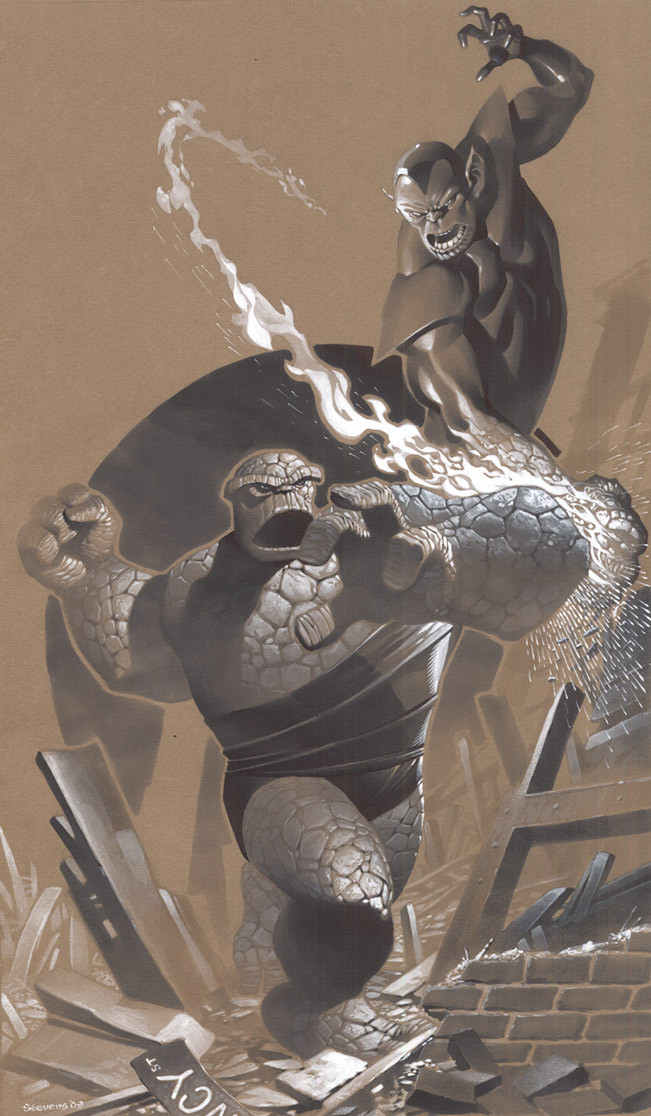
Hehe, yeah Ben's gonna lose...again, but he keeps trying and that's why we love him.
👍: 0 ⏩: 1
nah, I like him because he's an overall nice guy despite being a big lug. He has a kind heart, that's why I like him.
👍: 0 ⏩: 0


Your shadows and lighting are outstanding man! Great dynamic piece!
👍: 0 ⏩: 1
You're welcome man.
I did a full Hulk sample comic, check it out when you can!
[link]
👍: 0 ⏩: 0


Not surprisingly ... this is AWESOME!
👍: 0 ⏩: 1
Thanks, man. Glad you dig!
👍: 0 ⏩: 0

I LOVE the way you draw Ben, and this is great.
👍: 0 ⏩: 0

<= Prev |