HOME | DD
 Chromamancer — Forest Depths -Process-

Published: 2010-01-27 13:57:41 +0000 UTC; Views: 3363; Favourites: 69; Downloads: 91
Redirect to original
Description
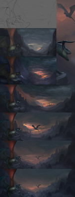
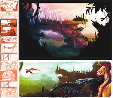
This is a bit of the process behind my Forest Depths picture. [link]Program: Photoshop Elements
I used a few brushes by
I don't have any layers with earlier sketches than the top line art layer. I probably deleted them, or used them for different things later. After the line art, I filled in the major areas with shades of gray. I made the shades of gray get lighter as they go back, to indicate depth.
I included two steps showing how I did the texture on the dragon. I drew the larger and more important scales. Then, I made some smaller brush strokes to add texture to the remaining area.
Another notable step is the first one where colors show up. I just did a solid layer fill with a shade of green. The blending mode of that layer was set to "Difference". This gave me some colors, but inverted the image in a strange manner.
I put a merged copy of the black and white portion of the drawing just above this layer, and set it to "Luminosity", so then those colors would be applied to my grayscale work properly.
That process was very quick, and ended up mapping pinks to the lighter parts of the picture, and greens to the darker parts. Adjusting the shade of green on the "Difference" layer allowed me to change the balance between the two colors.
Doing that definitly helped me get a start on the coloring.
I did some more traditional coloring after that.


Finally, near the end, I added some more colored lighting effects. These layers have a pinkish shade to them, so they help make that warm light seem more real, and not just like a color fill.
Related content
Comments: 37

This picture was entirely made with Adobe Photoshop.
That's the one that I tend to use when making these sorts of large pictures.
👍: 0 ⏩: 1

cool! i just can't figure out how to use photoshop.
👍: 0 ⏩: 1

you can also use Gimp..it is free it is sort of like photoshop but it is free, have less file space, you can updated too, but you have to find the updates i think...and get brushes like photoshop..well find te basics of those programs.
👍: 0 ⏩: 1

yeah. I do like to use gimp at the moment. I find that sometimes Gimp is easier, then other times i prefer photoshop. well, at least i can say that i try.
👍: 0 ⏩: 1

yes 
👍: 0 ⏩: 0

what did you use to add colours to your black&white picture?
👍: 0 ⏩: 1

Ah. On this picture, there is a layer with a copy of the grayscale image with the blending mode set on "luminosity" on top of a solid color fill layer with the blending mode set to "difference".
Gradient maps are a much easier way to get started, though. I know that now.
[link]
Currently, I use gradient maps to make big regions of color, and I put in some specific colors by hand, too.
👍: 0 ⏩: 1

Oh.... i see...
but that only works in Photoshop elements?
or can be used in Photoshop CS3?
👍: 0 ⏩: 1

Gradient maps can be used in Photoshop CS3 just fine.
👍: 0 ⏩: 1

what did you use to add colours to your black&white picture?
👍: 0 ⏩: 0

Photoshop Elements is the program that I make these large pictures in. It's made by Adobe.
Here's a link to the Windows version. [link]
I use the mac version, but I don't think there are any large differences.
I think it's a useful program.
👍: 0 ⏩: 1

Interesting! I like how you made the river shine more on the last step
Also, you have wonderful lining!
May I ask what kind of traditional coloring you used?
👍: 0 ⏩: 1

Thank you.
Traditional coloring may be a poor word choice in a way...
I just made another color layer, and did a bit of coloring by hand. I really just added a bit of blue to the dragon, some reds and browns to the tree in the foreground, and some gray in some of the shadows. I did add some more pinkish light, too.
Basically, the difference layer mapped colors to the picture, based on brightness. I took that as a start, then did a little bit of coloring of my own to complete the picture.
👍: 0 ⏩: 1

Oh I see
I'm really interested in using the difference layer feature now (always been to hesitant)! Many thanks for explaining
👍: 0 ⏩: 0

It's great to play around with different layer settings like this. There's also all the adjustment layers too - one that I find really helpful in adding colour to a black and white drawing too, or just unifying colours somewhat, is the gradient map. I have a lot of fun with it.
I love the texture you incorporated into this one, it looks great.
👍: 0 ⏩: 1

Thank you.
I'll definitely have to play around with those gradient maps. I just took a look at them, and they are rather impressive. They do something rather similar to the difference layer I used, but the added control over the colors is really nice.
The difference layer has a few good points, though. It automatically gives you a complimentary color scheme, and you can control the balance point between the colors by changing the luminosity of the fill layer. And it updates automatically, even if you change the lower layers.
Photoshop has some really interesting ways to map colors to certain luminosities that I really haven't used until now.
As for the texture, I think drawing the large, important scales like I did, and texturing the rest of the body like this may be the way to combine my previous scale method with the textures I've been working on recently. I'm rather happy with how it turned out.
Overall, I think it was a fun picture to work on, but also one that taught me a lot.
I'll have to remember the things I learned on this one, and apply them in the future.
👍: 0 ⏩: 0

The technique you used to get the colour on there, is very interesting...
Cheater!
This is a really impressive picture actually. You've improved alot over the few years I've known of you from DMBH. (:
You should do an art trade with me some time soon. ;D
👍: 0 ⏩: 1

Thank you.
It's good to hear that I've improved. I didn't draw much for a few years, and many people thought I left DMBH...
But, now, I've graduated from school and I have time to draw again, so I've been doing my best to practice up and improve.
Anyway, cheating on the coloring was a lot of fun. It looked rather good, so I didn't have to go over the entire picture, and it let me take a look at different color schemes easily.
👍: 0 ⏩: 0

woaaaah 8D i never saw one who colored fisrt black-white and then done it in color XD amaing ^_^
👍: 0 ⏩: 1

Thank you.
I got the idea to try this approach from watching Jamajurabaev.
It's quite an interesting method, and it makes it much easier to balance the lighting and colors.
👍: 0 ⏩: 0


