HOME | DD
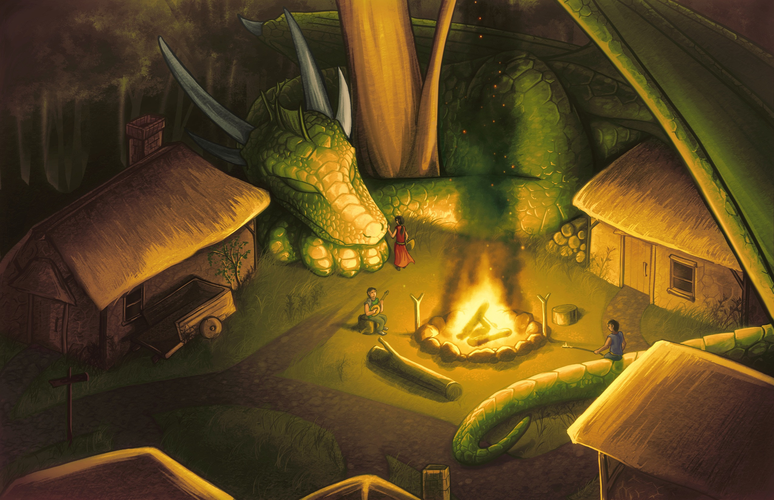
 Chromamancer — Village Guardian -V2-
Published: 2010-12-22 12:28:41 +0000 UTC; Views: 18077; Favourites: 952; Downloads: 530
Redirect to original
Description
This is a remake of my original Village Guardian piece. [link]It is a special picture to me, because I think it marks a turning point in my art. Many of the techniques I've been observing and practicing came together well in that piece.

I still really enjoy the composition and concept, but it was looking a little dated next to my recent art, so I thought I would re-draw the picture, using the things I've learned over the last year and a half.
I made it wider, too.
 (Wink)")
Enjoy!
Related content


Comments: 251


Thank you very much.
I'm rather proud of the setting in this piece.
 (Smile)")
👍: 0 ⏩: 1

Whoα! The coloring is αwesome!
Like how the drαgon looks.
👍: 0 ⏩: 1
Thank you.
The wings were especially fun to draw.
👍: 0 ⏩: 0

if i had a dragon guardian i can't describe how excited i would be
👍: 0 ⏩: 1
Agreed.
I would be, as well.
👍: 0 ⏩: 1

stunning! I love the way you colored it
👍: 0 ⏩: 1
Thank you.
The colors and composition on this piece are rather fun.
👍: 0 ⏩: 0


it feels protective, warm and safe.... i love it

👍: 0 ⏩: 1
Thank you.
I'm glad you enjoy it.
👍: 0 ⏩: 1

Well noone will try to raid this town... I would definetly not try
Maybe I will write a story about this... I got inspired
👍: 0 ⏩: 1
Indeed.
I'm glad you find this one inspiring, as well.
The setting here was very fun to draw.
👍: 0 ⏩: 0

BEAUTIFUL!!!!!!!!!!!!!!!!!!!!!!!!!!!!!!!!!!! 
👍: 0 ⏩: 1
Thank you.
I hope it brightened your day a little.
👍: 0 ⏩: 0

Thank you.
It was a really fun picture to remake like this.
👍: 0 ⏩: 0

This one gives me a cozier, more "village-like" feeling, while the other way more exciting and colourful. I love them both a great deal.
The people look a little stiff, though. That's my only problem.
👍: 0 ⏩: 1
Thank you.
The color scheme change was something that I put a lot of thought into. I liked the older color scheme, but I didn't want it to be quite so saturated. Personally, I think the new one is an improvement, but they both definitely have their good points.
People still give me trouble... They're one thing that I definitely need to practice.
👍: 0 ⏩: 1
Hehe, I'm only really good at muscles and wings and people, so... XD
👍: 0 ⏩: 0

I think its safe to say you outdid yourself here. HUGE improvement over the original with the same feeling. The concept is great and you pulled it off nicely... again.
👍: 0 ⏩: 1
Thank you.
Getting all the little lighting pieces that made the mood correct was rather difficult, but I'm very happy with how it came together in the end.
👍: 0 ⏩: 0


now that is one awesome village to live in
the amount of detail you put in this picture is astounding! from the blades of grass to the tiny scales on the dragon. even the fire!
I like how the composition focuses first on the fire, then you slide to the sleeping dragon and in the end you figure out all the little people, their houses and can basically expand the story from there
and the warm colour choices really work well! you really get the feeling the dragon is part of the family/village. (also my own little addition, the girl with the basket in front of him brought the dragon cookies!)
👍: 0 ⏩: 1
I think it looks like a rather nice place to live, as well.
I wanted the villagers to include the dragon, so I placed them in rather comfortable positions. I think that adds a lot to the setting in this one.
The fire was one of the things that I really enjoyed. I tend to have difficulty drawing fire, so it was rather fun to approach it with texture and brushes. I used the smudge tool to blur it a bit, and give it that softer look. That was definitely an experiment that worked out well.
Overall, I'm really proud of how this one turned out. I'm glad to hear that you enjoy it.
👍: 0 ⏩: 1
I've never really had luck with the smudge tool before. but here it looks really well. though my favorite part were the little details like the sparks flying in the smoke above
👍: 0 ⏩: 1
Well, I lowered the opacity and used a brush with soft edges with it. The smudge tool can be tough to use, because sometimes it blurs the middle nicely, but can leave hard edges.
It can be a nice way to soften things up a little.
👍: 0 ⏩: 0


awwwe he's so cute when he's sleeping...
👍: 0 ⏩: 1
Indeed.
This one was rather fun to draw.
👍: 0 ⏩: 0

A very nice picture and vision. I have dreamed about similar situations myself.
👍: 0 ⏩: 1
Thank you.
I always enjoy settings like this...
👍: 0 ⏩: 0

the other later one had a more vibrant colour but this one has that real life -ish, really at night picture.
i guess both a really nice, depending on what you want.
👍: 0 ⏩: 1
Thank you.
I blended the colors a bit more on the new one, and reduced the saturation, overall. One of the things that I found was that I tended to use very saturated colors back then. Overall, I think I like the color balance more on this piece.
I think it's a decently large difference. You're the first to mention it, though.
Good eye.
👍: 0 ⏩: 1
^^ thanks.
so thats the term...saturated.... ><
i used vibrant then coz i couldnt find a word to describe.
👍: 0 ⏩: 1
Well, vibrant is another possible word that you can use.
Your use of vibrant didn't seem out of place at all.
👍: 0 ⏩: 0

Lovely work on textures, colours and lighting. Especially the dragon's scales - I can't stop looking at them")
When looking at the previous version one can really see the huge progress with your technique.
The perspective seems to be a bit off, though.
👍: 0 ⏩: 1
Thank you.
I had a lot of fun with the light and scales in this one. I'm rather satisfied with the improvement, too.
Where does the perspective look awkward? Is it on the buildings, or something to do with the apparent angle of the ground?
I know I fixed a few perspective errors on the older piece when I made this one.
👍: 0 ⏩: 1
It's not a big deal, really. It even somehow helps to create the fairy-tale settings of the picture. But the forest line suggests the horizont line somewhere around the middle of the picture /so called "human eye" perspective/, while all the other objects placement suggest the high, aerial perspective. We should be seeing tree roots, not the trunks. Also, the roof ridge and edges of the chimney on the house on the left side seem to be sloping in the wrong direction.
As I said, I really like the piece and I don't want to niggle
👍: 0 ⏩: 1
Thank you for that.
I know you don't want to niggle, and I'm glad you enjoy the piece, that bit of feedback will give me a few things to watch out for when making art, in the future. That was very helpful.
I made a minor edit to the roof of the building on the left.
It was just a quick change, and I think it's an improvement.
👍: 0 ⏩: 0

Thank you. I'm glad you enjoy it.
I'm quite happy with how it turned out.
👍: 0 ⏩: 0
| Next =>