HOME | DD
 Cloudrunner64 — Nordanner: Screen Saturation Guide

Published: 2015-04-16 23:34:34 +0000 UTC; Views: 5579; Favourites: 73; Downloads: 0
Redirect to original
Description
File updated! Blacks altered for a little more leniency.
The first of many visual guides to come 
Also, what are categories?
As stated on the sheet, all of these values represent the absolute last shade that will still be accepted for the color in question. While setting such a border is always artificial, it provides both administration and members some solid guidelines to work with. Since every screen and indeed, every eye, is different, it’s simply impossible to account for the wide spectrum of variation - it doesn’t help that we also understand colors a bit differently. Indeed, there have been cases of green perlinos, cherry red chestnuts and very clearly blue blacks. These may look correct on the screen that made them, but we can not see what you see, and as such, these basic borders have now been established. We hope this will cut down on arguments stemming from members being told their horses are too red (for example), as on our screens we see a cherry bomb, but on yours it's a perfectly dull brown. Now we can all be on the same page!
Black: Your black may be no lighter, bluer or browner than the shades depicted. This means any black must be between these values and 000000 (true black). You can go as close to true black as you wish.
Pure black may never be lighter or more saturated than these values. All pure blacks must be clearly black, not brown or grey.
Pure black color appears in following: undiluted black horses and blue roans, black points of wild bays, bays and seal bays.
If your horse is pure black and has a mutation that may cause black markings, both values must be inside the acceptable spectrum, with the black markings being darker than your base black - as such, you can’t have them at the same darkness but the other tinted blue, for example. Visual guide to come to explain black on black further.
White: Acceptable border values for white color on a horse. This means any white must be between these values and FFFFFF (true white).
Pure white may never be darker or more saturated than these values. All pure white must be clearly white, and not too heavily tinted.
Pure white color appears in following: any natural white markings, and any mutations which cause white markings.
All white markings on your horse, regardless of origin, must be the same shade.
The white used must be lighter than your base coat, if the white markings are visible. White markings can never be colored in such a way where they become darker than the light base coat (for ex. champagne cream). It is, however, acceptable to have the base coat and white markings be the same white.
It’s recommended to use a tint similar to the base coat to avoid a very confusing look on your horse. On a light cream, pinkish white markings are likely to look very off.
Special notice: Whites and blacks should not be tinted towards unnatural colors, such as green, purple, bright red etc. All tints should be natural; that is, muted in tone. This is true even for colors such as Moulin or Glimmer.
Red: Acceptable border values for red (brown) color on a horse.
No brown may be brighter, more orange or more red than shown here. Brown may, however, be less saturated, lighter or closer to black than these values. This showcases the absolute brightest and most saturated end of the spectrum. As such, browns can go all the way from these values to brownish and greyish dark browns.
Red color is fairly common, and appears in colors such as bays and chestnuts. Many colors also dilute towards brown shades.
Cream: Acceptable border values for cream color on a horse.
No cream may be more orange or yellow than shown here. The color of your choosing should never be closer than this to green on the color spectrum, even when using muted or close to white shades.
Cream is a fairly common color and appears in red based creams, double creams and cream champagnes.
The green spectrum is also especially useful when creating flaxen or silver manes, for example.
Special notice #2: None of these rules of saturation concern Moulin or Glimmer, which can be brighter (although not more green) than the values shown here.
Related content
Comments: 38

This is very helpful - and yes, every eye, screen, and scanner is different.
👍: 0 ⏩: 0

Out of curiosity, rather than relying on each individuals monitor calibrations and personal preferences, why don't you also provide the CMYK or RGB codes for each variation or tone not just for pure white or pure black? That way everyone knows that no matter what it looks like on their monitors if they use the right codes it should pass any inspection required by admins? 
👍: 0 ⏩: 1

The point of this is to give designers freedom. Just because one code may look right on one monitor, doesn't mean it'll look great on the designer's monitor. And when people design for themselves, they'd like to enjoy their design instead of coming out all wonky and weird looking on our screen.
👍: 0 ⏩: 1

I understand, I really do, it was simply a suggestion from an outside perspective on what is a sensitive subject for everyone close to it and affected by it.
👍: 0 ⏩: 1

Yeah I understand that. I was just explaining why giving out hex codes of acceptable forms of black (on the admins monitors, which aren't true color calibrated either) would cause people with opposite calibrations of them to become angry.
👍: 0 ⏩: 1

As I said, it was only a suggestion
👍: 0 ⏩: 0

the two right whites and the bottom two right creams still look identical on my screen, but the blacks are so much easier to see now!
👍: 0 ⏩: 0

Blacks are soooo much easier to see. Still having trouble with the whites, but I can squint really hard and kinda make them out
👍: 0 ⏩: 0


👍: 0 ⏩: 0

The blacks are much easier to see now! The whites still blend together into one solid block of colour for me though. But like I commented to Astral, it only takes a couple seconds to grab the sheet and colour pick if Im ever unsure c:
👍: 0 ⏩: 1

So wait these are the only blacks we can use? I understand putting a limit to the saturation but thats so dark that it would actually make some designs difficult to create. At least on my screens those blacks result in horse shaped silhouette with none of the line art visible.
👍: 0 ⏩: 1

Nono, this is the most extreme on either end, that you can use. The first black is the absolute lightest you can go, the middle is the middle of a spectrum, and the end is the absolute darkest you can go. You can do any black in between!
👍: 0 ⏩: 1

The lightest is still almost pitch black on my screens... But ok. Sorry, the woeding on that was rather confusing.
👍: 0 ⏩: 1

I assure you it's decently gray, actually. However, we also found out yesterday that sometimes small blocks of colour run together; it's possible we're putting in slightly larger models to show off the colours better.
Your screen could also be decently dark, for a variety of reasons
👍: 0 ⏩: 1

Understood though its the same pitch black on several screens ive checked :/
👍: 0 ⏩: 1

Cloud has updated the file now; can you see them any better?
👍: 0 ⏩: 2

Ok that is MUCH clearer! This seems fine now :3
👍: 0 ⏩: 1

To give you an idea, I'm on a laptop and I can see the difference, though I didn't see the first file.
First looks grey, second black and third brown based. I don't see any blue there.
👍: 0 ⏩: 1

Yes, that's correct now ^^ Cloud has updated the file to show the absolute lightest the blacks can be. There is no 'this is as dark as it can be' now
👍: 0 ⏩: 0

It is so nice to see how well this is coming along!
👍: 0 ⏩: 0

Are you going to do this for every base colour? (Ie. dun shades, what colour roan makes base coats, liver chestnut, pangare, skin, etc?)
👍: 0 ⏩: 1

No, this is only a basic guide, there won't be a separate one for each color as we found that would be too limiting. It's not specific to any color either, so we tried to pick broad examples.
The actual color sheets will have sheets with typical examples and rules to give people an idea what it should look like, but not detailed sliding scales. Basically something to give people an idea of the range, but no hard borders.
👍: 0 ⏩: 0

I think I need to tweak something on my settings, the white and cream squares show as one single colored square to me instead of one with stripes like the darker color ones

Will liver chestnut and such be on another sheet??
👍: 0 ⏩: 1

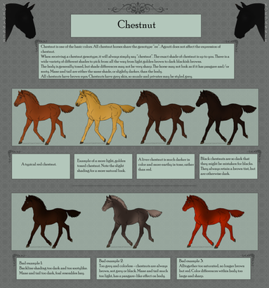
Actual color sheets won't have straight up saturation/color guides like this, but rather more general examples showcasing range and typical expression. Liver chestnut will be on the chestnut sheet, but it won't come with a sliding scale of acceptable shades. Rather, there will be pictures of several shades of chestnut, and some notes on each (like: liver chestnut should not be pure black etc).
I also hope that giving people visual examples on colors like chestnut will help people realize that liver and red chestnut are not the only options, and that there is indeed a very large scale of different chestnuts one can pick from. 
👍: 0 ⏩: 2

Ok awesome sounds great xD. It's hard for me usually not to end up with the same shade of bay almost every time.
👍: 0 ⏩: 0

looking forward to seeing them
👍: 0 ⏩: 0

Seems straightforward to me (also relieved to see that those colours don't look crazy on my monitor - that 2.5 hour stint of calibrating this monitor seems to have paid off!). Easy to follow, makes sense, good logic. I'm happy with this 
I do have one question: White markings that go near the soft parts; genitals, 'armpits', nose - they are quite often toned pink, is this still allowed, provided it's not cherry or neon pink? I would assume "yes" with the caveat that it must be natural looking, following this sentiment stated in your description above.
👍: 0 ⏩: 1

Yes, because that is the color of the horse's skin, not the white marking itself. Naturally no neons or super expansive pinks. 
👍: 0 ⏩: 1

That's great 
👍: 0 ⏩: 0

oh yay a sneak peek 
👍: 0 ⏩: 0


