HOME | DD
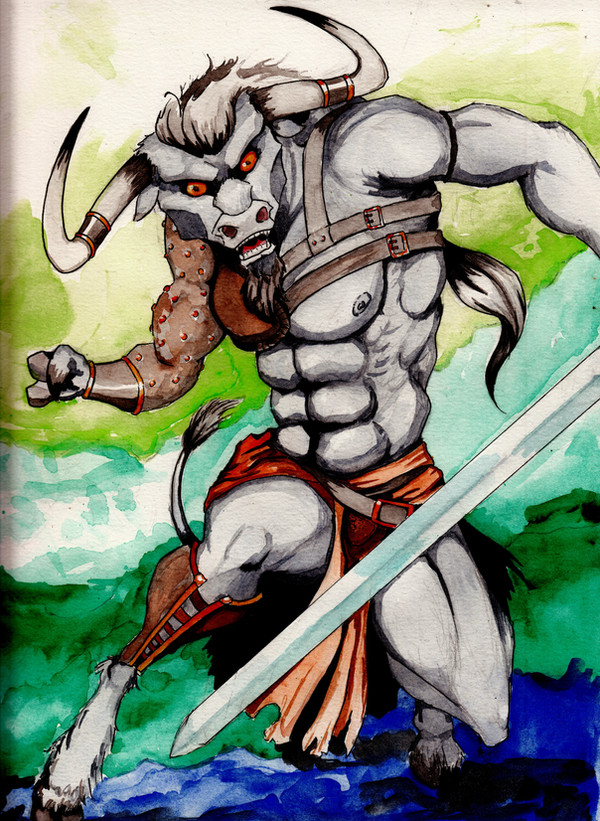
 CMBaggs — Minotaur
Published: 2013-12-20 05:31:03 +0000 UTC; Views: 1272; Favourites: 23; Downloads: 0
Redirect to original
Description
Rawr! Beefy watercolour!
Made for the contest being held by Forgotten-Realms-FC; fav.me/d6sml71.
This, in my opinion, could not be considered classically beautiful, and yet I had SO much fun with him! I choose the Minotaur because they're what springs to my mind when I think of a classic dungeon. I've never drawn one before and now can't figure why I've never tried before.
Anyways, hope you all enjoy!
Related content


Comments: 44

Overall
Vision
Originality
Technique
Impact
First of all I'd like to congratulate you with this picture, as it incorporates several things I know not everyone is aware of, but which you seem to have handled quite nicely:
Firstly, your solid character silhouette - at a glance, everyone can tell that this is a tensed-up, brutish minotaur ready to pounce. I see this enforced by the warm browns that complement nicely with the green tones of the background, making him stand out even more. His tiny hand (slightly smaller arm than the other one, too) is a bit of a surprise though; not something I'd expect from such a powerful creature, and the blue colour of the background's bottom right is a bit too saturated for its own good as well (a more modest tone there would push it back more, and prevent it from jumping at you like that).
That said, I like the shapes that enrich this silhouette: the grotesque horns (even though one of them seems to turn backwards instead of forward, the longer you look at it), his ponytail, the flaring loincloth. I also see that you control your watercolours very well, and you made sure to leave the highlights white / papercolour. Well done!
However, I regret that the hand holding the sword is missing, seemingly by accident - looks like you ran out of paper there. It's a real shame, more so because it'd have been a chance for a nice design for the sword, which is now reduced to a simple, straight slab of steel. I'll have to tell you though that the blade in itself isn't bothering me - even though the bull is white/grey (a colour I think is original and becoming), the sword still stands out well enough without drawing too much attention to itself at the cost of the main figure.
I have some minor doubts about the anatomy - the balloon-abs, the extremely sharp kneecap... The serrated muscles covering his ribs look somewhat hurriedly and haphazzardly placed, to my eyes. And while I have no reason to say his face doesn't get the message home (I love his glare, and his goatee too btw), I can't help but notice that it's made up of mere 'shapes', rather than of 'volumes', like I see in the body. Even though it's seen straight-on, its structure seems missing, making him look two-dimensional. His extremely sharply angled cheeks and jaws add to the impression I have that you started out with another style in mind - more stylised and cartoon-like, and turned to realism along the way. With the same expression, I wonder how good his face 'd been had you tackled it with the same convincingly three-dimensional and realistic style as the body.
Lastly I agree with what one of my predecessors has said about the armour being too form-fitting in places. Especially the studded leather sleeve looks like it could only be worn like that if it were made of spandex. I like the idea of studs there, but it doesn't look like armour: more like, indeed, an afterthought.
Overall though, I think the Honourable Mention was well-earned, especially talking about impact and skill; if I recall correctly, it only narrowly missed Third Place. I also find it laudable that you took the time to find references first instead of jumping in the deep end - an inspiration to us all! We all hope to see you around long and often over at Forgotten-Realms-FC , sunny personality & all.
👍: 0 ⏩: 1

Thank you for taking the time to write this in depth critique. And sorry it's taken me so long to properly say so.
It's rare that I don't use references for stuff like this. In this case it was men in action and real bulls. I never reference from anything other than actual photographs. There's no point in referencing something that's already been rendered by another artist.
You've made some very good points for me to consider for future pieces, so thank you. And yes, I totally ran out of page space. After your point about the hilt details I realize now that I should have given more effort to rearrange the composition.
👍: 0 ⏩: 1
Hello and yay! A reply! Don't sweat it, haha.
The early stages are the most fun (at least, to me), so I, too, tend to miss stuff like composition issues and then end up abandoning the thing or having to start from scratch later.
Good to hear you got something out of my blabbing there. Cheers!
👍: 0 ⏩: 0

Overall
Vision
Originality
Technique
Impact
As I said in my previous Critique (you can see on my profile) I feel that my lack of artistic ability should preclude me from writing about piece when i can not do one myself.
On the rating system I tried to be what as honest as I could be about this. I appreciate you command of anatomy, but the thing is that you exaggerate pieces of the body you want to draw attention to. This distracts from the rest of the figure which, given the desperate amount of detail between it and your background, was clearly meant to be the center piece.
Then there is the Armor and other pieces you have this "Minotaur" wearing, it comes across as far to form fitting. It seems that the piece was planed with the loincloth and then the later pieces of redundant armor were added slapdash. I do like the leather arm and the effect that it evokes but since the lower leg is obscured by his movements it is hard to see if he is even wearing another bracer on the leg to help balance the piece.
I would also like to comment on the head at length but since this is a fantasy piece you have leeway on how you would interpret what the head of a "Minotaur" would look like.
In the end I am not seeing anything new here though I am blown away by the amount of detail you are able to put into your watercolors your subject seems generic and has little individual personality. He seems to exist for this picture alone and I do not see anything that he is more then a Random Encounter used to temporarily inconvenience the party. And as a minor scruple on my part if a Minotaur invokes a dungeon for you why is he placed in a forest setting?
Thank you again for sharing the piece with the DA community it showcases your artistic skills and abilities quite well.
👍: 0 ⏩: 1
Thanks for taking the time to write this.
👍: 0 ⏩: 0


Vision
Originality

I'm not good with stars either so please ignore them! Darn stars making everything so difficult.
Anywho, this is really amazing, girl! The colors are so vibrant and bright; they contrast so well with one another in terms of the background against his body; very nice work! And I'm not sure what it is, but it seems that your shading has gotten much more detailed in depth and color variety; I'm really digging it e.deviantart.net/emoticons/w/w… " width="15" height="15" alt="
 (Wink)")
My only critique is a few little anatomy things here and there. Like a few others have said, I think the hands should be enlarged just a bit to even up his heavy body weight. The muscles are just fabulous all around; very realistic. I think his ankles should be a bit larger too though, maybe his feet too. Just because I feel like they should be large to hold up his massive body size. Other than those little factors though everything is really amazing! You never cease to amaze me, dear e.deviantart.net/emoticons/w/w… " width="15" height="15" alt="
e.deviantart.net/emoticons/h/h… " width="15" height="13" alt="

👍: 0 ⏩: 1
Thanks so much for taking the time to comment on this. It's nice to hear what is done well as much as what wasn't sometimes. Watercolour can be so tough to control, so it's nice to know that the shading is well received.
As to the anatomy, my only defense is that I referenced real bulls for this, and, well... their feet and ankles really aren't all that big in relation to their body mass. I think people expected a more WoW look, and so I'm getting a ton of flack over the feet and ankles, but given my references I feel I did as best as I could.
👍: 0 ⏩: 1
Oh I'm sure watercolour is super difficult! I respect you a lot for using it; I know mine would probably look like a huge blob if I tried to use it lol XD Your coloring and shading is always amazing  (Smile)")
You do bring up a good point that I didn't think about before. Using a real bull as a reference I do see now why the ankles/feet are smaller; I just looked up some pictures of bulls and you're right; their ankles are pretty small compared to their body. So on that note, I think you did a fantastic job. I think it's like you mentioned; since it's more fantasy orientated I suppose the viewers just expect a more 'unrealistic' feel. But since you were going off the real animal I feel you made the best choices in anatomy
👍: 0 ⏩: 0

Overall
Vision
Originality
Technique
Impact
Again, please don't pay attention to the stars rating, i don't know what does it means with "vision" or "impact".
The colors are so vibrant O _O , it looks great!
I like the dynamic pose like he is ready for the battle. the muscles are very well rendered but i would agree with the person below, who said that maybe his hands are a bit small for his huge body, and i think that his ankles look kinda of fragile. Think about how much this beast weights, he needs pretty strong legs to move around. But in this case the problem it's located in the ankles, the rest of the legs are fine, as i said before the anatomy its really well done.
This has nothing to do with the critique, but i don't know why people think that traditional art it's easier than digital, i was talking about this with someone else, there is no "undo" button in real life!
👍: 0 ⏩: 1
Thank you so much for the in depth critique!
I guess I could have made the ankles thicker given that he's a bipedal creature. I referenced real bulls for this piece and I found that their feet and ankles aren't all that big compared to the great mass of their bodies and I tried to stay true to that rather than the cartoonish over the top hoof sizes that you see in things like World of Warcraft.
I have no idea why anyone would think that digital is harder than traditional art. I have not had the honour of meeting someone who thought so, but I am certain they're out there! Out of curiosity, what was their argument? How did they figure it traditional was easier?
👍: 0 ⏩: 1
It was a discussion in a Journal of some guy ranting because he was offering very cheap digital comissions but noone requested him anything, (he wasn't offering anything special, really), and then he started bashing traditional artist just because one of his watchers was open to comissions too at that moment and was receiving more feedback even though his prices were a bit higher.
He went like: " oh come on guys, you prefer to pay more for shitty traditional art rather than comissionig me for almost half the price for a digital piece!, traditional art it's not that impressive" etcetcetc.
After receiving a lot of love he deleted that journal entry.
👍: 0 ⏩: 1
LOL... after receiving a lot of love... I could hear the sarcasm around "love" there.
Hmmm, the grass is always greener on the other side of the fence. I assumed that digital was a breeze until I actually tried it. Then I was like... omg... what does all these tools and buttons do!! And I have no one to teach me but myself (and tutorials). Just holding the tablet feels odd to me. So both have their own challenges and I am in awe of anyone who can do either well.
👍: 0 ⏩: 0

As a kid I was taught a lot about Greek Mythology in school, particularly during my early school years. The Minotaur and Medusa were mostly what I learned about and I think it's fair to say that lead to my life long interest in the old myths.
I do love how you've coloured and detailed this piece. It's especially prominent on his skin and around the shading to define the shape of the muscles; it's made to look so simple but adds so much. I also love the way you coloured the sword, giving it a metallic look and the background is stunning.
Beautiful work as always
👍: 0 ⏩: 1
The old myths are great, aren't they? I love how D&D gives a nod to the old stories that created these beasts.
And thank you, as always, for your thoughtful comments. I felt a little unsure about the background, but I'm thrilled that the colours harmonized well.
👍: 0 ⏩: 1
I've yet to play D&D or any similar table top RPG so I can't comment but I do like it in general when mythology is combined.
And no problem
👍: 0 ⏩: 1
I love it, especially when I get a DM who's more focused on story and character development/interaction than straight up combat. It offers so much more freedom and realism (in the hand's of a skilled DM) than any other platform out there.
👍: 0 ⏩: 1
Speaking more from a video gaming point of view, as much as I love a game's mechanics, battle system etc., I do agree and find it's the plot that draws me in the most. Bioshock Infinite is a brilliant example of this as while some people have said the gameplay was a bit meh compared to similar games, MANY have praised it's plot and I whole heartily agree. A good story just hooks me, drags me in and won't let go.
👍: 0 ⏩: 1
Yeah... and the look. I've always been a very visual creature. If I don't like the look of something (like my avatar) for example, then I can easily lose interest.
I'm so vain.
👍: 0 ⏩: 1
Honestly I've rarely been put off by visuals. I think I've only ever read one comic where the art was off putting but I was able to soldier through it for the plot line (fortunately the artist was only there for two issues).
👍: 0 ⏩: 1
I'm picky.
Take American comic book art. I, as a general rule, loathe it. Or at least the early stuff.
All the heroes and villains have the same cookie cutter over the top hour glass bulging physiques with 0 trace of fat or reality. Even characters that are supposed to be "clever" have this same affliction. I just hate it. And the lines! They're so... HARSH. The emotion is all conveyed through thought bubbles and horrible exposition rather than through the art. SHOW! Don't TELL!!!!!!
And don't even get me started on the horror show that is the fashion. What self respected man runs around in tights with his gitch over top? Come on!!!!!!!
End rant.
👍: 0 ⏩: 1
I agree they do need more variety in the shapes and physiques of some of the characters with some of the more big name stuff. Some of the more obscure characters/teams/books are better balanced in terms of physique and even design (a very good example was the previous volume of X-Factor; the main character wore a t-shirt with his emblem on it, jeans and a trench coat and had an average build).
I am trying to move away from the superhero books into the more indie/obscure series. Usagi Yojimbo, which is EASILY my favourite comic for the last ten years is a great example of a book with better fashion, expressions and art in general. You can even see the work of the artist evolve over the 30 or so years it's been run.
👍: 0 ⏩: 1
Well, it's great to see them diversifying, but I can't help to feel like Marvel is trying to pander to what they *think* people want, rather than creating characters with integrity. Characters that are realistic. They struck gold with one villain, but now I fear they'll ruin it by exhausting the character's popularity, and that they'll take him too far away from what makes him what he is.
I have not heard of these titles, but for the sake of argument and study, I may peruse the graphic novel section of my local bookstores soon...
👍: 0 ⏩: 1
I think your right to a degree. In many ways they've managed to "catch lightning twice" with some of their lesser known characters like Iron Man and Thor, and later this year we'll be seeing a Guardians of the Galaxy film. Now the 2008 - 2010 GotG comic was one of my all time favourite series and one I would highly recommend to people who like zany space opera style stories. Part of me is looking forward to seeing this team get some spotlight but at the same time I think they may find a film based on a C-List comic may not work as well as the B-List ones.
And I agree with you about how they've treated Loki. They're about to start a run on the character where he's bisexual, something he's never been before (to the best of my recollection anyway). Now I have nothing against them making GLBT characters or anything like that but I can't help but feel they're purely making him bi purely so the Loki fangirls can squeal over panels depicting him with other male characters as opposed to being an actual direction for him. I dunno, maybe I am wrong but I can't help but feel it's a cash in/change to match the movies, much like how they changed the core Avenger roster to match the film. While the Hulk WAS a part of the lineup in the first issue, he left after and always stayed clear of the team. Heck, they even made villain-turn-hero Red Hulk into a member - I direction I liked - but now he's been taken out in favour of his green counterpart.
I'd strongly reccomend it. I have the core twenty-seven books, plus two side-story/spin off graphic novels on display in my main bookshelf. Ten years ago I managed to trade down the first seven books, which were published by a company called Fantagraphics Books and no longer in print, only to then see they were re-printed a few years later
👍: 0 ⏩: 1
A list, B list, C list... I assume you mean that the Avengers were the B listers, after the X Men and Spider Man?
I'm probably alone in this assessment. But Spiderman and the X Men left me wanting. Except for Magneto. He rocked.
And I also don't think that Marvel/Disney has access to the above mentioned characters anymore. So they had to switch things up. And I don't think it was a bad move to bring newer comics back in line with the movie verse for that reason. I think Marvel is going to do well under Disney. I look at the casts they've assembled, and I can't help but think that they're doing the right moves (for the most part). They're picking good actors, and they're picking people who LOVE their roles and it shows through in their performances and in their appearances. And these people are so very good to their fans. And they're hiring writers and directors. They aren't just going after Baos... with explosions within explosions and giant robots and CGI dominating the humanity of the films. They're turning the characters into humans. Turning Loki into a goffick bi-curious hipster (who probably shops at Hot Topic) for the sake of their Agent of Asgard comic aside... that's an example of being COUNTER to the films, in my opinion.
So I'm excited for GotG. Very excited.
Look at us, geeking out. Good times, my friend. Good times.
👍: 0 ⏩: 1
Pretty much. I considered anyone who people hadn't really heard of due to a lack of cartoon or film as B-Listers and anything more obscure than that a C-Lister. As for Spider-Man and X-Men, I loved the first two Sam Rami Spider-Man films, felt the third was disappointing and have yet to see the reboot. I agree Magneto was a great character in the X-Men films. I've never been AS big an X-Men fan as I was Spider-Man but I was happy with the actor choices and portrayals they did for my two favourites, Beast and Nightcrawler. It's a shame the films were more "Wolverine and friends" as I'm not AS big of a Wolverine fan.
And no, the licence for Spider-Man belongs to Sony and the Fantastic Four and X-Men to Fox. Part of the reason we got the 2012 Spidey reboot was so Sony could keep the license, which is annoying . And you're probably right about Marvel trying to bring the comics more in line with what the movies are doing, as it does make the transgression from one to the other more seamless. In many ways I welcome change and shake up, which is why it annoys me when Marvel keep putting Spider-Man back to square one (i.e. post-One More Day and where Superior is likely to leave him when it's done). And I agree with you about their choices for actors. I was a little annoyed when Eric Norton was replaced as Bruce Banner as I really liked him in The Incredible Hulk but Mark Ruffalo did such a great job I don't mind as much. With rumours that characters like Iron Fist and Dr Strange are getting considered, I do look forward to seeing who they cast (is it too much to ask Ray Park as Iron Fist ")
And yeah, hopefully GotG will be good. I'll admit I'm not sure how I feel about the re-design Drax got but I'm hoping they'll bring him more in line with his comic book counterpart soon. I am a little disappointed some of the more obscure cosmic characters like Adam Warlock and Captain Mar-vell (who inspired the gold bands Silrun wears) aren't in the lineup but maybe that will get rectified in a sequel.
And I could go one for DAYS about any geeky media I hold close to my heart
👍: 0 ⏩: 1
I thought that Tobey Maguire did a good job as Peter Parker, in the first two films anyway. I too, was not a fan of Spiderman 3. It felt like there was too much going on, what with the villains and his own struggle with that stupid symbiot. And Wolverine has always been the fan fav. Not my favorite, not by a long shot. But when I was growing up and my brother and I and all our friends would sit around drawing Marvel characters, they were always all over Wolverine, whereas I was more interested in Deadpool, Nightcrawler and Psylock, lol.
There has to be a reason why they didn't get Edward Norton. The guy is a fabulous actor. Maybe he didn't want to commit to several films spanning several years? Frankly, I think an actor would need to be crazy to turn something like that down. Getting to become THE face of a super hero?? That doesn't come along everyday. RDJ is now THE Tony Stark, for example. There is no way around it. They have become one.
Heh, I dig the redesigns. I never was a fan of the campy costumes they all had. Making it look like actual clothes and functional armour is the way to go. It looks more... real? Like it comes from a culture all it's own? Whatever, I know what I'm saying. I just suck at saying it. And who knows? They have like, 7 movies planned. Who knows where the writing will take them.
👍: 0 ⏩: 1
Apparently Sam Rami isn't a big fan of the symbiotes and was forced to use Venom. I do wish they had Venom's story end when the symbiote bonded with Eddie and have him torture Peter from the shadows during the fourth film, similar to how he did in the comics. I know this may seem like milking the franchise but I don't mind when a story spans multiple films - so long as it's done well (I'm looking at you PotC3).
I've tried getting into Wolverine a few times, but I find the "gruff, brooding, badass" character type un-interesting although admittedly Wolverine is one of the better, less bitter ones I can think of. Personally I just prefer optimistic, upbeat characters like Nightcrawler.
I remember hearing it was because he was difficult to work with but I can't say for certain if that's the real reason. Like you said, having an opportunity to play a superhero and having people think of your face when they think of them (i.e. RDJ is now Tony Stark) is awesome. As a kid I'd have loved to play Peter Parker or Kyle Rayner.
I guess I'm a bit too much of a comic book purist for my own good
👍: 0 ⏩: 1
LOL... then I will be the first to admit that I am in over my head. If this came down to an out and out debate on the merits of this character or another based on referencing the actual comic material I'd be toast. I really haven't kept up on it... having written them off years ago in favor of "high fiction" and art that I find more visually appealing. As I said earlier, the aesthetic choices of the costumes and the ridiculous anatomy always used to leave something to be desired for me. So when I discovered manga, with it's more graceful choices I ran and never looked back. Even now, I get excited about rendering the movie verse aesthetics into art over the actual comics. I'm just not impressed by over the top muscle and painted on spandex. Never have been. Never will be.
👍: 0 ⏩: 1
I will admit that is one of my biggest pet peeves is people basing an opinion with half the facts, a poor portrayal or just generally not reading the comics. A VERY good example is Aquaman, a character who has a lot more going for him and interesting uses of his powers than people give him credit for, especially in the hands of a good writer. However at the end of the day I try not to let it bother me as in the end it's not really getting all worked up over. I do agree a lot of the character designs are just too over the top but I do feel they've at least started to tone it down in more recent years.
I used to be a HUGE manga nut. I still read and love One Piece (my collection of the translated volumes is in my main bookshelf along side Usagi Yojimbo) and I have toyed with getting back into it. I stopped reading around 08 (bar One Piece) as no one I knew back then were fans and started to sell my collection. However in the years that followed I met and socialised with more and more anime and manga fans, leading me to regret selling everything (especially as some of the volumes of one series I really liked are now rare and expensive) and continued to follow other series like Fairy Tail.
👍: 0 ⏩: 1
To each their own? What more can I say? I'm shallow. Why would I bother to read a comic if I care not for the visuals? There are too many awesome stories out there where I don't have to suffer through what I don't like to look at?
It's funny, because I find that the American comics are better written than manga (manga seems to suffer from more clichés and mary sue's than American comics), but I prefer the LOOK of manga... gah. Why can's someone create one that has BOTH?
👍: 0 ⏩: 1
I'm capable of turning off the parts of my brain that may lead to me disliking something and enjoy it as a whole even if the writing or art is bad (to a degree of course). And I think you may find the indi side of American comics may cover what you're after; for example I feel Usagi Yojimbo is a good blend of American comics and manga (but I may be bias as I do consider it my favourite comic series of all time).
👍: 0 ⏩: 1
See, that's just a foreign concept to me. I read because I love the story. And I look at art because I like what I see. If a comic/graphic novel/manga can't deliver on both, then what's the point? But then again, I treat my reading/art like a I do food and wine. I enjoy the fine stuff. And when it comes to my tastes, I can be a bit of snob.
Hmmm, thanks for the tip. I now have one more thing to check out. ")
👍: 0 ⏩: 1
See I can pretty much enjoy most things. If it's good it will captivate me where as if it's bad I can just laugh at and make fun of the poor quality (much like Mystery Science Theater 3000), but I do have some degree of limits. However at the same time (particularly in comics) I don't always know when to quit and will continue to follow a character I like during a bad run in the hopes that the next story arc or writer takes him/her down a better path.
And not a problem
👍: 0 ⏩: 1
LOL... don't know when to quit. That's cute.
👍: 0 ⏩: 1
Quitting in general is not something I agree with. I have a habit of trying to push myself too far and get frustrated if I can't go that extra mile on my run or higher on a climb (especially if it's something I've done before).
👍: 0 ⏩: 1
Well, that's a good quality to have, but I don't consider throwing a comic book down in disgust because they've messed up your favorite character as the same scale of quitting as the examples that you've listed above.
👍: 0 ⏩: 1
Ha ha, fair point. I will admit I do dislike "character derailment" in writing but that's a bit of a tangent.
It has it's pros and cons. It does give me the drive to push myself harder but like I said, I tend to mentally beat myself up if I "failed". The fact I took time off gym and climbing to get through a busy period means I have an uphill struggle to regain the fitness and capabilities I had before but I just see it as a challenge and motivation
👍: 0 ⏩: 0
Um, yes? I did ask for one.
I know... it's hard to tell sometimes. Some can be very sensitive. I can't promise that I'll like what you have to say, but I do promise to appreciate the time that you take and I will try to consider what you say and use it for my development as an artist.
👍: 0 ⏩: 0

Wow wow this is so brilliant! The pose is so full of action and coiled motion, and your shading of his muscles is also very dramatic, i think the details in his armour are great and the sword is beautifully painted, in fact the whole thing is, and the stark contrast of the vibrant background I think adds just so much more motion, it brings this to life
👍: 0 ⏩: 1
Wow! Thanks for that thoughtful praise, Sleyf! It's so helpful to know what you feel worked well in this... especially coming from you. I admire your style so very much.
👍: 0 ⏩: 1
You're welcome of course! This is brilliant!
👍: 0 ⏩: 0

wow, this is really cool, CM!
I have never see such a creature like this from you... and honestly until now I cannot draw something so mighty/ muscular/ vicious like this. so congratulation for successfully drawing this
anatomically I can't comment much because I have never see Minotaur in real life, LOL.
but in my opinion you draw his muscle and six pack perfectly, I always amazed by your knowledge and ability about male anatomy and muscle. I think his fist is a little bit too small (considering his body proportion, which is SO huge) but -again- I never met something like this in real life so I am not really sure
and I believe you use watercolour for coloring this particular picture, right? the result is so beautiful (the watercolour, not the Minotaur! Minotaur CANNOT be beautiful even though he wear lipstick
👍: 0 ⏩: 1
Yeah, I was referencing real bulls when drawing this, and I noticed that their feet were pretty small compared to their upper mass. I will keep your comments in mind if I ever draw more minotaurs in the future.
Thank you so much for your thoughtful comment. I've been trying to be more mindful of muscle symmetry and lighting, so I am pleased that it came off well.
👍: 0 ⏩: 0