HOME | DD
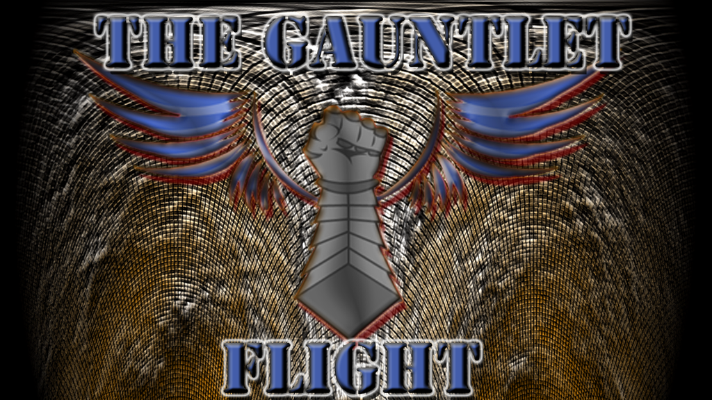
 Coasterfreak — CCC Showcase - The Gauntlet Flight v.2 (Logo)

#3d #coaster #coasters #cs2 #dutchman #flight #flying #gauntlet #gauntlets #photoshop #planes #vekoma #war #wing #coasterfreak #art
Published: 2015-12-03 04:21:39 +0000 UTC; Views: 596; Favourites: 6; Downloads: 0
Redirect to original
Description
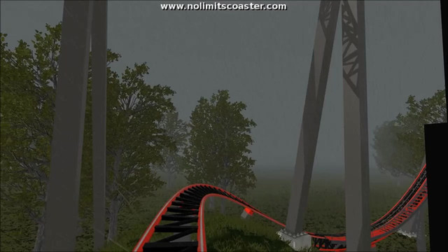
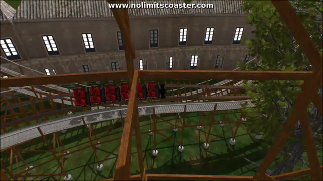
Welcome back to the Coasterfreak's Custom Coasters Showcase. Today we are heading back into the past once again with a new revisit/remake of an older coaster. The Gauntlet Flight was a Vekoma Flying Dutchman Coaster. We may stay with the original coaster type that is with the original ride, but we are also in the process to try out new coaster types to fit better with the theme of the ride. Please stay tuned for updates for the ongoing project of this original coaster design.Related content
Comments: 22


I think the idea itself is nice and has potential but there are a few things which are causing this design to not pop as well as it could.
The logo itself has appeal and it's a neat idea of a flying gauntlet to relate to a roller coaster. I like that a lot but what is hindering it is the red glow that's acting as a drop shadow. That combined with the lighting of the mesh-like background are causing the gauntlet design to be lost to the viewer's eyes. It's hard to look at the design itself with the blurry red outline because it causes it to lose clarity. On top of it being over this mesh background it overloads the eye with too much visual information that the elements of the picture get lost. In short it causes the eyes to not properly be bale to focus on specific areas and instead it gives an almost uncomfortable feel. Other than that I think the choice of text is fine but the fidelity of it may have been compromised at some point. What I mean by that is the text seems to be slightly blurry as if it was created and then scaled up while in photoshop or whichever program you may have used. Scaling up like that can cause the graphic to lose definition and become not so crisp and clear which it looks like happened here. It is also evident in the white glow around the text in some areas appears to be broken up. Also keep in mind it's possible that this was due to deviantarts decompression. When uploading images here to deviantart they tend to lose a tiny bit of their quality due to the way they're uploaded.
👍: 0 ⏩: 0

I like the idea you have here, but unfortunately the impact isn't as strong as it could be, I feel the background is slightly jarring to the eye
👍: 0 ⏩: 1

I'll keep that in mind on the next one
thanks for stopping by.
👍: 0 ⏩: 0

Thank you very much
👍: 0 ⏩: 1

Thank you for the comment
👍: 0 ⏩: 1

Thank you for the comment.
👍: 0 ⏩: 0

thanks for the comment.
👍: 0 ⏩: 0

Very nice, a simple but very effective and appropriate logo. I especially like the effects you have applied to the background. Great job!
👍: 0 ⏩: 1

Thank you for the comment.
Most of my backgrounds usually consist of just a few filters in PS CS2.
I do like how it did came out though, looks like metal plates.
👍: 0 ⏩: 0

this looks pretty good and well designed, you did a nice job
👍: 0 ⏩: 1


