HOME | DD
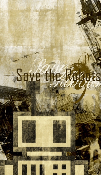
 cogwurx — Save the Robots
Published: 2004-03-09 03:40:17 +0000 UTC; Views: 1351; Favourites: 26; Downloads: 94
Redirect to original
Description
Not sure where I was going with this, but this is where I ended up.Anyway, I wanted to use my avatar in more of my work so I think this may be the first of many using him. Not sure yet.
Related content


Comments: 63


")


Nice work. Is it Notre Dame in the background
What would we be if there wasnt robots. The ones we made images of our selves...
👍: 0 ⏩: 1

Thanks!
Not sure what is in the background any more :-]
👍: 0 ⏩: 0

 (Smile)")


Thanks! Glad you like it.
Thank you for the +fav!
👍: 0 ⏩: 1

Very cool man, I lovin all those textures and that gritty urban feel! Kinda like a modern day recruitment poster! Very impressive!
👍: 0 ⏩: 1
Thanks man! I was going for that feel. And thanks for the +fav!
👍: 0 ⏩: 1
Your welcome dude, I'm in to those type of posters you did a real good job replicating that feel!
👍: 0 ⏩: 0

Thanks!
I've thought of that...need to tweek it a bit.
👍: 0 ⏩: 0


i like the grungy look of this, and i LOVE your avatar! that robot is awesome! anyway, one little suggestion: i think the purple stands out a bit too much. maybe decrease the saturation and add a little bit of yellow in colour balance to have it fit in with the faded look of the rest of the piece? just an idea. but great work!
👍: 0 ⏩: 1
Thanks. I've been meaning to get that fixed :-]
Just haven't had time and I keep forgeting :-]
Thanks again for the comment!
👍: 0 ⏩: 0

I like the atmosphere of the picture very much. It lets me romanticise machines as well as being critical to them. I love your avatar. It's simple and charming. Have a nice week.
Ps: The fonts are perfect.
👍: 0 ⏩: 1
Thanks. Glad you like my avatar. :-]
👍: 0 ⏩: 0

This is rockin. Reminds me of the 1940's recruitment posters.
Not that I was alive back then but I've seen pictures.
👍: 0 ⏩: 1
Thanks...it was kinda the tone I was going for. I really dig those type of posters.
👍: 0 ⏩: 0


good stuff, nicely weighted and mild colouring, but I'm not sure if the maroon works with it. I can't decide if it pulls to much focus on itself vs. your robot avatar... It's definitely a focal point to say the least
👍: 0 ⏩: 1
Thanks.
The maroon bugs me too. I'm thinking more of a deep red would have been better or maybe just black.
👍: 0 ⏩: 0

the thing is... i think the form of robot is kinda contrastin to the rest of the pic...
👍: 0 ⏩: 0
dun get angry with this comment plz..
👍: 0 ⏩: 1
interesting...
no worries...I ain't mad at you. I appreciate your constructive criticism.

👍: 0 ⏩: 1
👍: 0 ⏩: 0


| Next =>