HOME | DD
 collaps09 — neuropunks

Published: 2006-03-26 22:18:23 +0000 UTC; Views: 3885; Favourites: 49; Downloads: 240
Redirect to original
Description
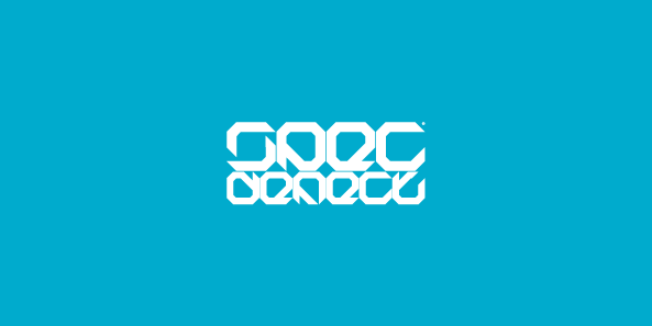
Logo for drumandbass crew NEUROPUNKSRelated content
Comments: 16

hi!collaps, are you ok? you have good graphical jobs, can you give me this font? it`s yours? greatings of buenos aires _
nacoiis7
👍: 0 ⏩: 0

looks cool. I can tell it's for a d&b band. but I have to agree. It spells NUEKOPUNKS. And in dutch 'neuk' mean 'fuck'. I am not kidding
👍: 0 ⏩: 1

haha. thx :]
Its now bit redesigned. but still R can look like K
heh ;]
👍: 0 ⏩: 0

nice work man. ur own type face or existing font??
👍: 0 ⏩: 1

the letter "R" in "Neuro" is really problematic... Good logotype tough...
👍: 0 ⏩: 0

looks nice , but i also think the first time u look at it u read neuko, sometimes u have to make a compromise between design and useability
👍: 0 ⏩: 0

I love it, but it is a little hard to read. I agree with cberry.
👍: 0 ⏩: 0

Aaaaaa tam pierdolicie wszyscy ja i tak jestem najlepszy
👍: 0 ⏩: 0

extremely hard to read I would have never known what is was.
👍: 0 ⏩: 1

Hard to read? where are you from? Japan?
👍: 0 ⏩: 1

Yes hard to read. If you step back from it and really look I get N E U K O, P U N K (it's a stretch) S (totally a backward z). On top of that it doesn't say punk at all look at drive-thru record, rushmore records, fueled by ramen, victory records, or any number of punk labels and the bands they have signed don't have a look anything like that. If anything that looks more like a hard core, metal, or tech group. I can see you're not one to take a critic well so let me finish by staying this is only my opinion but I think others would agree.
👍: 0 ⏩: 0


