HOME | DD
 computerologist — raindrops and waterspots
Published: 2003-03-31 13:06:45 +0000 UTC; Views: 1951; Favourites: 26; Downloads: 241
Redirect to original
Description
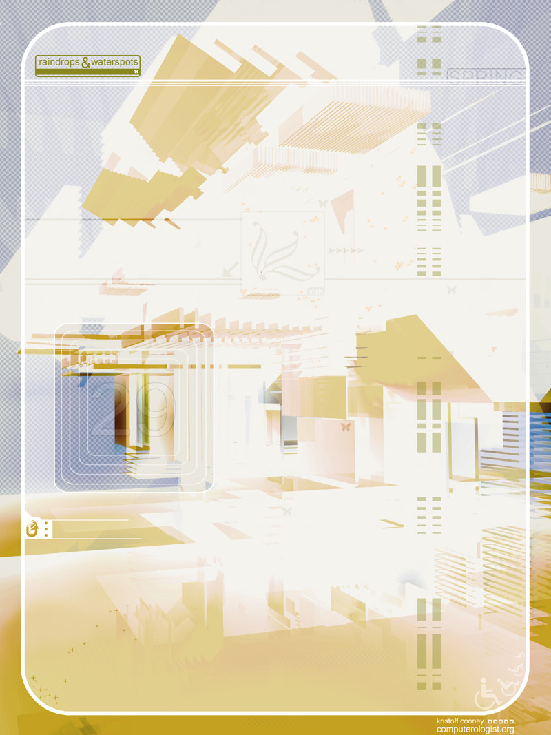
thought i would do something light and fun for the new spring edition which was released today. keeping things simple and clean and colourful for spring.if you haven't gone to check out the spring edition please do so...there is some really fabulous work there some really great people. and a lot of springtime fresh [link]
thank you as always for taking a look
Related content


Comments: 82

Raindrops keep falling on my head... but that doesn't mean me eyes will soon be turning red... na na na nanana na na naaaa na na na na na naaaa na na na na na...
Whoops -- too much listening to the oldies station (I swear -- the dial is stuck on that radio. I have to listen to it).
Great spring techy work. It really does produce a spring-like quality to it with those colors.
Sweet.
👍: 0 ⏩: 0

breathtaking as always - i love the way the blues cool down the yellows in this piece and make it look so fresh. you're work always makes me happy - as corney as that sounds its true - something very pure and honest about it.
👍: 0 ⏩: 0

I like it!!
Very fresh and "springlike"!!
It's clean and the colors look good!!Great effects too!!
Great Job!!!
👍: 0 ⏩: 0

Very very nice... I dig the colors and translucent effect Keep up the good work!
👍: 0 ⏩: 0

What else to say, but it's great? You're always just so good with your style and I love it. Great job.
👍: 0 ⏩: 0

~very good m8!
I love the colors and... and... hum.. everything!
as always, a fav!
👍: 0 ⏩: 0

very springlike colors indeed - and I think to see a new style, but I might be wrong
👍: 0 ⏩: 0

Very nice spring-ish design! Interesting colors but they don't look as bad I expected them to be
👍: 0 ⏩: 0

could have been a little more clear and straightforward, to me it seems a little confusing. great colors though.
👍: 0 ⏩: 0

Stunningly sweet as usual Been long time since your last submission, glad to see something of you again
👍: 0 ⏩: 0

Mmm, does feel very light and springy, especially the area in the middle, it's perfect to run around in!
PS
👍: 0 ⏩: 0


very nice 2d work olo.... glad to see you submitting art again
👍: 0 ⏩: 0
bloodpixel [2003-03-31 15:49:31 +0000 UTC]
really nice vectors...and colors....and everything
great perspective view too
👍: 0 ⏩: 0

kristoff,
it is truly a magnificent to spring....
the depth, soft tones and the butterflys..... i love it .....
layer upon layer spring unfolds before us, much to our joy!
.....i am
...
👍: 0 ⏩: 0

your 2d is just so fucking cool. Its always different and has a new idea to it. Its something that most artists dont understand -- but its always so...original (tho it seems kinda stupid saying that about simple lines and such) Very cool work
👍: 0 ⏩: 0

oh wait...photo involved..hmm not it's not..
reflection on the "floor"...hmm...no this isn't a floor, so no reflection...
!
abstract to a new level ! keep the lab open and keep that awesome path !
👍: 0 ⏩: 0


so wonderfully dimensional! One of those pieces that you could star at for hours and not get tired.
👍: 0 ⏩: 0


Nice edgy halftone feel to this - colour scheme's reminiscent of when you leave a bit of paper in the sunlight too long And yes... the rest of the stuff over at AngelWorld is similarly impressive ... probably the best edition yet.
👍: 0 ⏩: 0

love the colors, love the idea, love the typo, love the 3d, love the whole dang piece!
👍: 0 ⏩: 0

very nice job olo! i like the warm feeling it creates!
the 2d is at a top level as always!
👍: 0 ⏩: 0


what can I say? You are master! I really enjoy the way how you combine the colors and 2Ds onto the background...it's just...breathtaking! I feel the motion inside!
👍: 0 ⏩: 0

awesome style and concept, it's done very extreamly well. I love the soft tones and the 2D-ness.
👍: 0 ⏩: 0

Beautiful. I love the sporadic bits of dark red and green.
👍: 0 ⏩: 0

very nice and clean, as usual
you always manage to make the colors that i dont like look good
👍: 0 ⏩: 0
<= Prev |