HOME | DD
 continentaldrift — surface tutorial - part 01

Published: 2005-01-15 11:31:37 +0000 UTC; Views: 7528; Favourites: 60; Downloads: 997
Redirect to original
Description
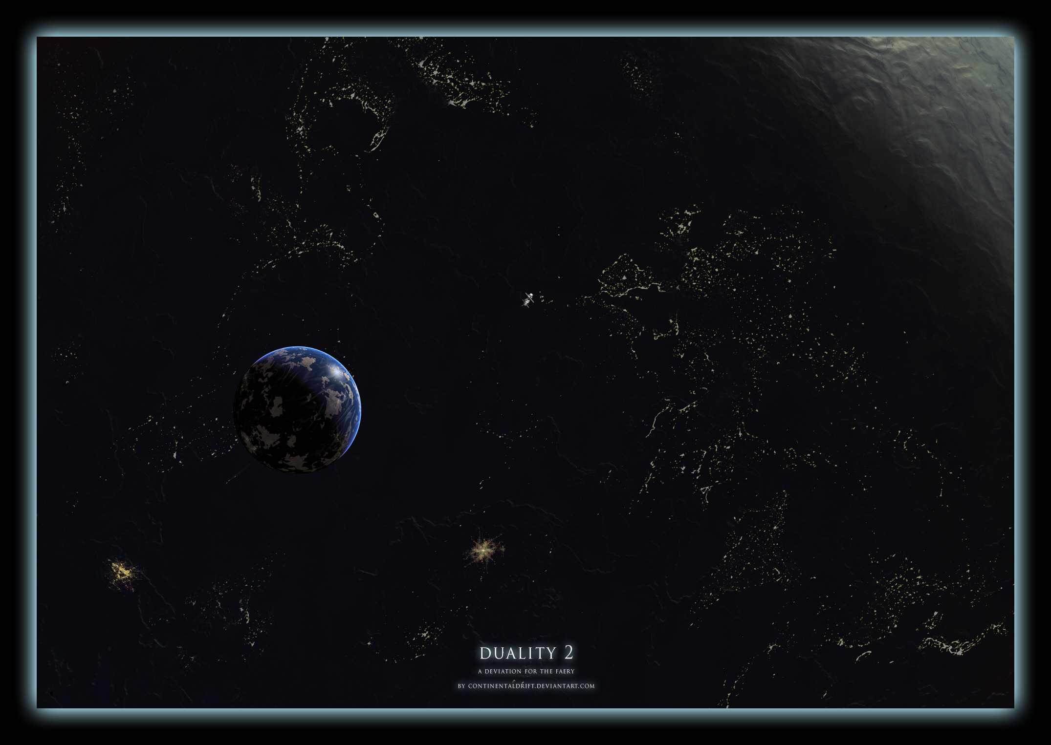
this is a tutorial - one possible way - on creating aearthlike texture painting for your digital-space-art.
use it whenever you want or just read it for further
ideas. this is my way, not the ultimate way and keep
in mind that this is just part one.
comments, critics, evrybody is welcome to post
ideas.
sorry for my simple and bad english but i tried to give
my best!
Related content


Comments: 13


Very good turorial, just what I've been looking for.
👍: 0 ⏩: 1

I think this is one of the better tutorials that I have seen in ages, the composition is realy nice and has allot of work in it. It is cleary a tutorial that seperates itself from all the other crapy tutorials on how to create a nice planet surface.
I never added a tutorial to my 

👍: 0 ⏩: 1

thank you very very much for your feedback!
i'm really proud. more than ever before.
well maybe i'll be able to post the second part
tomorrow in the late afternoon, but i have to fix
some parts of the description and of the screeshots
before to keep the level of detail as high as possible.
👍: 0 ⏩: 1
Yes you should try to keep the screenshots of the photoshop menu's realy high, also I have seen that you are using a german version of photoshop, perhaps some translation for the non german speaking would be a great addition.
👍: 0 ⏩: 1

yea c u need german to be a sucessfulla rtist ")
Nice tut
👍: 0 ⏩: 0
the font i used is a:
ITC Franklin Gothic BookCd < for copy text and
ITC Franklin Gothic DemiCd < for headlines
thanks very much!!
👍: 0 ⏩: 0

Nice tut, sadly i dont have a tablett, by the way, what font is that written in? it is really nice
👍: 0 ⏩: 0
updated the category
changed wrong spelling
thanks for your the feedback!
i know that this tutorial is difficult to follow without a
wacom or other grafic-tablett.
 (Smile)")
👍: 0 ⏩: 0

well i dont have a wacom tablet or whatever so i cant follow this tut. you spelled five wrong. also, in my opinion you should make the pictures of the blending options bigger. nice tut for those who have a tablet
btw, you should have submitted this to resources>tutorials>
👍: 0 ⏩: 0