HOME | DD
 dadrian — So nah
by-sa
dadrian — So nah
by-sa

Published: 2004-07-12 20:19:02 +0000 UTC; Views: 1658; Favourites: 45; Downloads: 259
Redirect to original
Description
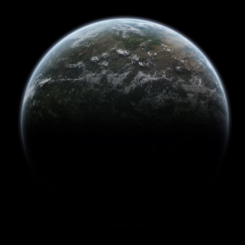
So nah - so close"So close, no matter how far, couldn't be much more from the heart"
- Metallica
Worked so long on this one. Inspired by Alyn, as you see.
FULLVIEW PLEASE!!!
edit1: fixed the clouds. didn't like them.
edit2: had to fix some more issues. i.e. light on the moons was not correct, etc...
now it's done.
Related content


Comments: 15

Hello Dadrian! My name is Endri-gol  (Smile)")
So I need your assistance... Please tell me if I could use your artwork in my one. Of course If you agree I will set your name (nick) as proprietor of the background. Also I promise that I won't receive money for this project... but if - I'll share with you
👍: 0 ⏩: 1

Of course you may use it, as long as you mention me .
 (Wink)")
👍: 0 ⏩: 1
Ok, thank you very much.

👍: 0 ⏩: 0

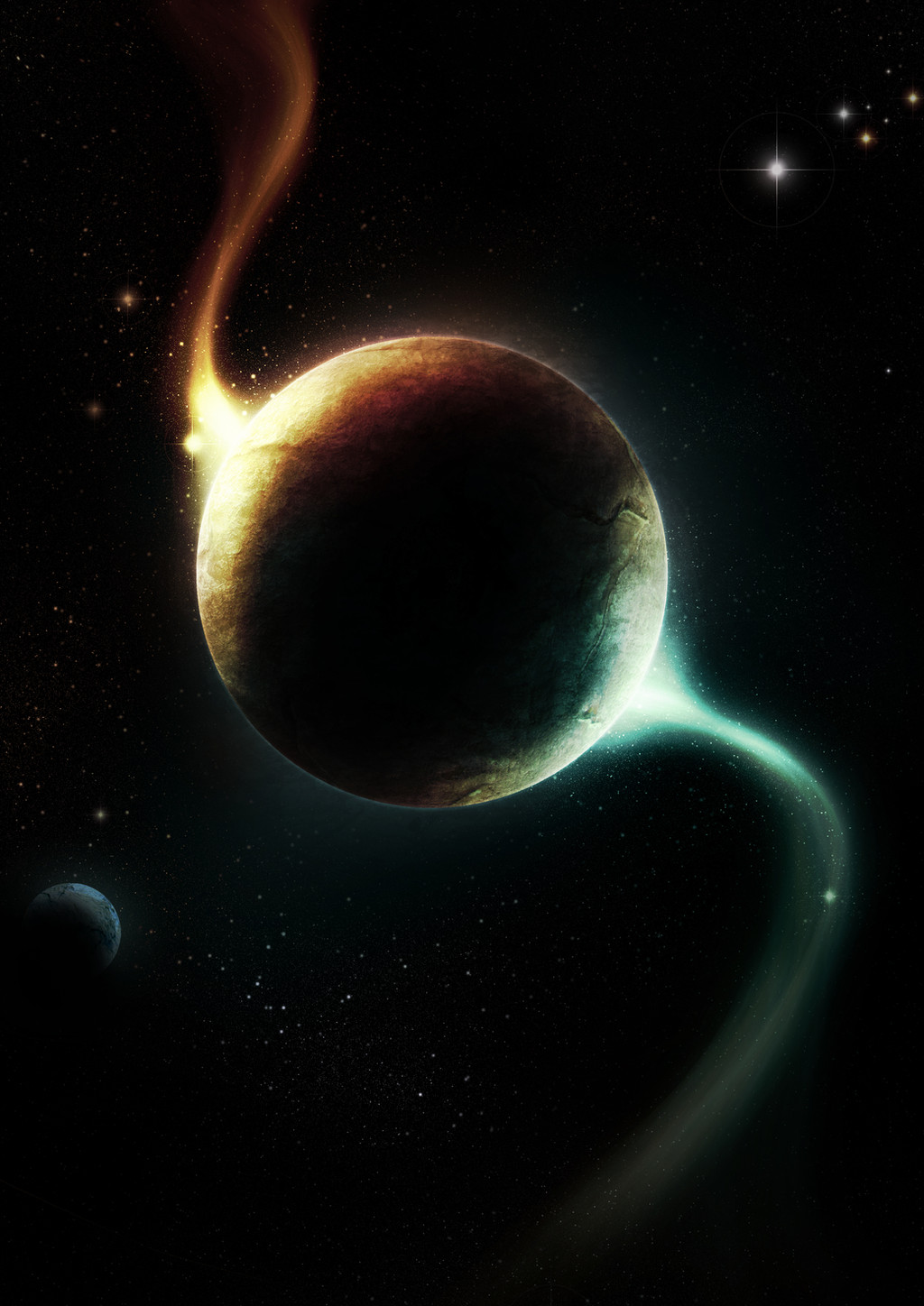
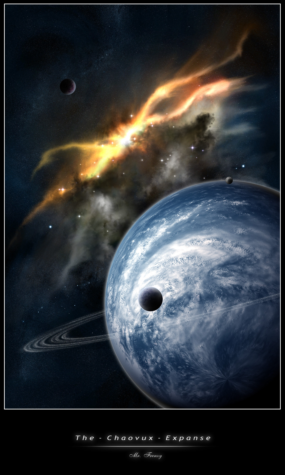
I love the nabulae in this - especially the bottom blue one, it look like a lobster or summink. I like the angularity of it. An the subtle variations in colour towards the top are well done.
Og.
👍: 0 ⏩: 0

wow, that piece is really good. the planet is excellent, with a very detailed texture, shows a lot of effort. the nebulae is too fractal like for my taste, should be blurred maybe, and then brushed a little
the terrain is nice, I like its shape. maybe some more contrast and detail would be good, but it works.
really a beautiful image with a stunning planet 
memod
👍: 0 ⏩: 0

always good to see i've had an impact somewhere
Overall, a good job well done dadrian, keep it up
👍: 0 ⏩: 1
thx a lot.
yeah, I tried to use apophysis for the nebulas. the blue one didn't turn out exactly as I wanted it, but it's ok.
I would really love to have trees there, but I don't have any idea, how to do them. And I didn't want to have cities there.
👍: 0 ⏩: 0

i have no idea why this hasnt got way more favs then it has now. Definitly deserves a fav
My fave part of it is that little planet with the rings ")
👍: 0 ⏩: 1
Thanks dude.
well it seems, peole dont want to fav me, for some strange reason.
👍: 0 ⏩: 0

It's beautiful! I love the clouds in particular.
👍: 0 ⏩: 0

Love this piece! The terrain is so smooth and calming, as well as the rest of the entire scene.
I'd add a slight more white/dark contrast to the terrain though. ")
👍: 0 ⏩: 1
thx
I'm contrast-crazy too, but once I had to say "stop, that's enough!"
👍: 0 ⏩: 0

nice work. the clouds really bug me, but the rest looks really good.
👍: 0 ⏩: 1
You are right. Last thing I did was changing the contrast of the terragen render and I did not notice the clouds. I'll fix em up, as soon as I am back at home.
👍: 0 ⏩: 0
