HOME | DD
 damnskippy — Carth and Revan
Published: 2008-02-04 18:32:11 +0000 UTC; Views: 7975; Favourites: 52; Downloads: 58
Redirect to original
Description
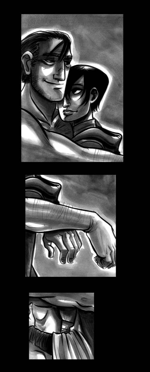
I completely forgot to post this! bought me a DA subscription ages back, and asked for lovey-dovey Carth/Revan (from the game Knights of the Old Republic) art in exchange. I was happy to comply.Related content


Comments: 22

It's funny how a lot of times you'll get an idea of what a character looks like in your head, apart from the limitations of the in-game character models. My initial reaction upon seeing this was to squeal a little because you've drawn Carth's hands exactly as I picture them.
👍: 0 ⏩: 0


i love carth, he's so awesome! ah good memories, haha
👍: 0 ⏩: 1

Yes. Yes he is. I vote for more video game guys like him. And Leon in RE4.
👍: 0 ⏩: 0

Eee Carth! I think I squeed the first time I saw him back in KOTOR2. Which I'm actually replaying right now. I love your Revan, she's such a hottie. It really irks me that they decided to canonically make Revan male.
👍: 0 ⏩: 0

Nice inkwashes. The third panel, however, doesn't flow well and kind of confuses as to what it's supposed to be doing. Is it the girl's hands to balance the man's?
👍: 0 ⏩: 0

The expressions and shading are just amazing. I really like the progression from panel to panel too, it's really subtle but says a lot at the same time.
👍: 0 ⏩: 0

Oo la la.
That's a cosey little scene you made. It's interesting how you set up the frames.
👍: 0 ⏩: 0


Oooooh, I was not expecting that! Oh my lovely, lovely god.
I love the separation of the three panels. You focus more on each aspect just because their separated, and leaves your mind to imagine what else is going on. Whether you meant to do or not, it looks good.
Summary; Naked Carth FTW.
👍: 0 ⏩: 1
Glad you liked it! Sorry it took so long to post. I actually had it finished ages ago, it just kept slipping my mind. ^^ Thanks so much for the subscription.
👍: 0 ⏩: 0
Nice work. Reminds me of the Harry Potter book art. What's the last panel though? I can't make that out
👍: 0 ⏩: 0

")

So happy in lourves are they! Great picture by the way. What made you decide to do it inks as opposed to a different medium? <---curious
Hair on the arm ftw
👍: 0 ⏩: 0

Well. The inkwash sure looks nice but I guess I don't really get the three little windows. A little cheapish copy pasting I feel!
👍: 0 ⏩: 1
WELL!! *flounces off*
Nah, you're right. I actually spent a really long time on this piece, but it just wasn't working as a whole, so this was the solution I came up with. Eh! You make do.
👍: 0 ⏩: 1

I think the third panel is where it falls apart a little. It doesn't read as well when taken by itself. You would have to almost show how that panel fits into the larger picture. I am guessing it is the crop from their two waist's pressed against each other. Over all though, the idea is a good one.
👍: 0 ⏩: 0

I just fell in love with your ink washes  (Smile)")
👍: 0 ⏩: 0
