HOME | DD
 daniellesylvan — That Strange Creature

Published: 2008-07-14 23:22:20 +0000 UTC; Views: 3213; Favourites: 67; Downloads: 0
Redirect to original
Description
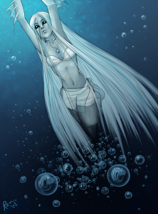
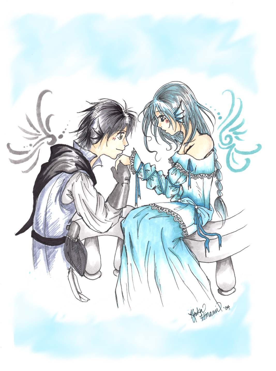
Aervi and Reia, together this time. ^__^I personally think they are adorable.
 I'm going to be drawing more of them.
Comments and Critique much appreciated. <3
edit: Changed a few things.
Related content


Comments: 16


Vision

Impact
I think this is an adorable piece of artwork! In terms of originality, I have seen many drawings about Mermaids and Angels coming together but this one is different in the fact that these two are not obvious lovers - whether they are a couple or not, I don't know. Most drawings of this scenario would have the Angel trying to kiss or reach out to the Mermaid but in this drawing, the two creatures have plenty of distance between them.
I think the use of colors is well done, the consistent theme of blue, white, grey and skin tone flowing nicely. I found it great that the artist took care not to let any of the pigments of blue match any of the other pigments of blue. The sky is different from the water which is different from the Mermaid's hair. It is a refreshing and clean color scheme.
I find that there isn't as much emotion in this drawing as I'd have liked, the eyes of the two not as expressive as the situation demands. The poses are a little too casual for the scenario, not depicting anything forbidden or curious, almost as if the two of them hang out every day. That can be fixed easily by making the Angel lean towards the Mermaid more and have the mermaid reach out her hand or something to that effect.
I find that the textures of the drawing are well crafted, the rock looking sturdy and slightly rough yet smoothed out from the water. The water looks peaceful and gentle. The sky looks like Heaven which works well with the fact that there's an Angel in this drawing.
This is definitely going in my favorites!
👍: 0 ⏩: 1

Thank you so much for the kind critique! I'm so glad you enjoyed so many different aspects of the picture. As for the parts about not conveying enough emotion- I absolutely agree! However I do want to point out this picture is very old, all the way back from 2008. I was only 14 when I drew it! 
Thank you again!
 (Smile)")

👍: 0 ⏩: 0


hi danni.
I really like this, but one thing is popping out at me--
his leg.
the ankle-calf relationship is a little off.
👍: 0 ⏩: 0

hmm... its a cute drawing but I think it would look a lot better if it had a better variation of color, the sky, the hair, the skin, and the water all seem to kind of blend together which does not appear as nicely to the eyes.
The guys leg looks somewhat uncomfortable (but legs sitting like that can be hard) and neither of them are looking the other in the eyes (draw a line from the eyes, it looks like the girl is looking at the dude's upper arm. Theres also a weird shadow on the guys lower leg that would only be there if it were bent inwards. As a side note, I really like the starfish
👍: 0 ⏩: 1
I love your harsh critique. 8D
mhmm, i see what you mean about his leg, I'm going to attempt to fix that, also the eye thing i noticed too, i'll fix that as well. as for the color thing, i actually don't really understand what you mean by that.
👍: 0 ⏩: 1
what i mean is that the colors are so simple that it actually starts to make the whole picture look flat, the water and sky would be fine as they are I guess if the characters seemed to stand out more. Theres a weird "center of attention" thing about art thats hard to explain but the characters maybe need to seem a little less faded (meaning less white in the colors) so that they do not become a part of the background.
👍: 0 ⏩: 1
Oh, I see what you're saying now. When I go back to fix those things from before, I'll play around with the colors a bit. Thanks. : )
👍: 0 ⏩: 1
")
I tried something with the colors.
Does it look better?
👍: 0 ⏩: 1
the characters looks a lot better now Id say
👍: 0 ⏩: 0

And then...he kidnaps her and takes her off to his cloud kingdom to be experimented on! I like it. Angels and mermaids meeting, it's a good idea.
👍: 0 ⏩: 0


Mermaid and wing-thingy taime! 8D
I like those starfish. And that rock. And the water. And the clouds. 0:
The main problem for me is his wings- I can't seem to find the bone/muscle structure within the wings, and they seem to be very weakly attacked to his back, like you could just walk up to him and snap them off. The feathers also look like fur; they should be rounded or squared a little more. It'd probably help to go stalk some birdies and look at their wings. (:
👍: 0 ⏩: 0