HOME | DD
 danioc —
Arsenic
danioc —
Arsenic
Published: 2010-04-14 15:20:57 +0000 UTC; Views: 102491; Favourites: 455; Downloads: 14302
Redirect to original
Description
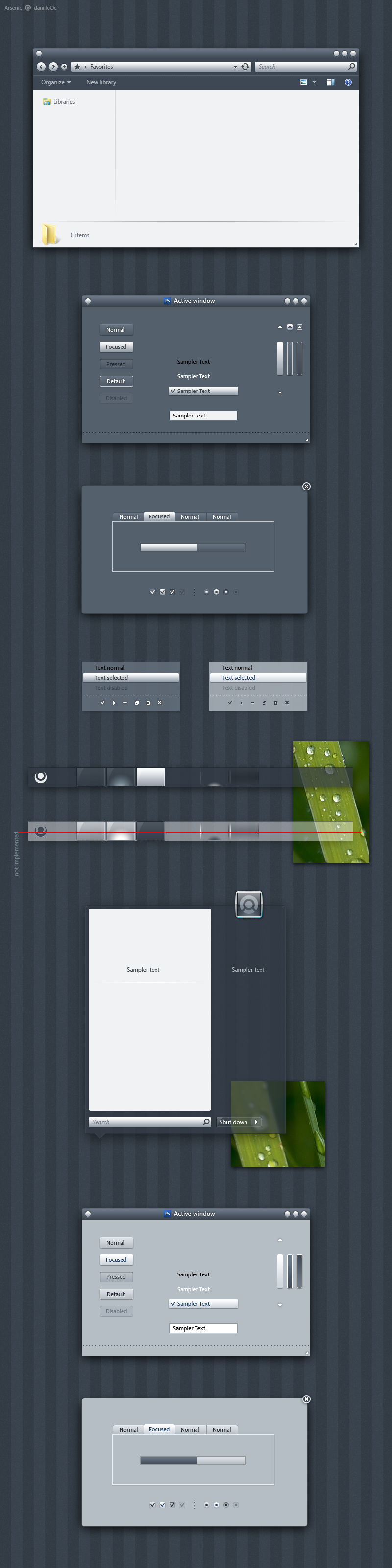
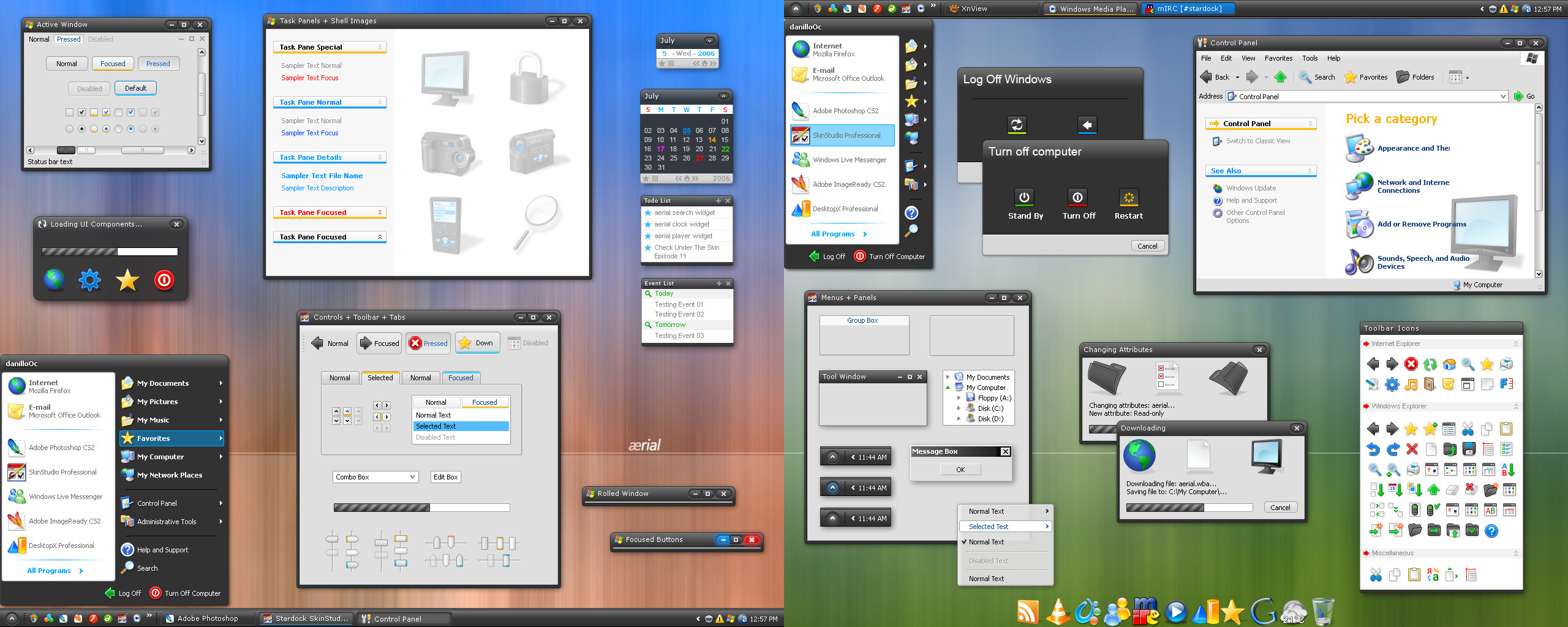
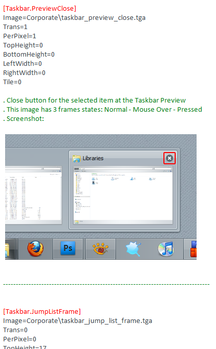
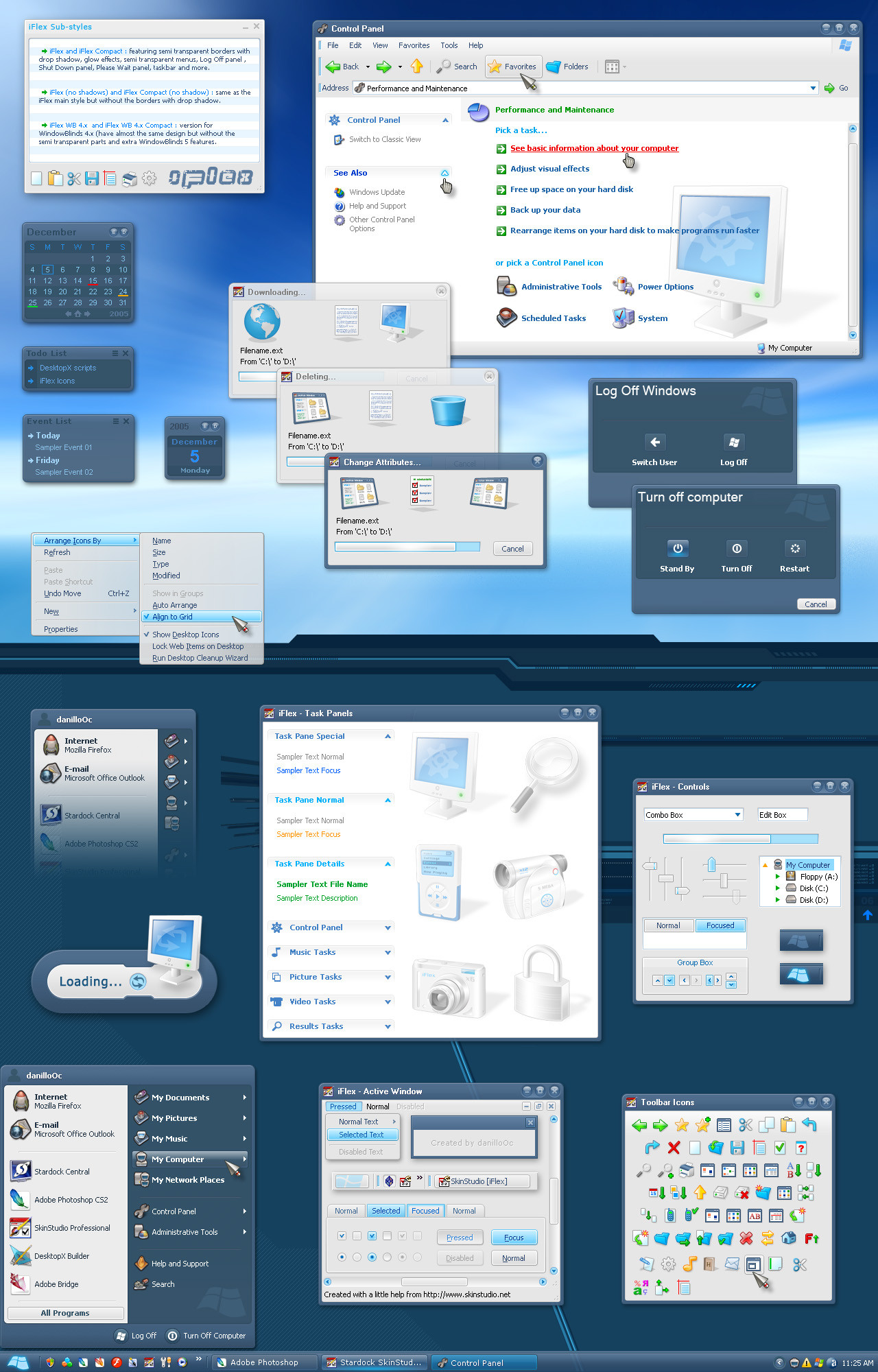
Arsenic visual style for WindowBlinds 7This visual style is for Windows 7 only, it will work on Vista
too as they are very similar but it won't work right on XP,
as I told before, I no longer support XP in my personal works.
There's two substyles:
* Arsenic - dark style that is better for dark rooms or night time.
* Arsenic (light) - better for lighter rooms and day time.
The Wallpaper:
If you want the wallpaper, it's located inside the skin too,
after install the visual style, go to:
"C:\Users\Public\Documents\Stardock\WindowBlinds\Arsenic"
look for the file called "Arsenic HD.jpg", it's a 1920x1200 file,
set it to "tile" and may cover all screen resolutions.
I hope you enjoy the visual style.
Regards,
danilloOc
*Updated 04/15/2010
- Changed the way the start button is sliced to help Vista users.
Important: the .wba file is inside the .zip, extract and double click it (DA is not good handling some file formats).
Related content


Comments: 245

👍: 0 ⏩: 0
👍: 0 ⏩: 0

👍: 0 ⏩: 0


 (Smile)")

")

I've always loved this blind I forgot the name I'm glad I found it again 

👍: 0 ⏩: 1

really nice...can anyone port to VS? I don't have a WB
👍: 0 ⏩: 1


Thank you, I hope you enjoy it
👍: 0 ⏩: 0

Professional looking work, easy on the eyes. Really nice job.
👍: 0 ⏩: 1

If I had WindowBlinds, I would totally be using this! But since I'm not, I shall honor your work by saying WOW! 

👍: 0 ⏩: 1
Thanks a lot, aspecteleven. You should give it a try, theres a free version at Stardock.com
👍: 0 ⏩: 1

What's with the "I can't afford". Just download it. lol
Great theme !
👍: 0 ⏩: 1

Beautiful! But is the frame transparent too (like a superbar)? (I can't see this on screenshot...)
👍: 0 ⏩: 1
Thank you very much. About the frames, no, they're not transparent.
👍: 0 ⏩: 0


This has remained my favourite WindowBlinds for quite some time, it's crisp, usable, and not loaded with gimmicky elements or glass. Just what I like from both shell themes and WB themes.
Though installing it on this new machine I notice something odd that may be present other themes, not sure what is causing it. In your preview your explorer window has a light grey shade, and the divides for the navigation and details panes are grooved. However I'm seeing white backgrounds with a solid 1px grey divide. I'm using Windows 7 64bit SP1.
👍: 0 ⏩: 1
Hey Jirbytaylor,
The skin didn't change since its release, apart from a quick start button adjust.
The background color is really a little lighter and the separators still have two pixels wide (fading), one grey and one white, you're probably seeing less the white one because the background is lighter. I don't remember if I changed that, maybe because compatibility or something, I will take a look and see what happened.
Thank you for supporting
👍: 0 ⏩: 3
Did you ever manage to solve this? I'm failing in my own attempts to make the explorer background and dividers the same as in the preview. The Skin Editor is... confusing.
You may have indeed changed it at some point, though I can't see why it would be incompatible with anything.
👍: 0 ⏩: 1
Hi,
The color can be like that in part, the whole thing except the favorites bar, on the far left,
that are is really hard to change in Windows 7 and after read this I made a quick test changing
the parts but there are too many graphics to change and in the end the favorites will still be
white, then I remembered why I ended changed the skin back to white in the end. On future works
I will try to get those areas painted different and will let you know but for this visual style, I may
not implement it, I'm sorry.
👍: 0 ⏩: 1
Ah, I had a sneaking suspicion there was something about that bar. There's a tutorial about fixing that somewhere on here, but as it requires patching Aero I think, you can't exactly distribute it with the skin.
jeez microsoft yet us skin your things easily :<
👍: 0 ⏩: 0
Just a slight update, I came across a skin that has different navigation/main/detail panels, and it appears the same in my system.
[link]
So that releases any worry that I have a dud system file causing my issue with your skin (i.e. due to using the Faenza icon patch).
👍: 0 ⏩: 0
Thanks.
I've just noticed something: the start menu has the correct light grey and groove effect, so I have a point of reference to see how I should be seeing that shade on my screen. It is definitely darker than the explorer windows.
I wonder though what could possibly be overriding this - because I have seen other themes where the window is darker, but the directory list and details area remain white. I don't think it's so much your theme then, but I'm at a loss otherwise.
👍: 0 ⏩: 0

Ignore my previously comment. I'm not using the software anymore. Anyway, i think it was my pc that was the problem.
Is there any chance for a Visual Style 7 version? I really love this
👍: 0 ⏩: 0
When i'm using this theme, i still have the original start button behind this start button and it looks ugly
Please help me any1, cause i really love this. It's the best theme for W7.
")
👍: 0 ⏩: 0

The thing I like about it is that I feel it's a good example of "content over chrome".
Namely, the borderless look and the opaqueness = elegance.
The min/max/close buttons however look a little dull.
All in all a great theme!
👍: 0 ⏩: 1
Many thanks
About the titlebar buttons, I made them very simple on purpose, as the glyphs show when you mouse over them.
👍: 0 ⏩: 0

Ignore my comment, turns out I was in the wrong section!
👍: 0 ⏩: 0
This is in the wrong section.
Shame, as I would like to see this as a visual style or custopack, rather than the crappy .wba format.
👍: 0 ⏩: 0

Hi. No, it's a WB style.
👍: 0 ⏩: 1

Darn. . . .
It's a great theme still!
👍: 0 ⏩: 0


I've spotted a glitch in the Windows 7 Explorer window controls when I use this skin. For readability purposes, I've changed the text size to 120% - not sure if this is the cause. Just uploaded a cropped screencap to show how it looks here. First time I've encountered this with a WindowBlinds skin. 
👍: 0 ⏩: 1
Hi there.
The skin should be prepared to handle custom DPI's as it's has the extra graphics needed but some things are based on WB's settings, not really on the theme side.
If you could, please upload the image and send to me (can send me a note with the link), I'll be glad to look and try to fix it myself, if not possible by changing the theme, I can send over the WB's developer to take a look.
👍: 0 ⏩: 1
Just sent you a note.
👍: 0 ⏩: 1
Cool, checking. Thank you
👍: 0 ⏩: 0

| Next =>