HOME | DD
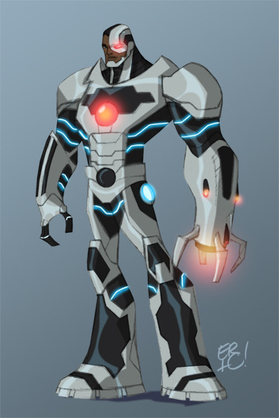
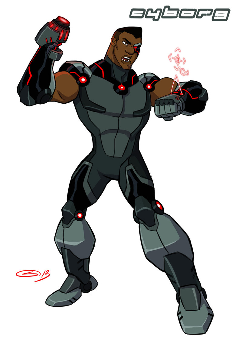
 DanNortonArt — Cyborg sketches

Published: 2012-11-14 02:25:00 +0000 UTC; Views: 29171; Favourites: 980; Downloads: 646
Redirect to original
Description
Some sketches for Cyborg. I was trying to get away from a guy in a cyber suit, so I changed up proportions and broke his feet up to look like shock absorbers.Related content


Comments: 66


give him a meat sandwich! lol
overall original look for him! i like it
👍: 0 ⏩: 0

Great stuff.
The Nu52 design isn't practical. He's too heavy. With all the tech flying around in the DCU it makes you wonder why he looks so outdated.
👍: 0 ⏩: 0

hmm... the way some of these curves are makes his figure look a bit more feminine...
👍: 0 ⏩: 0


He looks like he'd be a fast runner this way, maybe it's the narrow torso and the feet (I'm with you on the shock absorbers thing, that metal suit would have ripped up his heels and calves without something to carry the load). Well done.
 (Smile)")
👍: 0 ⏩: 0


I'd prefer this design over what they are actually using in a comic. If Cyborg is supposed to be so technologically advanced, why does he look so bulky in the new design? This I can believe he can still be athletic and still sci-fi. Though, frankly so much of his human body is gone, he's more of a robot with a human head than an actual cyborg.
👍: 0 ⏩: 0


I really like this. The colored on on the far right looks a bit TOO thin in the torso, but I love the sketches and the ideas. Sleek makes more sense to me than bulky considering he was supposed to have been a high school sports star before he got his cybernetics. I never did like his comicbook design (though the version in the Teen Titans cartoon was cool).
👍: 0 ⏩: 0


I love the way you think, instead of a clumsy, bulky suit it makes perfect fanboy-logic that his body should be more compacted and streamlined. Especially with so much of today's technology being similar.
DC please take note.
👍: 0 ⏩: 0

Good stuff, but his his waist/ab area on the finished far right just seems a little too small. I do like the idea of shock absorbers in the feet.
👍: 0 ⏩: 0

Hmmm. I actually like the upper left pencil sketch better than the finished model. I think the more pronounced hips give him a better silhouette and look like more robust machinery.
👍: 0 ⏩: 0


WOW!!!! I love the break up in form ....it looks more robotic ...amazing job...
👍: 0 ⏩: 0


This is one of the best designs for him that I've ever seen.
👍: 0 ⏩: 0

the awkward moment where you are besides looking at this piece of art, also watching teen titans at the process
👍: 0 ⏩: 0

Awesome, I have always felt closely to the same about his design. Great idea and concept
👍: 0 ⏩: 0


I like the black and green parts. I always thought his current look in the comics had too much gray.
👍: 0 ⏩: 0


As has been said before, my only problem with this is his waist. It seems really too out of place. He's all manly, and then that waist...
👍: 0 ⏩: 0


I really like the foot design and the green. I'm a sucker for green. However I think the anorexia waist isn't doing it for me. Kind of breaks the flow of the character. Otherwise looks great.
👍: 0 ⏩: 0

He looks great. I'd love to be able to draw like that
👍: 0 ⏩: 0


I think the Teen Titan Cyborg would like this design better, seeing as he use to be an athlete himself. Perhaps a more adult version, since this does look more like an adult Cyborg to me

👍: 0 ⏩: 0


The unique shapes and the not quite human proportions on this are intriguing, fantastic re-interpretation on Cyborg, very inspiring!
👍: 0 ⏩: 0

All is lovely except the waist and the eyebrow, that's way feminine for a superhero in my expert opinionion.
👍: 0 ⏩: 0

I love the subtle little "Uncanny Valley" effects, such as the too-thin abdomen—though I think I prefer the just-frighteningly long arms of the upper-right sketch. Nice work!
👍: 0 ⏩: 0


Never understood why villains didn't just shoot his organic bits right off the bat...
👍: 0 ⏩: 1

Same reasons why villains only shoot Wonder Woman's wrist.
👍: 0 ⏩: 0

I actually like where you're going on this design, man!
👍: 0 ⏩: 0

")

THANK YOU for not giving him hair. I've always hated it when Cyborg is drawn with hair. Really cool design though.
👍: 0 ⏩: 0


Shock absorbers? Why not blades like that runner in the Olympics this year, Oscar Pistorius? Though those feet look pretty cool as is ")

👍: 0 ⏩: 0
| Next =>