HOME | DD
 DanRabbit — AppCenter

Published: 2012-04-16 23:39:58 +0000 UTC; Views: 21137; Favourites: 84; Downloads: 172
Redirect to original
Description
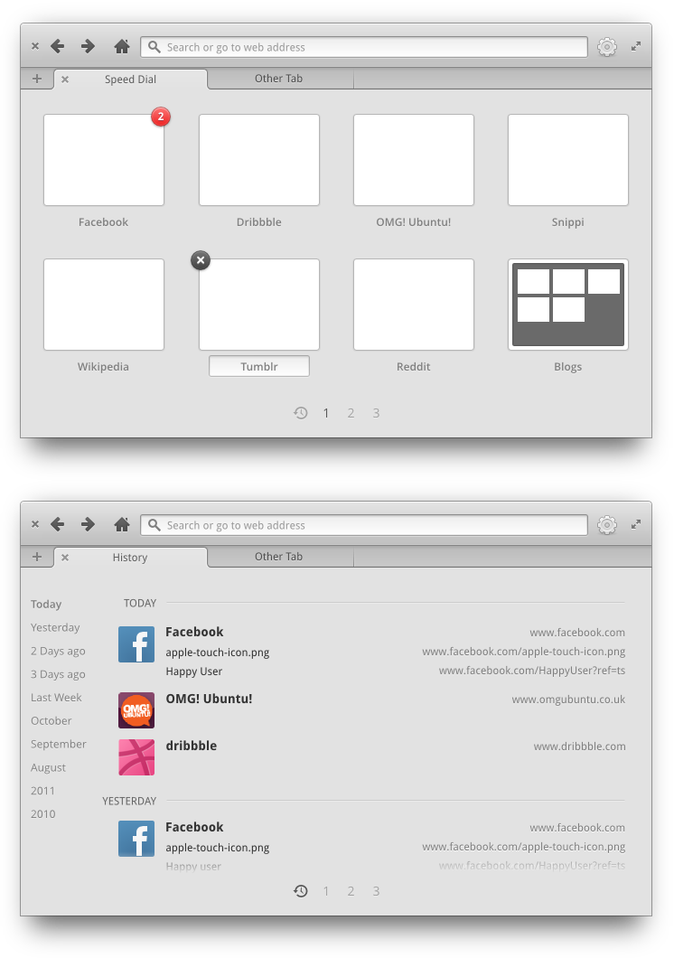
Doing mocks for the first version of AppCenter. That means the feature set needs to stay simple. No reviews or anything crazy yet. Just what data we get from a regular debian repository (plus screenshots).I want to have some nice looking banners to spice things up a bit, but we don't have the resources to go design a ton and we won't have the bandwidth to host them. So, the idea here is to automatically generate a nice color scheme based on the icon's colors and created banners based on a few different layout templates.
Also, in the category grid, it should dynamically resize. So if you have an ultra-wide window, it can go to 3, 4, etc columns. But if you have an ultra small window, it should shrink back to just 1 (a list basically).
Related content


Comments: 125


I know this is a mockup, but what sort of implementation is being planned for this? I'd really like to see it use packagekit, so that it will be distro agnostic.
👍: 0 ⏩: 1

We're using LibAppStore which does in fact use PackageKit
👍: 0 ⏩: 0


Great as always, love how you incorporated the sys. specs and "legal" information. Can't wait to see this in the update manager!
👍: 0 ⏩: 0

Ooo, if there's a good enough backend to build from, this is totally worth incorporating. Linux Mint has their own package manager / Application Store application. I figure most of the data you'd need is already available from the usual sources, including screenshots.
If I'm being honest, it's pretty clear that you have an outstanding portfolio for all kinds of UX and UI design jobs. Of course, if you guys could get a considerable amount of donations (just dreaming here) elementary could turn into something quite major. I think the developers, community manager(s?), and community itself have done a great job of being open and active with the public even during the long wait for Luna. I think elementary's by far one of the more interesting projects in open source right now.
👍: 0 ⏩: 0

very good, i hope that this app will be very light and themable. is it using html5 ?
👍: 0 ⏩: 0

Hi Daniel, what do you think about an option to save a list of installed or favorite applications? Maybe that list could be synced to Ubuntu One, Dropbox or similar and after e.g. installing Luna+1, one could simply point to that resource and all the previously installed apps are there again.
👍: 0 ⏩: 1
Yep, I was thinking about that the other day  (Smile)")
👍: 0 ⏩: 0

I like those back and forward buttons...why not implement them in the main theme to be used in Luna
👍: 0 ⏩: 1
This isn't something that can be implemented at a theme level. It would have to be done by the individual apps.
👍: 0 ⏩: 0

You are awesome, Dan! Keep up the good work!
Any news for mobile version of Elementary.org?
👍: 0 ⏩: 0


The system requirements is really just extra info people don't need. I don't even know how fast 1.6 GHz is or if an app would take up more or less than 9.1 MB. What would someone do with with info? Let the computer figure out if it meets the requirements, and only tell the user if there's a problem.
👍: 0 ⏩: 1
Well I was trying to think more in the context of Gaming or Pro Tools as far as speed reqs. But I think you might have a point about the information not necessarily being important as long as it's "okay" or "not okay".
👍: 0 ⏩: 1

But when user clicks "details" he expects to see details. Of course main info should be "okay" or "not okay", but think about someone (perhaps on netbook) browsing AppCenter, looking for a game. In order to see if it will work on his PC, he will have to turn PC on, log in, launch AppCenter and find this game. Or what if game doesn't work on his PC and he wants to buy a new one. But to find out if the new one meets the requirements he would have to run elementary OS on it or find the system requirements somewhere else.
👍: 0 ⏩: 1
In order to install the game in any case, he would have to launch AppCenter and navigate to this page on his own device. So I'm not sure what you mean here.
👍: 0 ⏩: 1
That if he checked requirements on his netbook and those were higher than his PC, he wouldn't have to turn his PC on. I know that currently games from USC will run on any device (maybe except calculator
And second case: Imagine that Crysis 3 for Linux comes out
👍: 0 ⏩: 1
Oh, I get what you're saying now. Yes, that is a solid argument for keeping the specs there rather than dumbing it down to just "okay" and "not okay"
👍: 0 ⏩: 1
But "okay"/"not okay" should be main part of specs tab.
👍: 0 ⏩: 1

What about an "OK" "NOT OK" button, than when pressed shows the details of system requirementes? I think that would be the solution to both problems
👍: 0 ⏩: 1
It's not obvious what this button will do when pressed. If you want to hide that info a bit, it's better to have this expanding/collapsing sort of widget labeled "details".
👍: 0 ⏩: 0

Nice mockup. Just a suggestion, hertz is abbreviated "Hz" with no exception.
👍: 0 ⏩: 0

By the way, is this just a mockup or actual screenshot?
👍: 0 ⏩: 1

I think that arrows should be also on Marlin
👍: 0 ⏩: 0

You may get some ideas from WebOS (HP TouchPad). Their app store is the best I ever tried. Two screenshots for you: [link]
👍: 0 ⏩: 1

Yes, I love webOS and it's a shame happened to it. Great thing it's open sourced now.
👍: 0 ⏩: 0

Much better. What happens when you use Autor: SuperLongCompanyName and Website: superlongcompanyname.com ?
👍: 0 ⏩: 0

looking great! I really like how to info-view looks now, it has good spacing and is well balanced, how will it scale on bigger screens? The details view should definitely contain the "real" package name in the info box to the right. It would also be awesome to have a "similar"- or "related"-apps view. Probably related would be best. Then if you are looking at, e.g. LibreOffice Writer you'd also be informed about Calc, Impress and maybe Dia.
👍: 0 ⏩: 0

Very nice update!!
I would like the name of the category was a link
👍: 0 ⏩: 0
The indent shadow on the [Info|Details|Reviews] buttons seems a little too subtle, you have to really squint to see which is actually selected.
👍: 0 ⏩: 0

It feels a little loaded to me. Not to perpetuate the Apple-likeness of eOS, but you might wanna take a glance at the Mac Appstore to figure out what you want to put in your app center and what you want to leave out.
👍: 0 ⏩: 0

Twitter doesn't make a GTK client ")
👍: 0 ⏩: 0

So good, love all your concept, and love that most of all become really software! (like the noise ui  (Wink)")
👍: 0 ⏩: 0
Will Luna use USC or another software manager of it's own?
Very nice design, btw
👍: 0 ⏩: 1
Luna is currently on track to stick with USC.
👍: 0 ⏩: 1
Why not consider the Linux Deepin Software Center which IMO is very nice?
👍: 0 ⏩: 1
We have a strong commitment to providing only fully native GTK+ applications that look and feel consistent with the rest of the desktop.
👍: 0 ⏩: 1
Oh.. didn't know that the deepin software center is not a gtk app. Thanks for the info anyways.
👍: 0 ⏩: 0
Woah. That's absolutely beautiful. Is that the official elementary icon for twitter?
👍: 0 ⏩: 1
Yea, it's floating around in our icon set right now
👍: 0 ⏩: 2

and why the wings are different from the real one? copyright?
👍: 0 ⏩: 1
Looks like they updated their icon and I forgot to update mine xD
👍: 0 ⏩: 0
Wow. Is at actually assigned to a specific app right now or anything? I mean, it's amazing, but what's it actually used for?
👍: 0 ⏩: 1
It's just called "twitter" currently
👍: 0 ⏩: 1
Fair enough. I'd love to see someone develop a really tight desktop Twitter app for Linux. Hotot is good but not quite there yet, whereas Gwibber is still a piece of crap UI-wise, it makes absolutely no sense when used as a Twitter client.
👍: 0 ⏩: 1
Yea that'd be great, let me know if you hear of one
👍: 0 ⏩: 2
| Next =>