HOME | DD
 DanRabbit — Open File Dialog

Published: 2011-08-19 06:53:27 +0000 UTC; Views: 18279; Favourites: 62; Downloads: 175
Redirect to original
Description
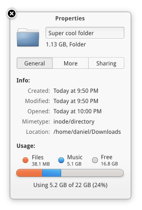
Now 100% more modal looking, with updated icons and everything (Smile)")
Related content


Comments: 99

Nice concept. It looks very clean and easy to use.
👍: 0 ⏩: 0


is it supposed to not have a search bar?
it looks way better than the current old gnome one.
👍: 0 ⏩: 1

Yes, the search is meant to be integrated into the locationbar like in your web browser.
👍: 0 ⏩: 1

hopefully we'll be able to work on this for the next version of elementary, but it won't land in Luna.
👍: 0 ⏩: 0

You could remove the cancel button, and add a closing button on the upper-left corner. Why settle with simple when it can be simpler?
👍: 0 ⏩: 0

I like how the 'list' view is selected, but the 'icon' view is showing.  (Wink)")
👍: 0 ⏩: 1
Oops. I was hoping nobody would notice xD
👍: 0 ⏩: 1
I'm a fan of details, and you.
👍: 0 ⏩: 0

I like it! but usually i love it...
Small problems :
- Musics and Pictures panel's icons have not the same center and scale than the others
- Videos folder's icon looks lighter (line thiner), downloads' icon is too small (why this ring?)
- (shadows are too much dark for me)
👍: 0 ⏩: 0


Looks more like a file manager for me.
Something I would love in a file chooser is a smart way to set the mime types to show, not only by extension. For exaple, show all video files, all image files, all music files, etc..
👍: 0 ⏩: 0
")

You use inkscape+gimp right? Is there any chance of you doing a workflow video?
👍: 0 ⏩: 1
This is 100% Inkscape here. I've had a lot of requests for a workflow video, I imagine I should do one at some point haha. I just never have thought before starting a mockup "Oh I should do a workflow video" xD
👍: 0 ⏩: 0

Looking good. Will there be bookmarks and recent items?
👍: 0 ⏩: 1
"Bookmarks" are already shown under the "Personal" header. Recent items is something that is totally possible (along with other smart folders) but it hasn't been implemented in Files yet.
👍: 0 ⏩: 0


I was just thinking about this the other day haha.
👍: 0 ⏩: 0
You can always get my icons from launchpad at code.launchpad.net/elementaryicons
👍: 0 ⏩: 1

ah ok, gonna port em again to windows ico files ^^
👍: 0 ⏩: 0

This is what I'd like the main theme to look like, as opposed to the grey fade, it's so much more minimal and flat. I understand that it's too much (or should I say too little) for most people though.
The one negative thing this style points out, is how babyishly big the navigation buttons are, but to contrast it also points out how pretty the folder icons are.
Also while I'm here; looking at it, the documents icon looks too much like the "missing icon" icons that you get :/ distracts me. I'd imagine the usual faux text lines would solve it for me.
Looking good as ever, please keep them coming
👍: 0 ⏩: 2


I second this! The normal grey doesn't look modern at all. This however gives Elementary it's unique, more aesthetically pleasing, look and it will stop the "It's a OS X clone!"-sayers.
👍: 0 ⏩: 1
If elementary does go this way though I needn't do any of my mockups >_<
There is a theme that does this pretty much:
:thumb340887671:
Still not going to be perfect without the backing of elementary though.
👍: 0 ⏩: 1
ffs DA
[link]
👍: 0 ⏩: 0

I'm guessing the save file dialogue would be similar. I personally prefer that in the elementary "light" modal style that symbolic icons are used exclusively, as it makes it seem more like a secondary interface compared to the normal style that has a regular icons. Would keep the full colour icons in the main sidebar, but use symbolic icons in the sidebar and toolbar. I would possibly also add a slight drop shadow between the toolbar and main window, and to add the word home to the breadcrumbs at the top.
👍: 0 ⏩: 1
That's actually a really interesting point about it being a "secondary" or "temporary" interface. I'm glad you were able to pick up on that
The only concern I think I have about using symbolic sidebar icons is that users would have already build a relationship with the color icons from the "primary" interface. So switching it up on them might be confusing.
👍: 0 ⏩: 0


Looks just great. I can't wait to see when it's implemented in eOS
👍: 0 ⏩: 0

It looks fantastic. Now if only wifi would work on elementary for me ")
👍: 0 ⏩: 0

Is it only me who thinks macosx open file manager has nothing on this?
Damn that open file is so much more good looking.
Cheers DanRabbit. this is really cool stuff a better copy i might say. And i don„t think anyone will say something comparing it to macos. it has more life in it.
👍: 0 ⏩: 0

so cool, hope will appear in daily build soon, the current is so ugly
👍: 0 ⏩: 0


Will we be able to bookmark folders and show them in the panel?
👍: 0 ⏩: 0

There's so much ugly space in the OSX window, and the colors are inconsistent and awkward. This is so much more natural!
👍: 0 ⏩: 0
Is there a real chance to see this included into Luna or at least into Luna +1 ?
👍: 0 ⏩: 0

I think I like this design better than the OSX one.
")
👍: 0 ⏩: 0

Isn't this modal? Shouldn't it use the white modal styling, then?
👍: 0 ⏩: 0

Don't quite understand the need for a "cancel" button when you could simply hit the "x" in the corner.
👍: 0 ⏩: 1
What it comes down to is that when we're in a dialog situation, we want to have a consistent way to exit the dialog. Sometimes we don't have window controls in a dialog (such as in popovers), so in order to keep things consistent and familiar, and comfortable, we need to make sure we're always showing that cancel button.
👍: 0 ⏩: 0

Hey Daniel has this been implemented in Luna or is it still a mockup ??
BTW Elementary OS is absolutely fantastic !!
👍: 0 ⏩: 1
Hey Daniel has this been implemented in Luna or is it still a mockup ??
BTW Elementary is absolutely fantastic !!
👍: 0 ⏩: 0

| Next =>