HOME | DD
 DanRabbit — Open File Dialog

Published: 2011-08-19 06:53:27 +0000 UTC; Views: 18284; Favourites: 62; Downloads: 175
Redirect to original
Description
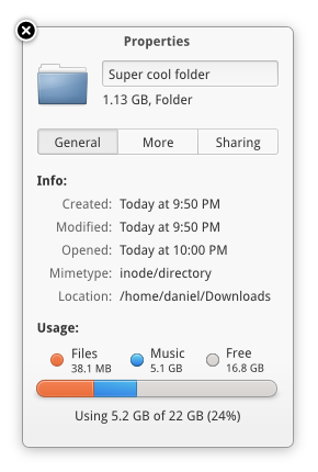
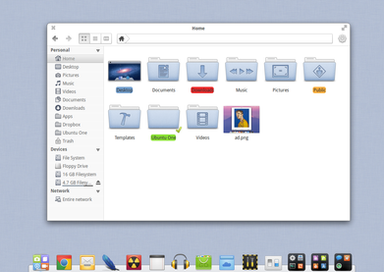
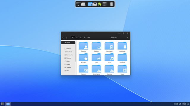
Now 100% more modal looking, with updated icons and everything


Related content
Comments: 99

Do you search for files by clicking the breadcrumbs bar thingy?
👍: 0 ⏩: 1

That is correct 
👍: 0 ⏩: 0

Dan,
Been using Elementary OS for a while now (great OS by the way), and have tinkered a little with OS X. For others to say that your work resembles Apple's is an insult to your work. Not that OS X is ugly, but your designs are much more refined and cohesive, while Apple's UI seems...well lets just say I can tell they have at least one designer who doesn't seem to agree with the rest of their design team. Illegitimi non carborundum.
👍: 0 ⏩: 1

Thanks for the vote of confidence 
👍: 0 ⏩: 0

Hey Dan, this is awesome and all, like all your designs but why are the corners and edges of your mockups so beautifully crisp while the real windows in elementary look choppy and have that hideous border. Is it an implementation restriction? Sorry if people have asked you this before!
👍: 0 ⏩: 1

Yea, it's an implementation thing, but It's being fixed! So for Luna we should have beautifully rounded corners
👍: 0 ⏩: 1

that would be absolutely fantastic... I have been using ubuntu ever since I was in high school and could not afford a Windows licence but this just blows it out of the water. Been installing it at work as well... An ETA for Luna, if you'd be so kind? (I know you guys are perfectionists but I'm really sitting on the edge of my seat for this one haha)!
👍: 0 ⏩: 1

Very nice.. Your design is getting awesome..
👍: 0 ⏩: 0

why not to use the dialog like the new unity's modal dialogs or like a drop-down dialog?
👍: 0 ⏩: 1

Yea I could try it in a different visual style for sure. I'll post here again when I do it.
👍: 0 ⏩: 1

PS: i would also include zeitgeist features like frequently/most used and related items to the sidebar.
example: create a html file with a text editor and see it in the related section in firefox`s open file dialog.
👍: 0 ⏩: 0

would love to see this implemented. one question: why are all buttons white and square except the back forward buttons? Don`t they look out of place?
👍: 0 ⏩: 0

Hey Dan. Don't get so upset. Trolling is a form of caring, the fact that there are people complaining means that what you do is relevant enough for them to care, and that's good right?
👍: 0 ⏩: 1

I'm not upset, just... trolling back xD
👍: 0 ⏩: 1

Not that much different than the usual GNOME file opening dialog, but the addition of a preview pane and different views for the files is very useful.
👍: 0 ⏩: 1

Yea, It's almost the same functionally. I just wanted to make it neat and organized and aligned.
👍: 0 ⏩: 0

No, I just made this mockup yesterday
👍: 0 ⏩: 0

I think it would be a nice idea to have a simple music player integrated in the browser, for example as a preview panel or something
👍: 0 ⏩: 0

This looks fantastic!
I noticed you made this mockup and the postler one with round corners. Will that be possible for Luna?
👍: 0 ⏩: 1

I'm not sure. I'll have to talk to Cimi about it since he's doing the unity window decorator stuff
👍: 0 ⏩: 0

Your description made my day! ahahaha!
Anyway...I love it.
👍: 0 ⏩: 0

I still don't get why people seem to think elementary copies Mac OS so much. elementary doesn't have the frankly ugly aqua themes inside of it, it's sleeker, nicer and far more professional looking.
👍: 0 ⏩: 0

So this is the browse dialogue ? If it is then I don't think there is any particular need of the Back/forward buttons. You might wanna get rid of them
👍: 0 ⏩: 1

I use those buttons quite often, even in save/browse dialogue. So I disagree with this.
👍: 0 ⏩: 0

maybe I have a primitive way of using marlin (or nautilus) but in which situation does this dialog appear?
I can't reproduce it.
👍: 0 ⏩: 1

In any application where you have "Open File..." as an option. Such as a text editor or an image viewer
It wouldn't appear in a file browser since you don't open files with a file browser, you open folders with one.
👍: 0 ⏩: 2

You cant open files with nautilus/dolphin/thunar etc? :-D
👍: 0 ⏩: 1

aaah, nervermind, I failed to read "Open File" in the top bar, I thought this was Marlin and the dialog you were talking about was the bottom pane. which would be a bad idea for a lot of dialogs..
👍: 0 ⏩: 1

* I meant "wouldn't be a bad idea"
👍: 0 ⏩: 0

Is it just me, or does the Mac dialog look really ugly compared to this?
👍: 0 ⏩: 2

Hahaha, your description is awesome. Of course you'll *still* get trolls, but such is life. Great work.
👍: 0 ⏩: 1

Trolls there are. I would suggest that you don't read the comments on sites that are mainly populated by trolls. You won't get any constructive feedback from those sources imho.
Looking good though. But when you have breadcrumbs do you also need the navigation-arrows?
👍: 0 ⏩: 3

If you have long folder names there can be situations, you have only 'current' breadcrumb visible. In this case navigation arrows can be handful.
👍: 0 ⏩: 0

I disagree, even trolls can have some truth behind. Dismissing comments as merely trolls because of the tone or whatever is just bias against contrary opinions.
I don't know what sites you are thinking of, but I visit sites where trolling is the norm and find them to be pretty insightful.
👍: 0 ⏩: 0

I would say yes because if you working between a few different folders lets say a\b\c\d and you click on a and you then want to go back and forth between the two then it would be very helpful with those back/forward buttons. Otherwise, you'd have to double click on b, c, and then d.
👍: 0 ⏩: 0
<= Prev |
