HOME | DD
 DanRabbit — Folder Usage
Published: 2012-05-07 06:27:58 +0000 UTC; Views: 8194; Favourites: 44; Downloads: 70
Redirect to original
Description
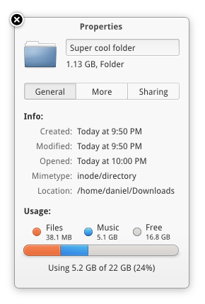
Would be cool to have a super sexy piece bar to show folder usage.Related content


Comments: 24


Categorizing files on that dialog would be inappropriate I guess, 'cause there are a lot of them. By the way, "Music" is too specific, if I were to decide, I would named it "Media". That's how I do when partitioning
 (Smile)")
👍: 0 ⏩: 0

")

Just put it in Luna and will be perfect haha.
I think, that mockup doesn't need any fix, is just ready
Sorry for bad english, cheers from Chile
👍: 0 ⏩: 0

That usage bar looks pretty but I don't get what it'd be used for. I can see one for your entire system: if you need to free space looking at the bar will tell you what is taking up your space. But for individual folders...
Also, it's misleading; there isn't a certain amount of space a folder can use.
👍: 0 ⏩: 0

shoulden't the orange denote noise and files be blue with reference to the icon colours of marlin(files) and noise(music)? ;x
👍: 0 ⏩: 1

Probably ")
👍: 0 ⏩: 0
Dunno if you can really say that. For reference: [link]
But glad you like it
👍: 0 ⏩: 1

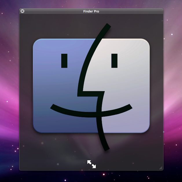
That picture was your reference?
👍: 0 ⏩: 1
No haha, I meant to say that here's the one in OS X to compare it. I don't think they are really that similar
👍: 0 ⏩: 1
The bar at the bottom it very similar to that used in iTunes. [link]
👍: 0 ⏩: 1

That's also the same bar used in the Ubuntu installer when choosing how to partition things.
👍: 0 ⏩: 1

How would this look with 10 different mimetypes?
And free doesn't make sense imo, folders don't really have a set amount of space it can hold.
👍: 0 ⏩: 1
Yea I'm not sure
Well your HD has a set amount of space it can hold
👍: 0 ⏩: 0

Hmm, I'm not 100% sure about the Files/Music distinction. How will you distinguish what types of files are in a directory?
Theoretically there could be 20% Photos, 20% Music and 20% Videos, that would result in quite a few nodes/colors (3+2). Or am I missing the point of your mockup entirely?
👍: 0 ⏩: 1
Yep that's correct, there would be quite a few little nodes/colors.
👍: 0 ⏩: 0

I think this info could be displayed in the side panel (as an option, of course)
👍: 0 ⏩: 0
Simply beautiful! Will be nice if it gets implemented in Marlin (or whatever it might get forked as considering it's stopped development)
👍: 0 ⏩: 0

All subwindows and dialogs should look like this !! maybe as a granite widget?
👍: 0 ⏩: 1
Already done  (Wink)")
👍: 0 ⏩: 1
")
