HOME | DD
 darkspeeds — ASHWORTH Volume01-CHP01-Pg01
by-nc
darkspeeds — ASHWORTH Volume01-CHP01-Pg01
by-nc

Published: 2007-07-03 17:46:39 +0000 UTC; Views: 8126; Favourites: 106; Downloads: 73
Redirect to original
Description
(edited on 24th April 2008)
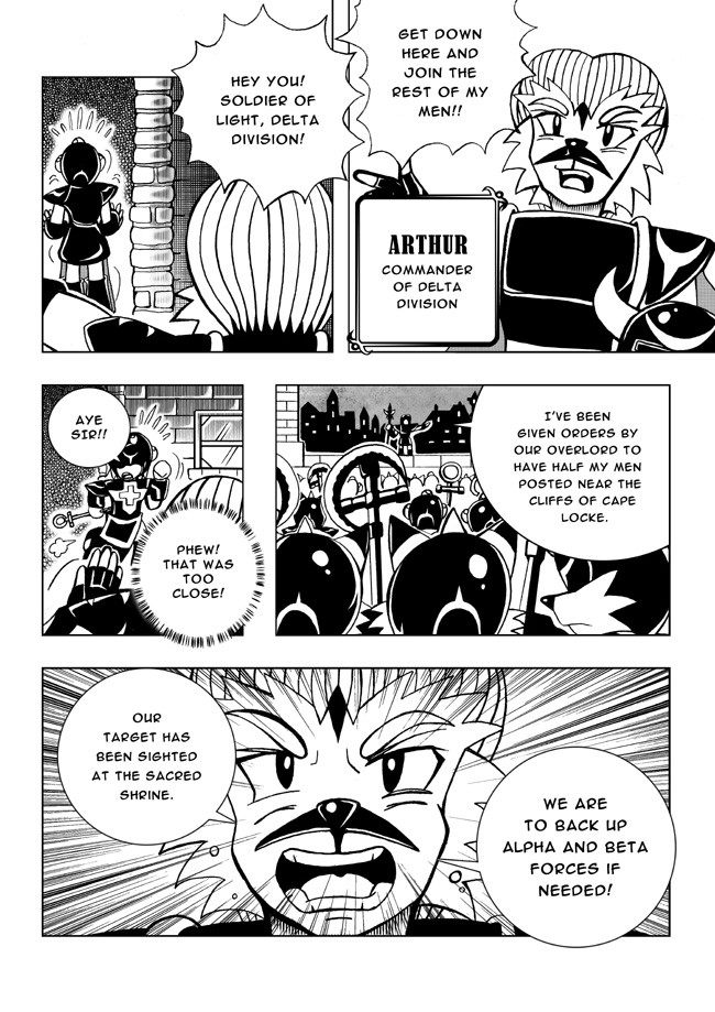
Hi guys! Well like I have already mentioned on my latest journal I think it may be a good idea to show case volume one to give readers an insight on the quality of my work.
 (Wink)")
My progress so far: I've just finished 7 pages of the official 'to be published' graphic novel! ^^
Anyway here is my first page to kick start the official story of my cartoon series! Enjoy! ^_~
[NEXT PAGE] Page 02 & 03 [link]
Related content


Comments: 112

I was reading through this page and i seem to see a flaw, i believe you had spelled artifacts wrong, not sure you noticed, just saying.
👍: 0 ⏩: 0


Very nice!
Hmm, the group of islands looks kind of like a suit of armor. Intriguing.
👍: 0 ⏩: 0


Will this be the main plotline? Wow!  (Smile)")
That island panel, however...phenomenal! You made the water look incredible, and I can't even find words to describe how amazing that whole island setup is. What an imagination!
I'm so sorry I haven't had the time to check out your work in a while... I nearly forgot the beautiful skill you have with a pencil. 
Keep it up, *darkspeeds !!
👍: 0 ⏩: 0

Congratulations on getting 7 pages done! It may seem small, but every little step counts.
I'll leave you to your work now. Good luck with The Grand Ashworth Fortune!
👍: 0 ⏩: 0

Finally realized what the island looks like...
OMG IT'S SOLARIS!
👍: 0 ⏩: 0

sweet intro ^_^ i love the artwork on this and i can't wait to see more.
👍: 0 ⏩: 0

Awesome you got the first page up!! I can tell that I'm already hooked and I'm going to be rooting for more of your wonderful artwork and story ^__^ I can't wait to see more
👍: 0 ⏩: 0

DUDE! Looks awesome! Although there's one or two grammar mistakes (You always need to be sure you iron those out) like in "Artefacts" should be "Artifacts."((Unless it's got something to do with spelling in different countries or whatever, in that case move on))
I can't wait for page two AND the whole novel!
👍: 0 ⏩: 0

Awesome!
Is the map in the last panel the world map or just a piece of it?
👍: 0 ⏩: 0

ooh, i just imagined the narration in a pirate voice. 
👍: 0 ⏩: 0

This is pretty cool. Your working on a lot of mangas

👍: 0 ⏩: 0

that dude had some bad teeth xD
No seriously. <_< I'm so buying this <3
👍: 0 ⏩: 0
Awesomeness!
I'll be looking forward to read it on a real comic book!(Book worm
👍: 0 ⏩: 1
Sorry for the double posting
Is there any chance we can see it around the world?
(I don't live in AustraliaXD )
Keep it up
👍: 0 ⏩: 1

It'll be available in Australia and overseas. ^_~
👍: 0 ⏩: 1
Awesome!
Is there any chance it will be in novel form though?(shots)
👍: 0 ⏩: 1
Not until I complete at least more than 100 pages. ^_~
👍: 0 ⏩: 0

Wow, you really catch my eyes on this story. ^^ Seems like fun. And good luck with the making. I'm sure it'll turn success!
And I can't believe no one didn't notices this. But you seem to have a spelling error. On the 2nd panel, you spell 'Artefacts' wrong, it's 'Artifacts'. But, it's still good ^^.
👍: 0 ⏩: 1
I'm afraid beat you to it. I spelt it in the Australian/British context. The Americans spell it with an 'i' instead of an 'e'. XD
Anyway cheers for pointing that out as well as your compliment on the page! ^^
👍: 0 ⏩: 1
Ah, crud. I didn't see that post.
👍: 0 ⏩: 0

Those islands have a shape... Looks like some animal. An insect maybe? When a group of islands has a weird shape, usuallythere's a meaning there. Hmm...
Nice way to start the story, dude!
👍: 0 ⏩: 0

Hmm, I have my concerns. I no doubt understand that you'll differentiate it from One Piece enough, but the intro is still extremely similar to that of it.
Nonetheless, it's not as if One Piece's intro was the most original at that, and its still an easy storytelling point for a pirate story.
I look interested to see how this turns out. I'm also doing a pirate manga/comic.
👍: 0 ⏩: 0


Great looking prologe!
Looking great so far Elson, keep it up!
👍: 0 ⏩: 0

The introduction is very well put together. Now I want to read more :Cries:
👍: 0 ⏩: 0

wow, this is like One piece but with a bird dude. This looks like a very kewl comic.
Great job.
👍: 0 ⏩: 0

Ooh awesome we get to see some of the comic now! While it does bring some resemblance with One Piece I have faith into seeing what comes after this! The first page looks really crisp and the characters are well detailed considering they are minor! Can't wait to see more Elson!
-DariusDemonWings
👍: 0 ⏩: 0

WOW I treasure hunt!! Sign me up since the hunting had inspired the world
This comic will be published through the internet as soon as it is done right?
Keep up the good work *Thumbs Up*
👍: 0 ⏩: 0

ok first off great start
fine compasition of the pages and perfect
shadeing
but i am notacing simalarity to one piece (not
that thats a bad thing)
👍: 0 ⏩: 0

Hmm... looks interesting for a start. Not much revealed just yet, but why would it? I'm looking forward to future installments.
👍: 0 ⏩: 0
Hope you're having fun with your E-Depth series Mayshing! I congratulate you on the awesome release of the manga to the public! *thumbs up*
👍: 0 ⏩: 1

^^b ha ha, its no big deal really just a lot of tedious hard work, but thanks for your emotional support. ^^
👍: 0 ⏩: 1
No worries! Man if we ever get the chance I'd like to speak to you on Skype about your progress and what it's like to be self publishing your own work! = )
It's a great thing to do if you can sustain it though! Many artist who start out have to get a second job to maintain an income! I wonder what your situation is Mayshing. It'll be fantastic if your mangas are getting your enough to sustain a living (and to be able to do what you enjoy doing - i.e. storytelling visually).
Anyway keep up the awesome stuff, I've checked out your pages from time to time and they're looking as professional as ever. Still it doesn't mean there is never room for improvement! There's lot to learn and improve on - even I'm on a continuous journey to improve on my drawing. ^_~ *thumbs up*
👍: 0 ⏩: 1
I don't skype, I use MSN, but I can chat on Skype with text if you want to schedule a time.
I believe you are doing much better than me in the exposure aspect, with that as a starter, you can get out better with your own publishing. It's harder for my originals to get out there if there's little fan base to relate to. (plus I was inconsistant with my work for a while) You have Sonic behind you which is great, his wind brings strong attention, as always. Edepth is really an average project, more like an experiment that has lasted 4 years? I plan to end it next year. (originally it was to end it this year but I can't do it.)
If one decides to step into self-publishing... it needs some determination to keep at it. Other wise, self publishing is no science... just need to keep at the basic rules, make a few mistakes here and there and you will get it.
Now of days, it's a fact that most artists need to keep several jobs even if they are professionals getting paid by companies. I know Rivkah, a famed Tokyopop artist still needs to work part time job to substain herself even when she's publishing books into the official market. My teacher Matt who's a freelance for 17 years has basically two jobs, one is a painter for children book cover, another is being a college teacher.
I personally am aiming for mangaka and illustrator, though I love animation too but I probably won't get into it full time if I can avoid it.
It takes consistancy, determination, and hard work to just pile and store up your bank of wealth, much like ants work. I suppose. You have that, so no worries.
👍: 0 ⏩: 1
Wow! Such word of wisdom and advice! Thank you for sharing with me those including current real life experiences (on how your friends and collegues are doing in the art industry).
I have no doubt that you will achieve that dream of yours one day. You've already got the foundations in your hands and all the tools you need to get into the industry. All you have to do is find someone to give you the desired position!
You know Mayshing everytime I'm looking through your artwork - especially the 2Masters manga pages I wonder how you achieve the fine and smooth shading so well... I wondered what the secret is to getting that refined 'soft' look on those backgrounds. After accidently picking up a 4H I finally found the answer! LMAO! XXD I'm really happy with my new pages (not the ones submitted yet on DA XD). It really is awesome to see the difference in what you said about taking contrast into consideration with the shading of foreground and backgrounds.
I thought I was able to achieve it with my favourite 2Bs (0.7mm pacer) as well as my B (0.5mm pacer) but even if I applied the lightest of pressure with the B (0.5mm pacer) I still have a dark outcome on the backgrounds. I was lazy and thought that using those pencil types will be a quick shortcut to achieving the desired shading on the backgrounds... But now after having to use the almighty 4H I've found a new best friend! LOL! XXXD
Man it's so cool! No matter how hard you apply pressure with the 4H you'll still get a very light shade of grey on the paper... But if you shade it over the shaded part several times you get a dark tone slighty darker than the shaded part. Now I can truly see what you mean on your critique about my shading.
I've quickly scanned Page 13 (sorry if it's messy! You can still see some eraser bits on the page! XD) to show you what I mean. ^^ [link] Check out Panel 03 and compare the foreground with the background! ^^ I also realise that the 4H is an awesome toner too, Panel 04 exhibits this. I now got more control on shading in areas without having to suffer too much on impact (i.e. overtoning/darkened shading). The shrubs, roof, lighthouse and mountain were shaded with 4H now. If I were to continue to use the usual methoed of 2B/B shading it would be more difficult to produce a better quality/realistic finish.
Anyway sorry for blabbing on! I had to make this mention to thank you for your critique earlier on my shading, you made me realise that there is a much more better way to shade than using my current methods! XD
👍: 0 ⏩: 1
You are a good learner. One critique you can go to figure out this much on your own. You will do fine in the future.
I have seen the sample page 13, there's a lot more depth now in comparison to your past pages, so congratulations to you. 
Lately as I practice with my non-dominate right hand, I noticed the excellent control my left hand has when it comes to shading.... somehow, I am able to always find the edge I want on the dull pencil with my left hand and use it to shade and do linework.... So one can often see I work with dull pencils and hardly sharpens them. @_@ However, I can not do that with my right...
It's probably just drawing with the pencils a lot. Pencil is one of my best medium, but right now I am trying to boost the other ones up as well.
"You've already got the foundations in your hands and all the tools you need to get into the industry. All you have to do is find someone to give you the desired position!"
You nailed it, that's exactly my problem. -_-
👍: 0 ⏩: 1
Why thank you! = ) I've much more to learn myself, this journey of being a comic artist is a facinating one.
Nani? You're kidding?? O_O You shade everything with you 2B?! No wonder it still looks so smooth because you made adjustments with Photoshop! XXD I used to do that but I felt that I will affect the final quality of the scanned image if I were to adjust the brightness/contrast on desired areas of shading (i.e. using burn/dodge tools). I guess it all comes down to personal preference and appreciating which method works best for you. ^^ I now try to save time by doing the proper shading first and have less editing on the shading later via Photoshop.
Photos 2 & 4 of my new journal [link] pretty much sums up all the tools I need to make each comic page (on paper that is! XD). It's not much and I'm not the type either that spends plenty on art tools. Mine is as simple as you see on those photos! XXD You see that green and blue pacer? They're the same 0.7mm 2B leads I use to do close up lineart and heavy shading. The white pacer which is 0.5mm B is more solid and can withstand pressure/breakage so I use that to do most of my lineart (it can be used for shading too! Excellent for finer shading). I got that white pacer free from my university! It's still sitting with me and all I have to do is by more leads! LMAO! XXD Besides a short ruler, eraser (I don't care which as long as it does the job - I've heard of fancy erasers but who really gives? XXD) and white-out there really isn't much else to say about my traditional tools.
Amazing you've figured brand of pencils that can reach the darkness and smoothness of a 5B? Could it be Fabre-Castell? I've got one right next to me but I don't use it! XXD Oh I had forgotten... For even heavier shading I use a 4B. And not forgetting to mention my new best friend the 4H - an excellent shading/toner pencil.
I reccommend you give it a go! You're feel the effects when you start shading with it! You've got so much control on what you want to shade. Even if you shade semi solid you still won't get that guilty dark and unwanted shade that will ruin the overall flow of the shaded area. That was what my 2Bs had to done to me. One wrong application of pressure when shading and you will get a far more darker tone that your consistent shading regime of a single tone (like from very light grey to a dark-dark grey). 4H is guilt free when it comes to this kind of shading! I wish I could show you what I mean rather than having it explain in words! It is so confusing trying to explain it sometimes! XXD
Geez you can use both hands to shade? Amazing. I'll only consider using the other hand if my best hand isn't working at all (or it gets chopped off/broken in an accident or something XXD). Mhh! That's very handy to be able to shade with both hands. I draw with my left and shade with my left. That is why I try my best to look after it even when playing sport or doing fitness work/exercise... XXD
Anyway what have you done so far with your applications? What companies do you plan to work for in your field of expertise? I'm sure there are tons in New York (even when I visited New York a month ago my relatives knew about how there are many jobs out there in need of artists to do regular work in the comic's industry). But then the argument is that it is extremely competitive... Hmm... That is why I'm trying to sell my concept/cartoon series in a market where it is not so strong yet (i.e. the comics industry). If it makes an impact to the Australian comic readership I plan to get 'The Grand ASHWORTH Fortune' to be made into a cartoon show! XD Anyway it's best you keep looking. You'll get there one day! = )
👍: 0 ⏩: 1
Exactly... Over here it's very competitive. I can probably get myself a job if I go for it... but I am quite undeceive on that. Plus I am STILL in school for animation. -_-b Result of first year if you haven't seen it already: [link]
Actually I am not sure why I lengthen my schooling period right now. But I will keep going because I would like to be my own boss someday. Call it stubbornness if you will.
I don't have the pressure problem like most male artists do. I know male artists tend to have problem with applying less pressure when they draw and ususally mess up that way.
My hands are light therefore I can control a normal HB-2B about the same. I have tried 4H before, but it's too light for me, I don't even want to use it.
No need to exaggerate my right hand's current state, it's as good as an elementry school kid's work judging on steadiness, with my knowledge I can get it to look like middle school drawings.
The reason why I started training my right hand is... it has come to alarm me that my left hand is often overworked, not just the drawing part, also internet surfing add to the stress on my fingers. I do not want my left to take all the stress and bill out on me when something important comes up. That's why I have been training my right. I used to think I will train up my right when accidents or bad things happened to my dominant hand as well, but now it appears I better not wait until then.
👍: 0 ⏩: 1
What the? That's the first time I heard about this pressure problem with the guys!
Hmm I'm sure that your decision to lengthening your schooling period is a good one. I just hope that the course you're taking will teach you some basics on management and business skills. You gotta have some of that if you want to become your own boss especially the management part.
That is why the things I studied in my university (business school) has helped me a lot in terms of getting myself into the right direction with my cartoon series. When thinking of publishing something of your own you gotta think ahead too with regards to marketing & distribution, business strategy and research and analysis of the comics industry.
It's a good thing that you're training your right to draw... Man that would be very handy to have both hands to draw and reproduce the work you expect. For me I'm investing my opportunity costs into the other things - well pretty much a full focus on getting the first volume out and about and then getting ready for the next volume! XD
Oh! I had just recieved my TM regsitration details today for The Grand ASHWORTH Fortune logo! ")
Anyway I'm very sure that you will apply for TM in the United States when 2Masters becomes a big hit!
👍: 0 ⏩: 1
For the "pressure" problem, it's several male artists I know all start out with too much pressure on the paper, making a huge imprint and sometimes they require abusable tools to draw. ")

I have taken no business schooling, but my parents were business men so they teach me themselves as I start out. (that's one of my advantages.)
TM, Trade Mark? Right now I am planning to apply for 2Masters and Edepth their own copy right, I haven't applied for trade mark yet. I am not familiar with trade mark and international trade mark. I probably won't be applying until I am sure my work will hit mass production.
👍: 0 ⏩: 1
Hmm with regard to copyright I assume from what I've researched that it is kind of automatically protected (in Australia's case). However if it requires full protection then a Trademark is recommended. I applied early to avoid any dissapointment in future. In fact it's good to apply early if you're confident about cartoon series because the process for the trademark to become registered will require a minimum of 9 months.
I'm sure I'll be seeing either 2Masters or Edepth in the shelves of a comic or book store one day.
And hey that's great how you have that initial advantage. Having the business knowledge is useless if you don't apply it though!

👍: 0 ⏩: 1
Donating is a good step to make. >_> Too bad my local library is fussy about donations.
👍: 0 ⏩: 0

You should narate this sometime in a slide!^^
It'd be awsome!
It sounds like a good story so far.^^
👍: 0 ⏩: 0


The Island of Fortune? x3
What an awesome name Elson, really cool n_n
great, great work bro, really!!! Every panel is amazing O.O
👍: 0 ⏩: 0

yay! if this gets published i would soo buy it! the storyline you are seting up is really original. i cant wait to read the whole thing.
👍: 0 ⏩: 1
Thanks Boomerboy190! I really apprecaite that! ^_~
👍: 0 ⏩: 0
| Next =>