HOME | DD
 Dash-X — Earth vs. The Heavens
Published: 2008-04-05 04:34:52 +0000 UTC; Views: 1443; Favourites: 33; Downloads: 43
Redirect to original
Description
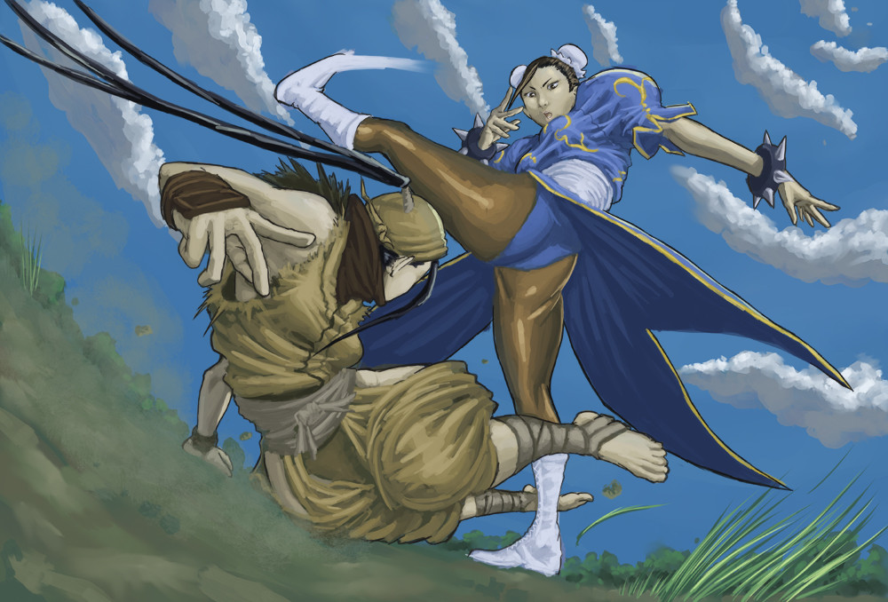
Done for The Street Fighter Tribute contest, but didn't make the cut, so that means I can show it here.Congrats to the winners.
Ah, well, just means I have to work even harder. 'Still got a long way to go.
Street Fighter characters belong to CAPCOM.
This piece took a noticeably shorter time than the last one. For this one, I tried fusing my old style with newfound techniques...
Don't know how effective it was.
Related content


Comments: 9

dont know how this didn't make it in dude, i own the book and this is better than a lot of the entries in there....
great work.
👍: 0 ⏩: 0
dont know how this didn't make it in dude, i own the book and this is better than a lot of the entries in there....
great work.
👍: 0 ⏩: 0


ibuki is a lucky girl
this is awesome funny her rival was makoto
but this is original
👍: 0 ⏩: 0

Hi Dash,
Your piece made it through the first few rounds as we filtered through submissions but, unfortunately, didn't make it all the way to the final pieces in the book. Hopefully we'll be able to include it on a fan gallery page once our new Street Fighter comics get rolling later this summer/fall.
All the best,
UDON
👍: 0 ⏩: 1

Ah! Thank you very much. I appreciate it (because you really didn't have to let me know...). Regardless, I look forward to reading the next round of Street Fighter comics. You guys rock!
👍: 0 ⏩: 0

i feel that there's a lack of intensity in your color choices and it really leaves a lack of focus in the illustration, especially in a scene that is in broad day light with a blue sky. the reflection of sunlight would be very intense in some areas, even on clothing or skin.
Value wise, it seems like you have a lot mid tones albeit in color. There is no real ultra-dark value that catches the eye. The exception is in the hair of the character who's name i don't know ( i don't recognize the character that Chun Li is fighting), but even in that position, the area of dark value is so minute that it scarcely draws attention. The areas of light value hardly give off the impression of brightness due to the atmosphere around those areas created by the more mid-tonal colors surrounding them. I put the image in grayscale in photoshop, and i noticed that the sky and earth aren't that different in value, which kind of weakens the foreground in a way.
As a result my eyes have a hard time finding a focal point aside from Chun Li's massive legs.
Individual components of the drawing are well done, but as a whole, there's something that fails to bring the composition together.
👍: 0 ⏩: 1
I see... Thanks, Cheese. Looks like I was able to learn something from this after all.
👍: 0 ⏩: 0
