HOME | DD
 Dash-X — Mega Man Tribute Entry
Published: 2011-04-21 17:05:07 +0000 UTC; Views: 6804; Favourites: 234; Downloads: 2
Redirect to original
Description
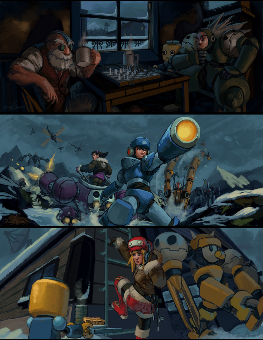
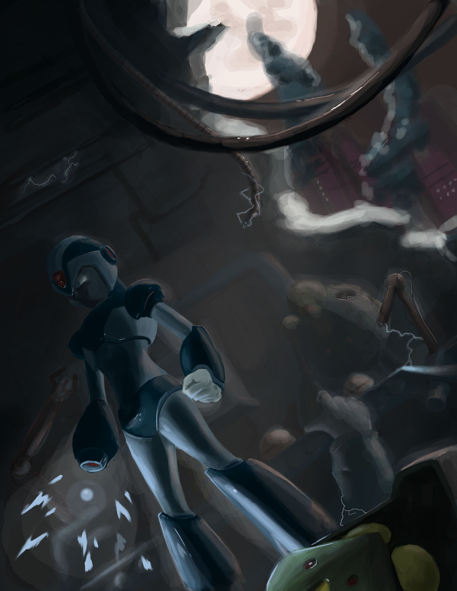
This is the triptych I submitted for Mega Man Tribute a long time ago. You're seeing it here, which means that I didn't make the cut.If you're reading this, please do me a favor and provide critique in the comments (as my DA subscription seems to have run out)... It seems that I still have a ways to go ('gotta work even harder). Thanks.
Congratulations to those who made it in! I look forward to seeing the Mega Man Tribute book.
Related content


Comments: 24

And Tiesel has no abdomen, only torso and pelvis, maybe that too....
👍: 0 ⏩: 0
Critique? The angles, lighting, poses, expressions, composition, atmosphere, ALL is great!! I guess that this didn't make it to the book only because Rock, Roll and Tron look way older! The girls are 14 and 15 in the games.
👍: 0 ⏩: 0


those bastards ")
👍: 0 ⏩: 0


I really don't see that much wrong with this. Trigger's pose and face maybe, but otherwise I really like this piece. Gives off the feeling of a winter evening.
👍: 0 ⏩: 0

this picture is amazing, i think i especially like the top with tiesel and barrel playing chess with each other
👍: 0 ⏩: 0

I definitely think the top panel is best and here's my critique and why I think that's true:
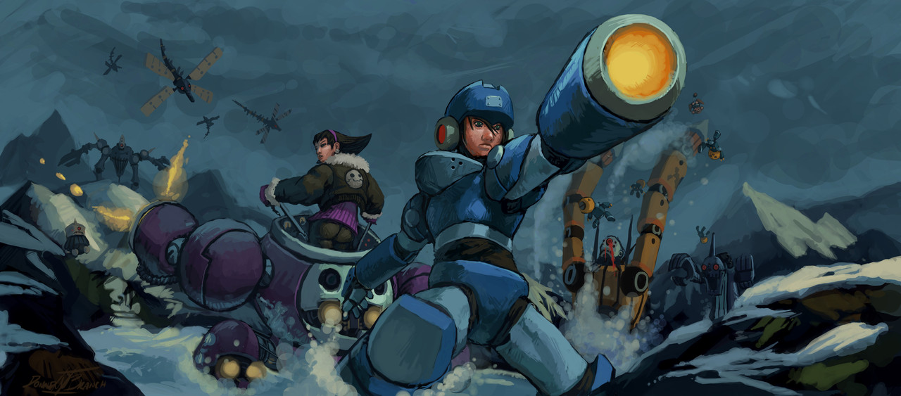
The lighting in the top panel makes more sense than the lighting in the bottom two. It makes more sense for a night scene inside a house to be as dark as it is. I think you could just get better results by turning up the brightness and contrast in your drawings. They always seem dark and muddy. It might be your monitor - always try to check your drawings on someone else's monitor. I actually ran into this just yesterday with a picture I was drawing where it just ended up being too dark. There's easy fixes for stuff like that. You may need to go back and retouch stuff to account for the extra light, but the extra effort is usually worth it. Also Mega Man's chest seems backwards. I'd maybe have his hips twisted the other way to accommodate for the rest of the pose. I think your draftsmanship is fine, I just think you need to work on varying your colors a little more. Try doing a picture with a wild color palette to try to free yourself of old habits. Try using blue as a base instead of gray or brown. I think you've done a great job of improving your drawing skill, but maybe try doing something a little more stylized. And maybe, more than anything else, try not to think about it too much.
👍: 0 ⏩: 1

Whoa! Haven't heard from you in a while! How are you doing these days? Thank you very much!
👍: 0 ⏩: 1
I'm pretty well! I'm working on an educational children's game, and learning the basic rules of game design. I somehow wound up being their level designer? Living on the northside with my gf. Also, upon second reading, I think I may have came across as a little harsh or terse. I really do think you're making the right strides in basic draftsmanship.
👍: 0 ⏩: 1
It's good to hear that you're doing well.
"Harsh?" "Terse?" Psh! Don't worry about it, man. It's much appreciated. It was good critique, and quite valid. When I read it, my first thought was "Classic Ian." There was something very "you" in the critique; and I don't fault a man for being himself -- especially if he's got a point. Besides, if I couldn't take criticism, I'd have no place in this business.
Level design, eh? You'll have a pretty good time. I certainly hope you're not gonna be making it too easy for those youngsters -- part of learning is learning to deal with adversity after all.
👍: 0 ⏩: 0

a little work on nose size, but other wise awesome! Love the barrel and teisel chess game!
👍: 0 ⏩: 0

epic !
seeing this makes me wish they would make the new game on the PS3
👍: 0 ⏩: 0

The style is different of what I'm used to.
I like that they're getting along. I don't know squat about chess, so I can't tell who's winning.
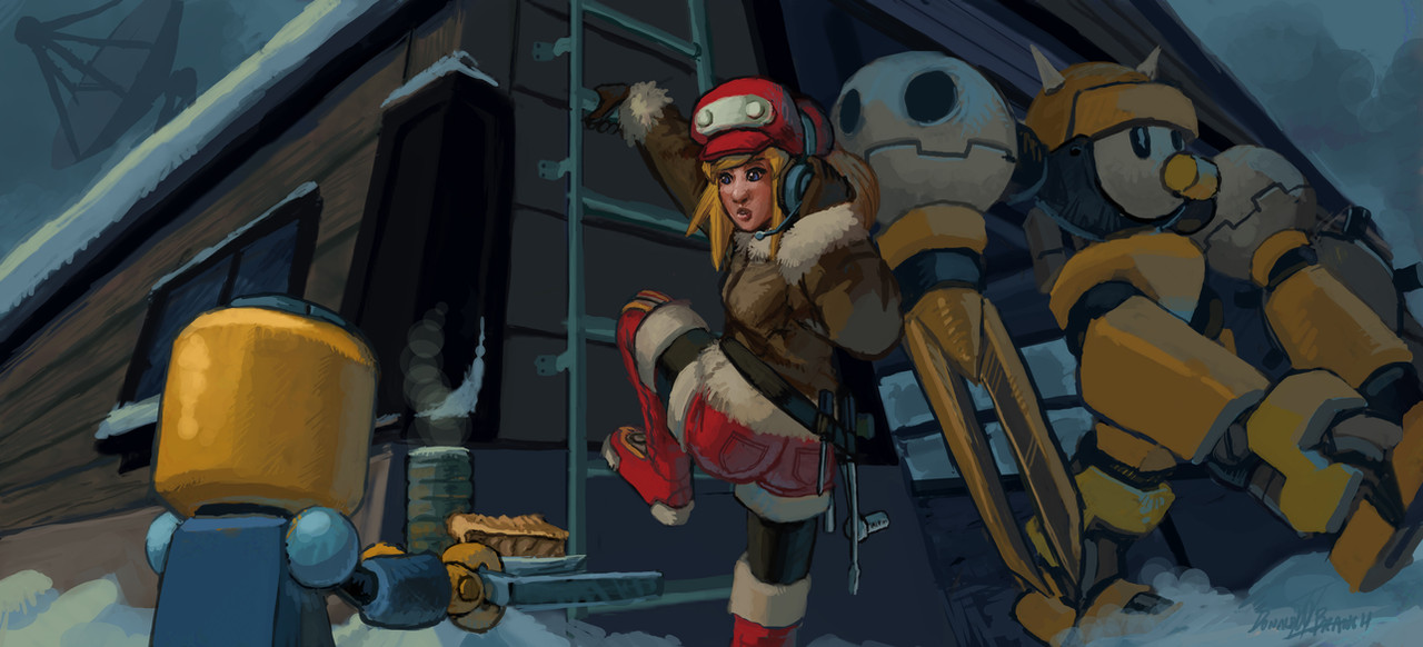
I like that you had the creativity to dress Tron in a different outfit, even if it is a jacket. Most people have limited visions and don't see her beyond her standard outfit or the lab coat.
I just noticed the Lake Jyun reaverbot's eye is bleeding... and that a shockwave is coming.
I even like the Servbot bringing Roll some pie. I'd always thought she'd be wearing a smaller headset, but then I remember that they use ancient technology there. Not ancient by our standards but ancient nonetheless. I dig the tools hanging from her belt.
Now I'm wondering how Bon got that Sharakurusu arm.
I think you could've made their noses a bit smaller, but that's just me.
👍: 0 ⏩: 0

The middle pic, I cant help but feel like it would greatly suit some end of the world event, where rever bots are popping out from every corner of the earth, leaving every pirate, bounty hunter, digger, and so forth to join forces and fight in a final last stand.
Regardless, awesome work.
👍: 0 ⏩: 0

This is an excellent entry! to bad they didn't accept it. You got the feeling of the game greatly!
👍: 0 ⏩: 0

Even if tottaly out of the usual cartoon/manga/anime style that Legends is.... it's not half bad.
I raelly imagine all of those situations happening, the raverbots look cool. Bon Bonne himself looks very detailed (i'm not so sure about that.. weapon?). And Berrel and Tiesel playing chess really seems a plausible scene.
But Megaman's armor does not have a collar that big and I'm not so sure about the Gustaff... I never liked the Vs. Capcom Gustaff they made.
👍: 0 ⏩: 0

Hello! You know, I'm running a downloable fan artbook with all those entries that were rejected by Udon. Would you like to join us? You can read more about it in my journal: [link]
👍: 0 ⏩: 1
Sure, what do I need to do?
👍: 0 ⏩: 1
nothing!! I'll just add this pic to the project folder. (Smile)")
Thanks for join us!
👍: 0 ⏩: 0

The piece looks great itself, although a bit more color meshing would be better in therms of making the colors look a bit cooler. Then again, you used this to mark distance, like having those further meld more into the background by having colder colors. Of course, perspective looks great. My only complaint would be Trigger's pose, which looks a bit unnatural to me. Mostly because I can't figure out just how he's standing/turning/etc. I'm not quite sure how you tried to pose him, but it's not clear on how he's turning like he is.
I like the contrast between indoors and outdoors, but it's not too noticable because, as I said before, the foreground characters don't meld in as much as the characters further in the background, as they have more 'neutral light' colors.
All in all, I actually liked this piece a lot, as well as the general idea. It gives a nice feel of winter, with the first and third being peaceful, and the second being that of battle.
A small comment, but on Trigger's buster, more light could be eminating from it. Just a thought.
👍: 0 ⏩: 1
Thank you very much! This was helpful. Now, I know what to work on in the future.
👍: 0 ⏩: 1

This is awesome !!
Everyone's in the in their right situation ... love it
👍: 0 ⏩: 0