HOME | DD
 DDrDark — midtone redesing BETA
Published: 2009-03-19 11:13:14 +0000 UTC; Views: 39601; Favourites: 409; Downloads: 1456
Redirect to original
Description
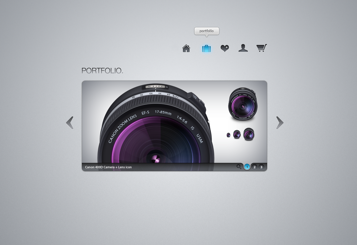
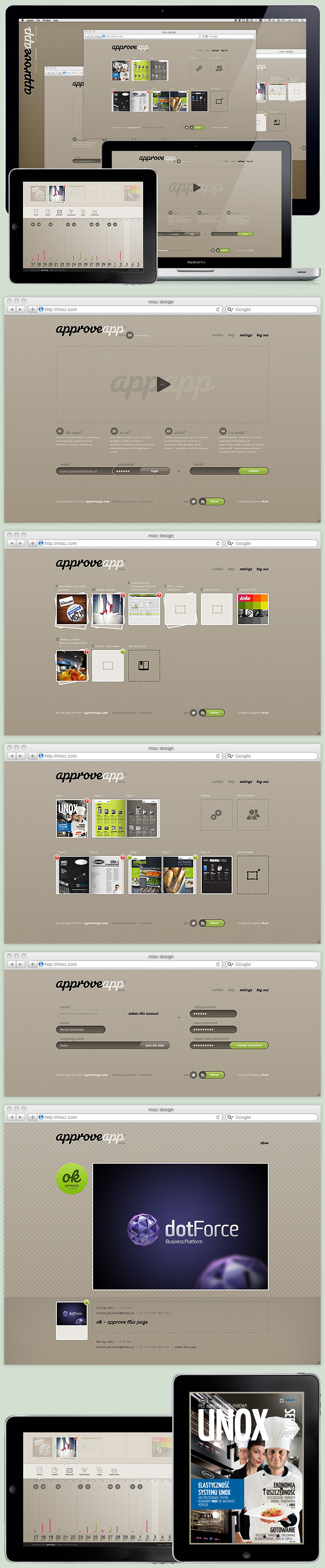
Redesign of my portfolio. Work in progress (beta)Related content


Comments: 69

is there a way to have the colored part of the camera, lens?
👍: 0 ⏩: 0


clean and lovely (Smile)")
👍: 0 ⏩: 0


Ah! I didn't know it is your website! I visited it a few months ago and enjoyed it (and its content) much!
👍: 0 ⏩: 0

yeah, it's a bit similar with the "applestyle".
I love the simplicity. Sometimes it's harder to design minimal as to design with 100 effects.

👍: 0 ⏩: 0

really nice. colours, atmosphere, minimalism, all...
i like it.
👍: 0 ⏩: 0


Nice, that's one of the sleekest designs I've seen so far! ")
👍: 0 ⏩: 0

nice one, but I thought the icons are made by you...
check this out : [link]
👍: 0 ⏩: 1

ARE made by me, those icons sucks
👍: 0 ⏩: 1
well, i can't see any other icons similar to yours except the home and portfolio ones, so I give you credit
Anyway, you must admit, those two ones look pretty similar
👍: 0 ⏩: 1
LOL, similar in what aspect? They look really bad...
👍: 0 ⏩: 1
well, the shape of the house and of the suitcase
Actually, apart from your polished aspect and inner glow, they look quite similar IMO, no offense
I do agree however, that yours' are better  (Wink)")
👍: 0 ⏩: 1
It's a typical shape man... I didn't polished those... I just did mines
Thanks
👍: 0 ⏩: 1
You got me wrong, I didn't say you polished THOSE icons, I said yours look more polished, meaning you paid a greater attention to detail when creating them
Cheers!
👍: 0 ⏩: 0

This is really nice man, simplistic and stylish at the same time.


👍: 0 ⏩: 0


Que buena pinta tio. Me gusta especialmente la transparencia en la parte inferior del pop up y los botones para elegir la imagen.
👍: 0 ⏩: 0


Mmm, the navigation is kind of ripped
[link]
Also the content slider is kind of the same idea.
But I still think your version is nice
👍: 0 ⏩: 1
lol xDD, so all the website that have icons for the nav bar and slider are rip?
thanks man
👍: 0 ⏩: 1
Well, its not 100% ripping, but its not very likely a coincidence, don't you think.
I'm not "mad" or anything like that ")
👍: 0 ⏩: 1
Well there is a significant difference between rip and inspiration.
I'm sure that I saw the website of Alex Buga before, but I wasn't designing mine watching at his. I barely remember it until you linked to me.
I just have done my ideas with my style. And of course all the gallery is mine and I'm always doing my own things
So... there isn't any bad feelings because there isn't a cause for it. I have my conscience in peace
👍: 0 ⏩: 0

I think the glow effect on the buttons is incomplete and could use some more work.
👍: 0 ⏩: 0


I really love the minimalism on this one. Great portfolio design

👍: 0 ⏩: 0


I love your style. if I had the money I would pay you to do a website for me
👍: 0 ⏩: 0


your idea is close to alexbuga.com
the implementation might be helpful to you
👍: 0 ⏩: 0


| Next =>