HOME | DD
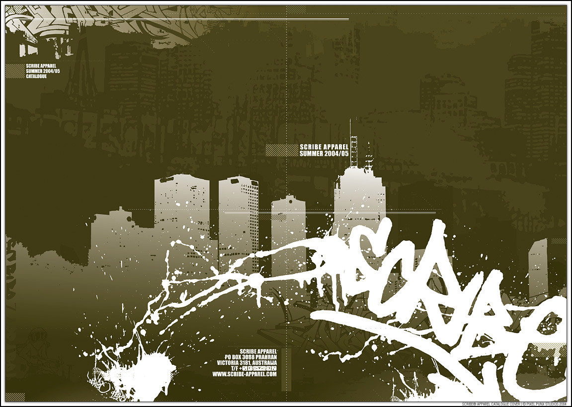
 Delicious-Daim — Nibris interface

Published: 2006-04-12 21:37:41 +0000 UTC; Views: 9628; Favourites: 72; Downloads: 1576
Redirect to original
Description
[link][link]
Related content


Comments: 55

pretty kickass, but the antialiasing on the pixelfont on the menubar gets slightly anoying.
👍: 0 ⏩: 0


czcionka w menu i mapki niewycentrowane w pionie (IHMO z centrem lepiej by wygladaly), troche szaro .... wektory jak zwykle mistrzowskie xD
👍: 0 ⏩: 0


i was just wonderin if i could pick your brains about this web page. if ya got time to chat drop us a note. cheers.
much appreciated! Ad
👍: 0 ⏩: 0


very abstract cool design
looks like it would make a very good anti-political website...
👍: 0 ⏩: 0

powiem ci z emyslem z ebedzie wiecej wodotryskow wiecej ruchomych elmentow a jest nie liczac lewej strony ubogo;/ , to sie jesszcze zmieni czy ostateczna wersja???
👍: 0 ⏩: 0

very interesting...
cool veks as allways
i m looking forward to see the finished site
👍: 0 ⏩: 1

its finished already, but needs some updates. check it: [link]
👍: 0 ⏩: 0

Świetna rzecz: nie wali sztampą ale jest czymś oryginalnym. Dodatkowo świetnie dobrane wektory po lewej + samolociki. Jak to mówia amerykanie: gotta love that
 (Wink)")
👍: 0 ⏩: 0
good interface dude. got me thinkin for my site. aircraft might be over type area too much. f44kin shit hot! did you draw the character yourself or is that a dumb question?
👍: 0 ⏩: 0

Interesting design.
Would be nice to see it finished.
👍: 0 ⏩: 0

would've been nice for the content to be shown but i havent seen a 2d website thats this good in a longggg time ")
👍: 0 ⏩: 0


looks so far good... i would work the content part to see how the info is going to be display...plus the menu..but it's looking great so far, this would look awesome in flash....
👍: 0 ⏩: 0

hmmm, the headbar seems too complicated. Would be nicer if it was simplified a little? I dunno what company nibris is so can't access the suitability of the graphics.. erm but i suppose the dark grey shapes can be minimised so the 3 blue streaks start nearer the corner of the page? and could make the rising guy above the same dark grey silhouettes more detailed and less vague... other than that, the colours are okay. (: the striped background is nice, and the grey tones with white are quite cool. and perhaps consider adding something at the left bottom corner? looks abit lonely.. hahha. Yup, mainly its the header that's too complicated. Maybe keep it to 3 rows would be cool. Heh. You wanted to hear opinions.. so hope I've provided useful feedback!
👍: 0 ⏩: 0

wow, too much!
i don't like these kind of interfaces, my personal opinion offcourse
👍: 0 ⏩: 0

i would change the color of he blue lines cause i think it stands out so much
👍: 0 ⏩: 0


hmmm...looks kinda unsharp in a way. is it all photoshop?
👍: 0 ⏩: 1

The design is pretty cool but the colors are a bit dead. If that's your aim then it's fine. But if not, add some color to it.
👍: 0 ⏩: 0

Change the blue lines so they look like they are glowing with the blur tool..it would make it look better.
I can see this more on a weatsticker or something not on a website..bit busy for my liking for a website..unless it is a portfolio though.
👍: 0 ⏩: 0

czlowieku dizajnerskie niebo! ty nie potrzebujesz ocen bo doskonae zdajesz sobie sprawe z wagi wlasngego talentu! idealnie!
👍: 0 ⏩: 0

Very good layout man...
I love the tones, shapes and forms, but I don't like the top, sorry, I think that need more...
good work bro...
👍: 0 ⏩: 0


looks so owning! very nice webpage and very creative! did you made everything with illustrator or did you also traced some parts?? example : how did you made those wings on those planes! very nice! maybe do something more with the buttons?
👍: 0 ⏩: 0


As cool as the plane things look, I think this layout would look better without them. It would make the interface more balanced, and allow you to enlarge the 'screen' so more information could be put on it. I do like the stuff across the top though, and the white outline to the pilot.
👍: 0 ⏩: 0


Zgodze sie co do byt mocnego gradientu na dole. I troche maly jest wlasciwy obszar gdzie bedzie tresc na stronie. Poza tym - ma swietny klimat :] Taki oldskul/hardkor
")
👍: 0 ⏩: 0

elo, nie podoba mi sie jedna rzecz  (Smile)")
👍: 0 ⏩: 0


i think its needed to include more bright elements - (orange, cian)
👍: 0 ⏩: 0

lookin good - nice button/link space, curious about content flow around that ship (I love the ships)... this is damn solid.
👍: 0 ⏩: 0

would prefer more white outlines at the bottom?
the graphics are awesome tho!
👍: 0 ⏩: 0


I forgot! I don't know if you knew about this, but the space you left for the info is located exactly were the human eye has more attention when looking at something, so you won't be getting any trouble with the images around it... jsut try not using fonts smaller than 8pts.
Hope I helped
👍: 0 ⏩: 0
Love it... I don't really think you should give 'more space', per-se, to the information. Nowadays to pay attention to something it should look nice... and this looks awesome. Still, i hope you're not getting toys or candy information into it
GOOD JOB!
👍: 0 ⏩: 0


SWEET< i have no idea what it would be used for but the compotion is AWESOME
👍: 0 ⏩: 0

| Next =>