HOME | DD
Published: 2010-01-06 00:47:42 +0000 UTC; Views: 13822; Favourites: 115; Downloads: 430
Redirect to original
Description
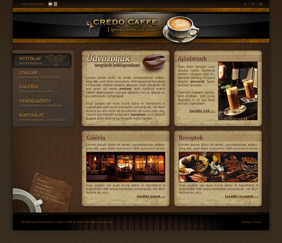
Software: Photoshop CS4Font: BerrysHand ; 04b03
Icon: Old school by Babasse
Texture: [link]
Photo: [link]
Inspired by: [link]
...
Related content


Comments: 69

")


I really like the effect with the chains on top and the globe :] Beautiful details :]
👍: 0 ⏩: 1


Perfect design for that picture.
Quite the way I would have made it, too, of course.....
")
👍: 0 ⏩: 1
detrans In reply to igryk [2010-01-07 00:07:26 +0000 UTC]
... or a perfect picture for that design : )
-thanks
👍: 0 ⏩: 0

Interesting layout and colors. I'd be careful with the icons at the bottom though since they overlap the text; if you want the website to be functional, the users have to be able to read the displayed information. One thing that could also be better are the textures used in the brown background; I'd make them softer and more realistic, especially in the top left corner. I think that part of the background contrasts too much with the right side which definitely looks better. I like the way the information is displayed. Overall a good design.
👍: 0 ⏩: 1
detrans In reply to vervex [2010-01-07 00:05:29 +0000 UTC]
thanks for ur long comment,
you can position the icons in a functional site, this is just a layout...
... but, you're probably right with the background thing.
👍: 0 ⏩: 1
You're welcome. Just trying to help  (Smile)")
👍: 0 ⏩: 1
detrans In reply to vervex [2010-01-07 04:01:37 +0000 UTC]
thanks,
comments helped me to fix some issues, please check back again - it's updated
👍: 0 ⏩: 1
Oh wow I see! I like the chain addition at the top and the hanging globe
👍: 0 ⏩: 0

detrans In reply to alldee [2010-01-06 21:30:32 +0000 UTC]
thanks,
no, it is the "Old School by Babasse" icon set
👍: 0 ⏩: 0

Very nice, great use of texture and typography.
👍: 0 ⏩: 1


yeah, this is nice and clean
👍: 0 ⏩: 0


The textures and colors are indeed great, but i think the icons are to shiny and bright. Also they should not overlap the text. Great concept but it needs some improvements, keep up!
👍: 0 ⏩: 1
detrans In reply to gdpr-12449088 [2010-01-06 21:20:16 +0000 UTC]
thanks,
icons: I don't mind mixing shiny and matte
overlap: this is only a layout...
👍: 0 ⏩: 0

The font of main menu seems to be fine, but the font for description makes it unreadable. Other than than it doesn't need any change, great work mate
👍: 0 ⏩: 1
detrans In reply to umar123 [2010-01-06 21:27:50 +0000 UTC]
thanks umar123,
do you think the description font should be changed?
👍: 0 ⏩: 1

Thats an really interesting style. I love the style of the navigation and of the headline. Textures and Icons work fine here, the only thing I dislike is the pixelfont you used.
Good job overall
 (Wink)")
👍: 0 ⏩: 1
detrans In reply to deadlinesdesign [2010-01-06 21:21:26 +0000 UTC]
thanks,
what font would you recommend instead of pixel?
👍: 0 ⏩: 1
Not really sure, maybe Museo.
👍: 0 ⏩: 0

good work my dear
u choose the tools of photo & icons to the color very well
👍: 0 ⏩: 1
detrans In reply to fewela [2010-01-06 21:24:21 +0000 UTC]
thanks,
I tried to select the elements match together
👍: 0 ⏩: 0

")
| Next =>