HOME | DD
Published: 2010-03-16 08:03:27 +0000 UTC; Views: 82131; Favourites: 481; Downloads: 3724
Redirect to original
Description
Tutorial: [link]Software: Photoshop CS4
Fonts: Helvetica ; Helvetica CY
Icons: [link]
Photo: [link]
Colors: [link] - my mix
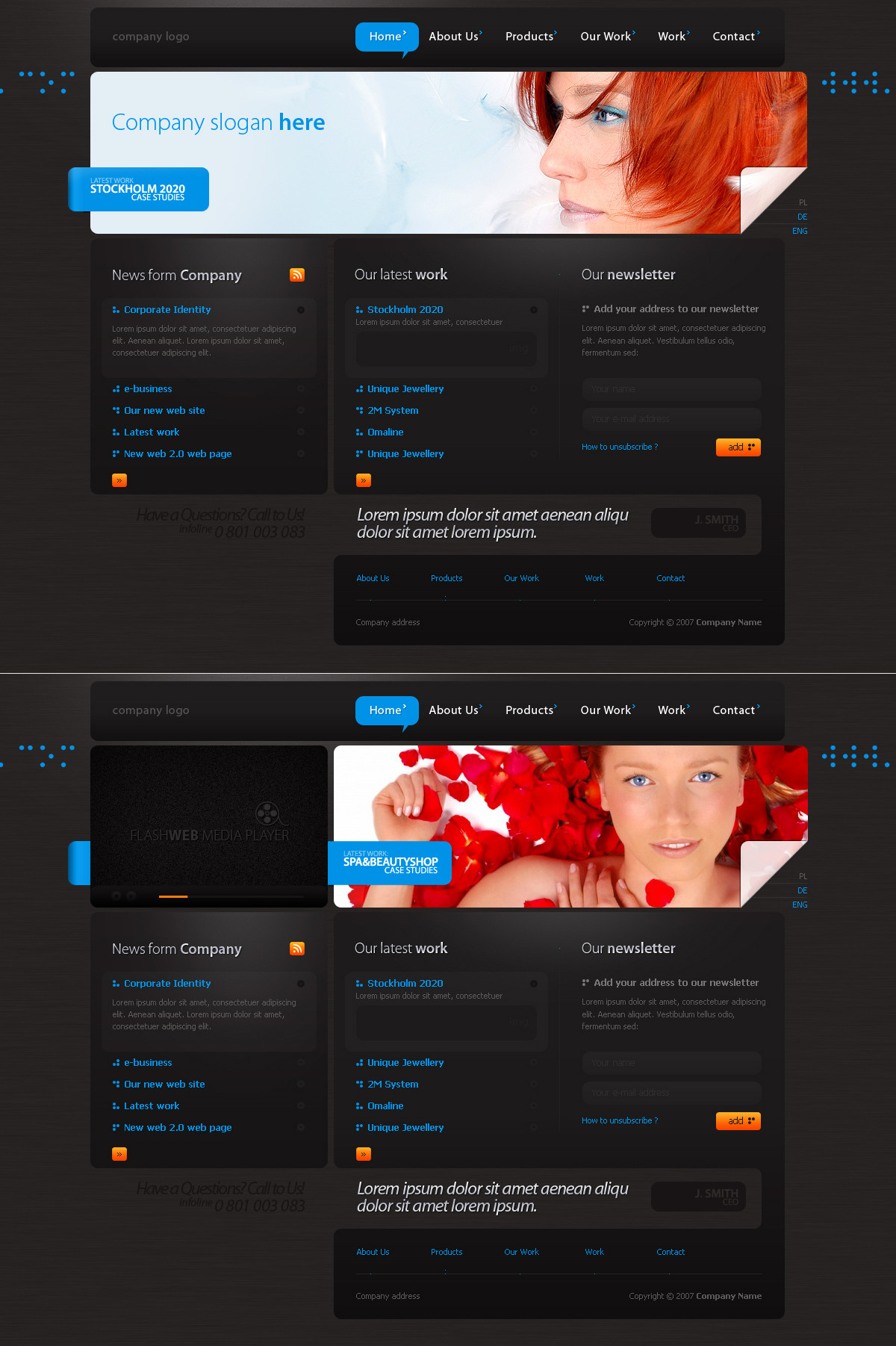
Description: Clean Web 2.0 portfolio layout for illustrators, but could be used for any design services.
...
Related content


Comments: 109


 (Wink)")


 (Smile)")


detrans In reply to TheArtofDesigning [2011-06-29 15:54:45 +0000 UTC]
1300x1500px
tutorial:
[link]
👍: 0 ⏩: 0


This is a very beautiful web interface. The design breathes, the colours are calm! haha, latin (it does the same in Justin's yearbook avenue). The only thing I don't like is the portfolio headers at the end of the page. It should look like the end of a page, not like the beginning. Oh, also, you don't have to put the Mac controls on the gallery pic's (leave them if you're a big Mac fan). It distracts from the artwork. Great job! I would join your illustrator's site!
👍: 0 ⏩: 1
detrans In reply to NayDug [2011-04-08 13:17:51 +0000 UTC]
thank you,
the free psd if you need it: [link]
👍: 0 ⏩: 0

")


Hello!!!
I think it's a good work. It's a good inspiration.
Greetings
👍: 0 ⏩: 2
detrans In reply to mikihiro [2011-01-28 16:13:08 +0000 UTC]
Hello!
I am glad you liked it...
👍: 0 ⏩: 0


Good work I like header.....
Check my friend's work
[link]
👍: 0 ⏩: 1


Your work have been featured in my blog [link] take a look to see all the other fantastic artists that were features along with you.
👍: 0 ⏩: 1

I love this interfase!! clean and comfortable!!

👍: 0 ⏩: 1


Hi, its a good attempt to make it clean.
But do take note and put yourself as a visitor whom knows nothing abt you or your website:
The biggest problem i feel is the "view more" buttons for every "category". They are out of place, dun seem to be related to the "content/category" it supposed to link to; and i'm not sure if its the best position to put the "view more" above.
Another thing, your 2nd menu at the bottom, should be inverted, so that it seemed to "stick" to the main content above. I was wondering if thats a 2nd webpage screenshot or what - its misleading and poor design/gui-wise.
Good try though, but alot of improvement needed if you want my honest opinion. =}
👍: 0 ⏩: 1

Sleek indeed. Very clean and professional looking. I like it.
👍: 0 ⏩: 1


| Next =>