HOME | DD

DevJohnson β€” Barbarian Bannerman

Published: 2014-02-07 16:48:07 +0000 UTC; Views: 3375; Favourites: 112; Downloads: 23
Redirect to original
Description

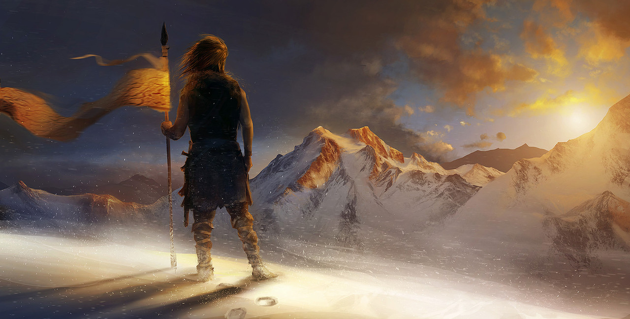
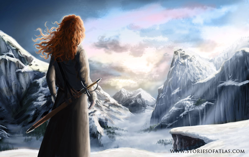
A proud barbarian warrior stands tall and holds the banner of his clan, gazing upon the sun, setting over his ancestral lands. Chill wind blows, snow drifts and covers his footsepsΒ 

A personal work for my portfolio. Done in photoshop around 8 hours with Jonas deRo brush set I've been working with lately. Seems it does it magic. No phototextures used, except the pattern on the banner. Everything else is hand painted Β 


First piece im a long long time that I am sort of happy with Please enjoy! As always C&C muchly apreciated!

Related content
Comments: 11

mawigator [2023-12-23 16:39:05 +0000 UTC]

πŸ‘: 0 ⏩: 0

Raakone [2014-11-19 03:24:20 +0000 UTC]

Nice picture here! Love the lighting!

πŸ‘: 0 ⏩: 0

LotsOfLowe [2014-03-08 19:32:21 +0000 UTC]

Great job!

πŸ‘: 0 ⏩: 1

DevJohnson In reply to LotsOfLowe [2014-03-12 14:56:09 +0000 UTC]

Thank you

πŸ‘: 0 ⏩: 0

ScurvySimon [2014-02-11 06:29:17 +0000 UTC]

I love the lighting in this, it works really well especially with the minimal colour palette. Β The blowing snowflakes really add to the atmosphere too. Β Nice work.

πŸ‘: 0 ⏩: 1

DevJohnson In reply to ScurvySimon [2014-02-12 12:57:39 +0000 UTC]

Thank you for the kind words!! Dunno why, but it always come out for me in warm colors, especially orange-ish hues seem to be my favourites. Good for sunsenst Β 


πŸ‘: 0 ⏩: 0

Jacob-Cross [2014-02-09 03:25:22 +0000 UTC]

I like the lighting effect

πŸ‘: 0 ⏩: 1

DevJohnson In reply to Jacob-Cross [2014-02-10 12:45:48 +0000 UTC]

Thanks Β 

πŸ‘: 0 ⏩: 1

Jacob-Cross In reply to DevJohnson [2014-02-11 03:46:24 +0000 UTC]

Your welcome

πŸ‘: 0 ⏩: 0

rhezM [2014-02-08 17:21:18 +0000 UTC]

I know the flag is supposed to be affected by the wind, but it looks a bit odd to me. and the pattern doesn't seem to follow the way the flag waves imo.Β 
other than that, it's a great work.Β very stunning & impressive!

πŸ‘: 0 ⏩: 1

DevJohnson In reply to rhezM [2014-02-08 21:47:20 +0000 UTC]

Thanks! You certainly have the point about the banner. I've added it as a part of composition, while I re-positioned the figure to better fit the golden ratio. Maybe it's behaving a little unnaturally, but I wanted it to continue the reading line of sunlit peaks, so I've stretched it to reach outside the frame. It also serves as a contrast to the figure, drawing the attention to the left-center, and allowing the viewer to continue towards the setting sun. I sketched it about two dozen times in different waves and twirls before setting on this one, but it doesn't mean I was happy with it, so you're probably right. Thanks for pointing it out Β 

πŸ‘: 0 ⏩: 0