HOME | DD
 diablo2003 — Pin-up step 3 tutorial

Published: 2011-08-08 20:28:20 +0000 UTC; Views: 54093; Favourites: 819; Downloads: 1090
Redirect to original
Description
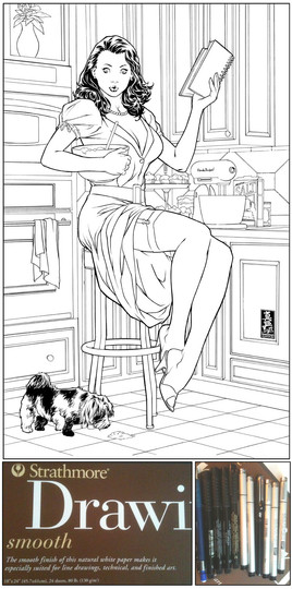
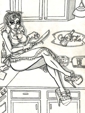
I was commissioned to do a piece for a client recently and they asked for a pin-up style woman baking ( it ended up being a gift for his wife). I decided this would be en excellent opportunity for a tutorial on how I go about doing my marker rendered pieces. This is the second in 4 steps and all will be posted separately so, if you would like to see the rest of the process, please check out the following links to the other Deviantart entries. Step 1: [link] Step 2: [link] Step 4: [link]STEP 3:
Now's where the fun begins but first you need to scan in your linework as a safety measure. All it takes is one bleeding marker or a badly rendered face to make all the hard work leading up to the step a waste of time. If you have a scanned copy, you might loose the original linework but you can still print out a linework copy and begin rendering again. Luckily, I didn't have to on this piece as the rendering worked out the way I wanted.
For my marker rendering I like to use Copic markers. These are markers from Japan and I find they blend better than any other marker out there. They are also refillable so you don't have to keep buying new markers over and over again as the ink runs dry. These can be difficult to find in the states especially if you are outside a major city so check online as there are a ton of online venders that offer the makers and refills. Here's their main website: [link]
Copic makes markers in all colors but I prefer to render my artwork is warm and cool grays. This is mainly because I will be coloring the piece in photoshop so color is unnecessary in this stage. Warm gray will have a slightly brownish hue and I use them to render anything that would be a warm or hot color where the piece is full color. This includes anything that is brown, red, yellow, or orange like the cabinets, the cookie, dough, the baked goods behind her, and the wall and tile. I also use these to render her face and skin. The cool gray markers have a slightly bluish hue and I use them on anything that would be a cool color in full color. The is anything that would be blue, green, or purple. This includes her dress, the oven, floor, dog, stockings, blender, and ingredients.
Lets address the face as our example here but realize I use the same technique throughout the entire piece. I begin by laying down a solid layer of my lightest marker(in this case warm gray-W1). Before that has a chance to fully dry I go in with a warm gray W2 marker and begin adding the shadow areas around her nose, eyes, cheeks and forehead. I'll repeat this gradually moving up darkness in markers with each area until I get the rendering like I like it. For the nose and cheeks I usually stop around a W4 marker while the eyes go as far as a W6 and the lips all the way to W8. I repeat this rendering technique on all the other areas that require warm gray while varying up the darkness of the markers. I then grab my cool gray markers and repeat it with all the things that are a cool color. I reference a lot of photos of real life women in dresses to get the shading on the folds right as well as the contours of her skin and body.
Copic markers are very much like watercolor paint in that they are a wet medium and you are relying on the markers ability to bleed into itself to blend your shadowing. Just like everything else, markers are a tool and owning them won't mean you can automatically use them. It takes lots of practice and patience so start practicing and you'll be rendering like a pro in no time.
Once my markers are all laid down I proceed to the highlight portion of this step. This is where I'm going to add the the little highlights that make the piece really pop. For this I use a white Prismacolor pencil and a Uni-ball Signo white pigment pen. This pen is indispensable for me because it lays down a super fine line of very opaque white ink. It basically gives me the look of using white ink and a brush with the control of a pen. I use this on areas where I need a sharp white highlight like the shine in her eyes, the tip of her nose, her lips, the dogs white fur, her pearls, The blender, The metal legs of the stool and some highlights on the stove. I also render the lace on her bra and slip with this to get the little details correct. For the more gradual highlights I use my Prismacolor pencil. This includes highlights on the stove, her skin and face, the cabinets, the blender, and some slight reflections on the tile floor. If done correctly, this is going to make your artwork leap off the page and add a ton of dimension that your markers couldn't achieve alone.
Once I am finished and given plenty of time for all the markers and white paint to dry I scan the piece into my computer at 600 DPI in full color. Next up is to color this puppy up in photoshop so check out the next step to see how she turns out!
Hope you dig!
Best,
-Mark
Follow me on Twitter: [link]
Related content
Comments: 25

"I reference a lot of photos of real life women" hahaha I bet you do
👍: 0 ⏩: 0

Hey, man, I seriously owe you a beer or a coffee or something for the tip on the Uni-Ball Sigmo pen. I've searched for no less than two years for something better than these Gelly Roll pens (which are awful). I immediately ordered 3 from Jetpens.com and they arrived today. They're absolutely perfect. Can't stop gushing about 'em. Even wrote a journal about them 
👍: 0 ⏩: 0

Wow!!!! This is something I have to try. Thank you.
👍: 0 ⏩: 0

My dad uses copics too! Your art is beautiful, by the way. This is a prime example of why I will always respect traditional more than digital art(which I love as well)
👍: 0 ⏩: 0

Wow, this is so great. I love the colors. 
👍: 0 ⏩: 0

Nice work. I also like the most complete one you have, but this here fits more with what I can do with my hard colored pencils.
👍: 0 ⏩: 0

just a possibly dumb question, can you use the copic markers on regular computer paper?
👍: 0 ⏩: 0

Looking at the rest of the series, I think this one in particular stands out the most to me. I will definitely need to play with markers more, so I can make my work look this good! As a personal side note, I like how neutral all the colors are at this stage more than the finished piece, but that's neither here nor there.
👍: 0 ⏩: 0

600DPI is extremely hi-res especially at 13"X19". Are you sure you're not thinking of something else?
👍: 0 ⏩: 1

im used to needing to print and have worked more photos- thats why i started moving to working on pencils then going digital. there are guys out there that work @ 1200-1600dpi for posters and the like.i work larger then size down, but since i rarely go over 8", i rarely go past 800dpi. thats the ruler- never size up, and the inches(100) is the maximum optimal output level for a raster
Mind you...its all web based and without a DL the maximum people can only see the equivalent of 150 dpi anyway.
Sorry. That was the one class I was awake thru u.u
👍: 0 ⏩: 0

It's really neat that you go back and forth from traditional and digital! O__O So much patience, and it always shows in every piece you do. 
👍: 0 ⏩: 0

Ha! I'd call this one finished as is! Bee-you-tee-full!
👍: 0 ⏩: 1

Oh, and that's a good job on the "ooh! face"
👍: 0 ⏩: 0

Your final, finished version is gorgeous, but I just adore the look of copics. Ergo, I prefer this one.
👍: 0 ⏩: 0

Oh man... this is amazing. Completely amazing.
👍: 0 ⏩: 0

So beautiful Mark. That would have been one happy client!
👍: 0 ⏩: 0

Cool work and i like how you do the work with copics, amazing way of use it
👍: 0 ⏩: 0

Brilliant work... lots of useful details in how you work. Very inspiring!
👍: 0 ⏩: 0

