HOME | DD
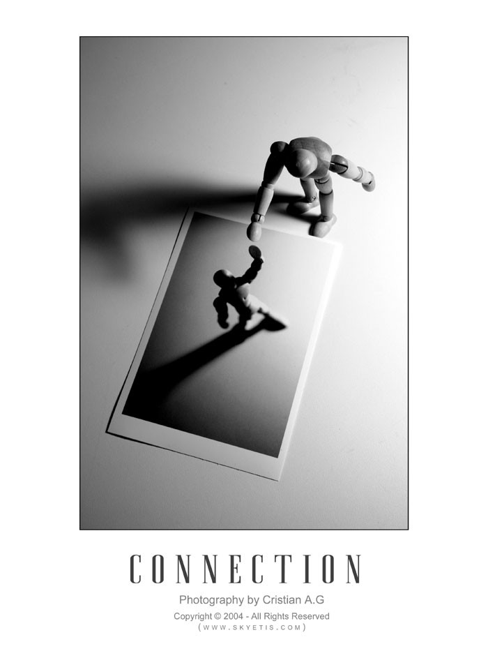
 dinyctis — Connection
Published: 2004-12-27 04:04:02 +0000 UTC; Views: 10654; Favourites: 231; Downloads: 1612
Redirect to original
Description
This was done for my photography class. We had to take images in black and white, highlighting compositional elements such as light, contrast, texture, etc.I've had this dude hang around my room for a while, so i decided to put him to good use. The photoshoot was rather fun, and this is the result. I know it's not the most original idea ever, but i felt compelled to reproduce something like this.
Suggestions: It has been suggested to reshoot and have the 2 shadows point in the same direction. I only realized this when it was mentioned to me. Until then, i just wished that the shadows were more similar, rather than one darker than the other. This can be taken in different ways and even add something to the picture. I will keep these suggestions in mind, along with any that you throw at me in your comments, which are greatly appreciated of course, just like all feedback i get
 (Smile)")
Related content


Comments: 82

Awesome picture. I think the shadows are perfect as they are (:
👍: 0 ⏩: 1

Glad you like it! They've grown on me as well
If I were to shoot it again today, I think the only difference would be better quality in terms of noise
")
👍: 0 ⏩: 0


amazing concept. very well executed. good job, man
👍: 0 ⏩: 0

this one is perfect! i suggested this as a DD..
keep on the good work
👍: 0 ⏩: 0

I love the contrasts and the idea to this... the border, though, rawr. 
Nice work.
👍: 0 ⏩: 0


wow... technical perfection and minimalism. Love it!
👍: 0 ⏩: 0


sorry to write twice but i have fogotten to mention how much i like your icon. This is cool man. nice to see good work.
👍: 0 ⏩: 0
this picture is one of the most impressive that i have seen since a long time. Good work. A really good idea to make this with too shots. 

👍: 0 ⏩: 0


I really like the way you portray emotion in this piece.
Not much more to say... Nothing that hasn't been said already, anyway
+fav
👍: 0 ⏩: 0

Great idea
and also well taken ^_^
The grey colour is nice and gives it a kind of deep... Great job
")
👍: 0 ⏩: 0

very nice composition and contrast, the light is excellent... congratulations!
nicolas
i saw your web page and your photographs are cool!
👍: 0 ⏩: 0

Simple, yet detailed. I really like this one. ")

👍: 0 ⏩: 0


Love this shot man. Fantastic idea and execution. Sometimes I wonder how you come up with half the things you do.
👍: 0 ⏩: 0


HAH...i love it!!!!
i agree the shadow play may be a little better if theye were corresponding with each other
but honestly ..as it stands.....its a great capture altogether
on that note....more i look at it.....if the shadows were aligned the same....i think it would cast an overflow onto the polaroid which to me may adhere to not only the composition of the image..but hide some detail on the figure in the polroid (not sure id have to play with it) and really all depends if you move the polaroid..or the light source etc etc )
but like i said......tis a great idea...and well executed
congrats on a job well done

👍: 0 ⏩: 0


Love it.
Wish it was just a bit sharper though, seems to be a bit soft on the edges.
+favs
👍: 0 ⏩: 0


the composition is great. i think it might even better with the title, and break a bit from the standard form, if the second figure (one on the bottom) was completely in shadow. that's what I saw at first when I looked at this, especially because the arms of the second one have not three-dimensional attributes to them.
it might work better, I am not sure. do whatever you like with it.
👍: 0 ⏩: 0


This is so beautiful! I love the emotion in this piece, it says so much.
👍: 0 ⏩: 0

it makes me think of reaching back to a younger self, perhaps to shed more light on an old darkened situation. this is an awsome piece. a 
👍: 0 ⏩: 0


I liked it very much! I don't mind the shadows are not the same. Actually I like it. It is more organic in some way! But you could do it and we could judge from there!
👍: 0 ⏩: 0

The suggestions would make it that much better...I like the original too though. Nice work.
👍: 0 ⏩: 0


Oh, now I just plain like this. Very well presented too.
👍: 0 ⏩: 0


Aw I love it. It looks like he's trying to save the other dude from a hole or something. ^_^
👍: 0 ⏩: 0

Great idea and execution! The simplicity and focus on the subject here is what i think makes this image a lot more compelling emotionally. Keep going man, you're doing great.
👍: 0 ⏩: 0

It kinda takes on Bell's Everyone is connected commercial. I like it!
👍: 0 ⏩: 0


first class concept.. the lighning is really good as well.
fantastic work
👍: 0 ⏩: 0

Wow, this is exquisite! I think the concept is creative, and you captured it wonderfully. Great job!
👍: 0 ⏩: 0

having the shadows point in the same direction will ruin the composition. the two shadows are wonderful the way they are. if you had them parallel (same direction) it will kill the movement in the picture. keep it
👍: 0 ⏩: 0


| Next =>