HOME | DD
 diosrubra — tutorial attempt 1

Published: 2017-05-05 20:20:53 +0000 UTC; Views: 208; Favourites: 19; Downloads: 0
Redirect to original
Related content


Comments: 21

Really good work. Excellent blending of the pedals and the stalk
👍: 0 ⏩: 1


thank you im glad you like it
👍: 0 ⏩: 0

This looks beautiful so far, but a little touch of some darker tones would help.
👍: 0 ⏩: 1
thank you i shall try and get some in
👍: 0 ⏩: 0

Not bad, I know little of painting, but adding some darker tones might be good.
👍: 0 ⏩: 1
thank you i shall ad to thus
👍: 0 ⏩: 0

")

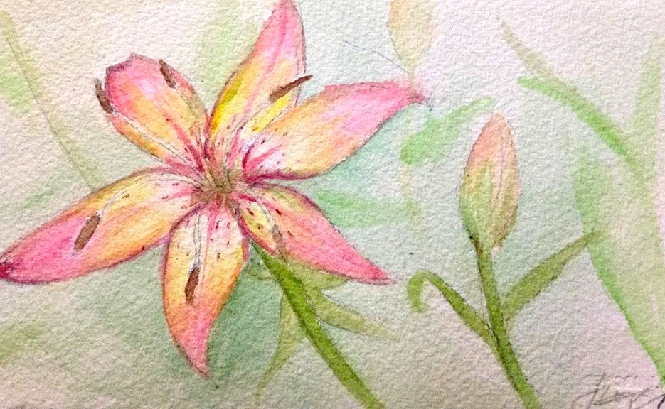
hi jennomat feel free to give me as many pointers as you like this is my first attempt and it failed quite badly lol if you need some help as to where to start i picked up too much colour after trying to get it darker for about an hour layering up very weak colour. then i tried to rectify that by adding water and lifting it which worked to a point i didnt leave any white as the only bit that ended up white after the first mistake was the centre which is supposed to be most in shadow
👍: 0 ⏩: 1

Hi diosruba,
I'm very flattered you tried out my tutorial! And no need to beat yourself up, it's really not bad for a first attempt (watercolours are really hard). I like the delicacy of the petals, that is a very good start.
It is really ok to take your time with adding darker tones. Let the layer dry and only then add another with slightly darker tones. To keep areas white or at least lighter than others but still have a smooth transition to the darker areas, wet the whole petal, including the areas you want lighter and wait until the paper is almost dry and then add the color only to the parts of the petal you want darker. This way the color won't flow into the lighter area, but the blending will be smooth. It's best to have a smaller piece of the same paper you use for painting on the side for testing how long the paper takes to dry and how fast your color flows and such.
Maybe you can add a little shadow on the stalk and the leaves where they vanish under the blossom. You don't need to wet the paper, just use your dark green color mixed with a little water. You will get a harder shadow edge and the blossom will pop up more.
Did you put a real flower in front of you or use a picture as reference? I would recommend using a picture when beginning, it's easier to identify the values and colours.
I hope you understand my explanations  (Smile)")
 (Wink)")
👍: 0 ⏩: 2
Oh I see, it seems like in your reference image the lighting comes from behind the flower and some of it goes through the delicate petals, making the middle of the flower the darkest part. So you chose a very interesting but also very hard to paint lighting situation. To achieve that in your painting you could paint the background of your image much darker than your flower. I did something similar in this image:
If the stalk is doesn't stand out enough after that you can add some opacque white (gouache white is perfect for that) with a very fine brush on the edge of the stalk after everything is dry.
👍: 0 ⏩: 1
i shall do that thank you for the feedback
👍: 0 ⏩: 0
thank you very much for this i shall attempt to mix the green as near as i can get it again i think i have used acrylic too often forgot colours go muddy easily with watercolour lol i used a reference its in my gallery and in reference photo folder i forget the name but will find it for you
👍: 0 ⏩: 1
I have to admit, one thing I love about water colours is, that you don't have to throw away the leftover on the palette, when you stop painting. I use watercolors that come in tubes and press a little amount of each colour on the side of a porcelain plate, let it try a bit and than I mix my colors in the middle of the plate. And I never clean it. Ever
👍: 0 ⏩: 1
lol whatever you do seems to be working
👍: 0 ⏩: 0