HOME | DD
 dioxyzone — Webdesign, English class

Published: 2009-04-12 17:27:50 +0000 UTC; Views: 7113; Favourites: 61; Downloads: 228
Redirect to original
Description
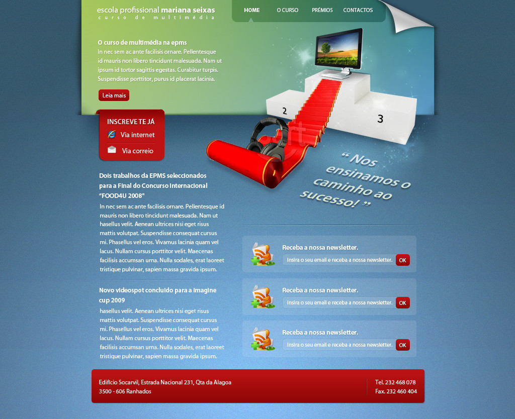
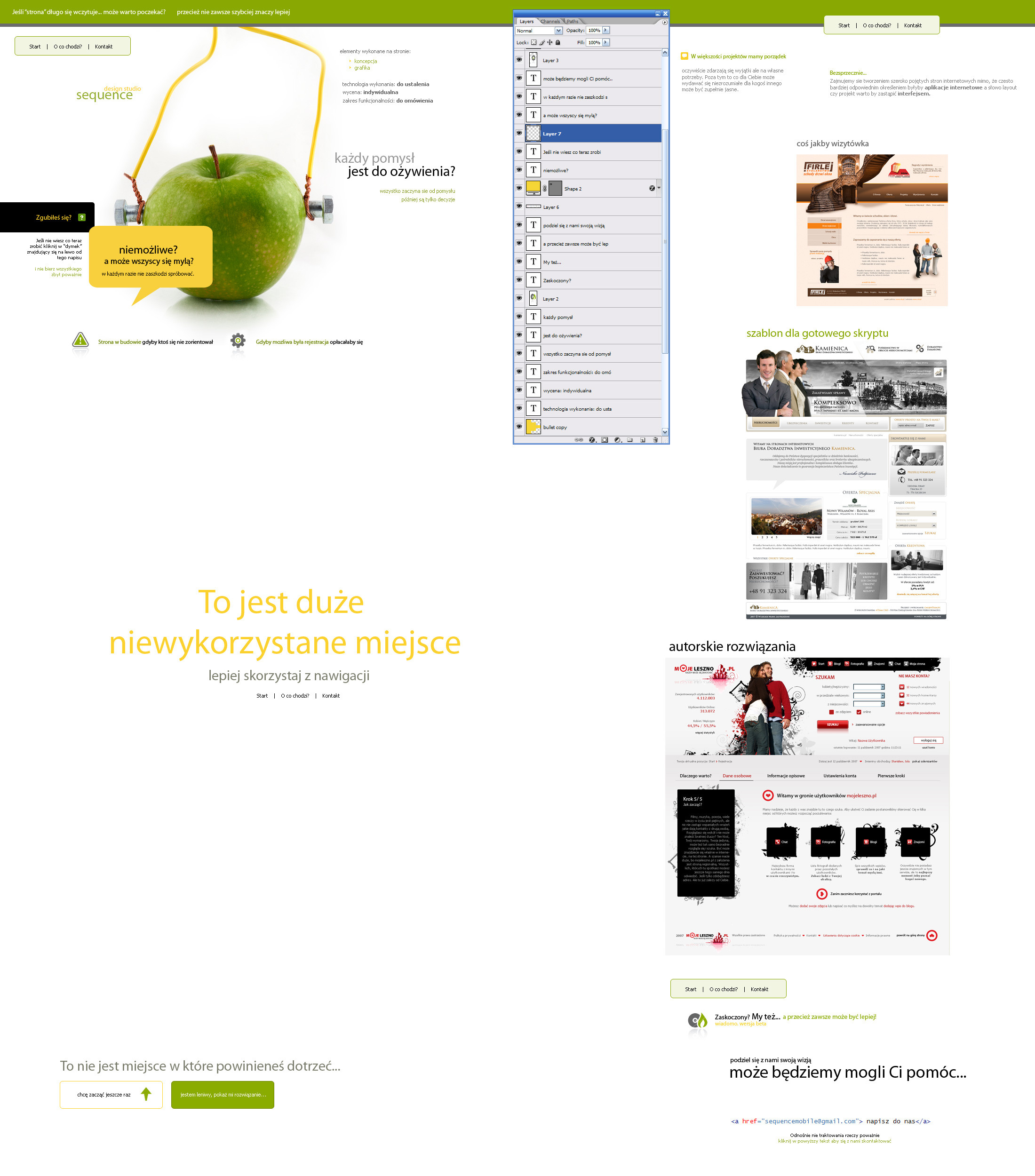
Just screen shots from an presentation for English classes. It starts with an animation of an falling cube.Hope you guys like it, comment &

just submitting to web interfaces as I really dont know where to submit and I think it could be used as an concept for an website
edit:
Available for download
download application
Related content


Comments: 43

Overall

Vision
Originality
Technique
Impact
Simple, clean and white. I like that. The initial idea with the box is very good but could have been realized more consistent.
On the second page the text on the actual is not clickable and it took me too long to find the "enter" button. Either make the box smaller or the button bigger. You are kind of suggesting a function which is not there.
Same on the third page. Make the box work, make it clickable. The navigaton cross on the top right is not clearly perceptible as the main navigation.
No harm, but this great idea seems not fully reallized.
One small last thing. When navigating though the site the black box rotated on every navigation click you make. The text on top of it not allways ends in the same position. There are combinations of navigations paths where the toptext magically rotates 90 degrees before the box starts to spin.
👍: 0 ⏩: 0


Vision
Technique
Impact
A nice webdesign, about webdesign.
I like the black box and the messages written on them. The composition is great, everything is placed perfectly and altough the design is quite empty it doesn't seem to break the design. Very minimalistic but a nice design.
The navigation is simpel but original (it is that folded out box right top of the bottom page right ?)
The type is very clear and looks good the header type (webdesign ?) seems a little big though.
Also i don't really like the part on the right of it, the light grey text seems to fall out of place and i don't think it really fits there.
👍: 0 ⏩: 0

I really love this. Do you still have a version of it animated?
👍: 0 ⏩: 0


Nice to see that the netherlands have good desingers too ;D
 (Wink)")
👍: 0 ⏩: 0
Nice to see that the netherlands have good desingers too ;D
👍: 0 ⏩: 1

thanks a lot mate ")
👍: 0 ⏩: 1
natuurlijk ")
Sry I'm just an crazy german freak !
👍: 0 ⏩: 0


like a lot the whole concept... would be great to wacth the presentation
👍: 0 ⏩: 1
I can upload it tomorrow if you want
 (Smile)")
👍: 0 ⏩: 1
Thx for uploading the presentation and the link. It's simple and clean and yet it caughts the attention on the message. Like it a lot, congrats!
👍: 0 ⏩: 0

")
is it dynamic or it's yet a design?
👍: 0 ⏩: 1
it's dynamic, got an excellent on the presentation
👍: 0 ⏩: 1


thanks a lot for the kind words +
👍: 0 ⏩: 0


oeh ik vind em koel
lekker creatief ontwerp
en die navigatie van het uitgevouwde kubusje vind ik ook goed bedacht
👍: 0 ⏩: 0


Really amazing work!
I like the logo,simple and objective
👍: 0 ⏩: 1
thanks a lot for the kind words and the fav
👍: 0 ⏩: 0