HOME | DD
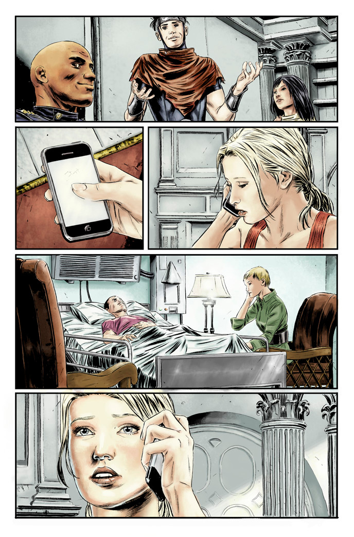
 dismang — First coloring attempt...

Published: 2008-03-10 02:11:59 +0000 UTC; Views: 3329; Favourites: 17; Downloads: 46
Redirect to original
Description
Line art by Mitch Breitweiser (the husband). This is my first attempt at digital coloring.Mitch introduced me to the basics of photoshop and got me started in parts on the page. If I can get the hang of it, we are considering coloring most of his books in house.
I know there is still a little polishing up to do, but I would love any constructive criticism that you guys could offer.
Related content
Comments: 25

Wow. Its amazing to see how far you've come since this piece in such a short amount of time.
👍: 0 ⏩: 1

heh, yeah, I cringe when I look back at these! haha
👍: 0 ⏩: 1

Yeah, but all you have to do is look at what's currently on your screen and I bet that all disappears.
👍: 0 ⏩: 0

Oh man
very well done.
I can barely color by hand rofl ):
👍: 0 ⏩: 1

Spam. You click the link, and the link gets sent to other people by your account.
👍: 0 ⏩: 0

That has to be one of the best first time digital colorings I've ever seen. Hell my try sucked...and I'm still not good at all.
Good job
👍: 0 ⏩: 1

this is cool, i really like the coloring! good job for a supposed first attempt!
👍: 0 ⏩: 1

NW i wish i could color like that... instead mine turns into this [link]
👍: 0 ⏩: 0

thats a great first attempt!!!! my 51st attempt wouldn't even look that good
👍: 0 ⏩: 1

oh, I don't know about that! but thank you!
👍: 0 ⏩: 0

damn, i wish there was something i could say as a constructive crit..... this is perfect... the shades, the consistent light sources, the colors are spot on.... you did a fantastic job over your husband's work, great job!
👍: 0 ⏩: 0

It's looking good pretty good so far. A good first attempt that is miles ahead of some people who have been doing it for a while. I agree with robtlsnyder's comment on the shadows and the colors on the page as a scene. It does look like one location for the entire page. Simply shifting the hue/saturation would be helpful without having to totally tweak out your page's color pallet.
For me, the pages seems a bit flat because of the lack of color contrast between foreground/background. The first panel is an example. The pillars look to be behind the wall the cast is next to and further in the background; but they are too close in hue/saturation. This is also true for the last panel. That pillar, wall, and the girl kind of flatten out because the colors are a bit to close.
The fourth panel works well in that the green and lavender draws your eye to them immediately. The last panel my kind of goes to the black part of the phone first cause it pops out against everything. And it's not all about making things darker or grayer, a slight hue change can create a more dynamic panel and lead the eye to where you want it to focus. You don't have to follow local color to the letter; use color as another means of storytelling. The best thing about photoshop is that you can play around with it all you want and that ctrl+z will always be there.
👍: 0 ⏩: 1

Excellent advice! I really appreciate it!
👍: 0 ⏩: 0

Really good points & just what I was looking for, thank you!
...and pshhh! about your last comment, your stuff is great!
👍: 0 ⏩: 0

It's really well done. I think you and Mr. Breitweiser are going to be a good team. I look forward to seeing more of your colors.
There are two things that I think would make the colors seem a little more real though. One is more prominant cast shadows. Like for instance in the last panel. The light, or at least one light since there are two light sources, is coming from the right(?) and there should be a shadow on the left of the hand on the face. Also shadow on the phone under the hand where they meet.
The other thing is just by going by the colors chosen, the diffrent scenes are kinda running together due to the likeness in the colors.
If the color of the hospital room was a different color, it would help the reader notice the change in scene better.
Anyways, this is a whole lot better than what I can do, so who am I to talk.
👍: 0 ⏩: 0


