HOME | DD
 dismang — zero point

Published: 2008-10-20 20:28:08 +0000 UTC; Views: 4971; Favourites: 71; Downloads: 145
Redirect to original
Description
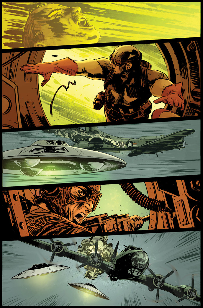
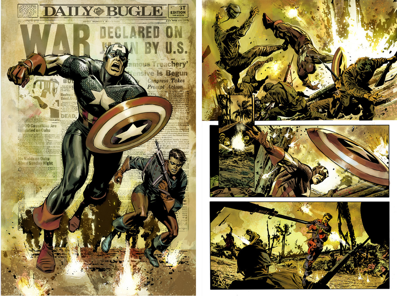
Captain America: Zero Point[link]
Writers- Charles & Daniel Knauf
lines & inks- Mitch Breitweiser
Colors- me
Related content


Comments: 69

Thank you! Kudos to you as well! You do beautiful work!!!
👍: 0 ⏩: 0

")

I thought Frank D colored Cap well, this a beautiful book!
👍: 0 ⏩: 1
Frank is awesome! Thanks for the compliment
👍: 0 ⏩: 1

The color on these forest scenes is really impressive!
-B*
👍: 0 ⏩: 1
That means a lot coming from you! Too bad they didn't print the same ")
👍: 0 ⏩: 1
I hate to hear that. I'm praying to the printer gods right now for the next issue of Brave and the Bold.
-B*
👍: 0 ⏩: 0

His palette of colors is fantastic.
Their very professional work.
Rob.
👍: 0 ⏩: 0

Wow, this page is awesome. I LOVE the colors and Mitch did an awesome job too...I actually really LIKE the painterly look...It really works well with the brush strokes that Mitch is using for the foliage and stuff.
👍: 0 ⏩: 1
Thank you so much Micah! ...now hurry up and send me some of your pages!

👍: 0 ⏩: 0

Awesome stuff... I love the last 2 panels (and the sniper scope). The lighting and color tone is great.
👍: 0 ⏩: 1

Nice, nice, niceee  (Smile)")
 (Wink)")
👍: 0 ⏩: 1

Brilliant! You really add to the inks, girl! I hope they give you more opportunities to show your stuff, you deserve it.

👍: 0 ⏩: 1
Thank you! I hope so too... you should write them and tell 'em
👍: 0 ⏩: 1
Hahaha, If I thought it would help ya, I would. Your skills speak for themselves.
👍: 0 ⏩: 0


The colors on this piece are really nice!
I LIKE IT!
Captain America, Nazis, Aliens... best combination ever!
👍: 0 ⏩: 1

Wow great work, madam! I really like the way you use those warm, natural colours, those lovely greens, yellows and browns, which seems to pop up in a lot of your work. It's very aesthetically pleasing. And as a aspiring writer myself, it's good to see that the writers got a little mention also!
👍: 0 ⏩: 1

Wow, very nice. Yeah, without the text, the color change can be confusing. But i just read it as a time cut anyways. Though looking at this page made me realize that Cap's costume is horrible for trying to sneak around. I mean really, the RED! WHITE! BLUE! doesn't really blend well with the foliage. No wonder he carries around a shield.
👍: 0 ⏩: 1
Haha! Ya, between that & the girl sticking her fat head over the rock- he doesn't have a chance!
👍: 0 ⏩: 0

Your colour choices show clever restraint and subtlety. Very inspiring
👍: 0 ⏩: 1


ok, so i'm going to be the bad guy and crit for a little bit (hey i'm a poet)
why are there two different types of background color schemes for one scene; one which might be early dawn and one that is smack dab in the middle of the day?
I like the cold blues contrasting with the warm tones in the scope but then we jump into the next panel and have the same warm colors as the scope. wouldn't it visually look better to have us back into a 'cool' setting? I know we don't have the text, so that might explain a time lapse, but i'm a little confused.
and tell mitch to get that woman's head down in panel 4, she isn't modeling a tailored kahki shirt with howitzer, she's hiding. Get down before she gets cap killed (oh well to late for that, both for mitch and for cap)
maybe my real problem is that this isn't mitch's strongest page so I'm having issues with that, but i felt the need to ask about your scene coloring.
beyond that, it's done really well. maybe a little to much lens flare on the nazi's heads (to much painting and not enough coloring), but good job, really.
take care
👍: 0 ⏩: 1
Thanks for the critique! I appreciate you taking the time. The script called for a time change of late night when they are running off into the woods to early/mid day with Cap looking through the scope. I was just trying to make sure the reader understood there was a time change. I agree it is confusing.
and your right about the painting- this page is over done.
👍: 0 ⏩: 1
well in that case, you did your job. it totally looks like a different time of day. how is it working for the big guy, not God but Marvel? weird, cool, normal?
by the way, keep at the digital painting skills, there will be a time and a place. my comment on that was not about your skill but choosing when to use that skill.
oh, and thanks for replying, i appreciate that you can take that criticism as constructive and not antagonistic.
take care.
👍: 0 ⏩: 0


Great colors! Your colors are a great compliment to Mitch's work, and his to yours. I think that's how a marriage should work ")
I'm trying to be witty, did I fail?
👍: 0 ⏩: 1
Thanks! & no way, your the witmeister!
👍: 0 ⏩: 1
Hehe, good deal
I should have that put on a shirt
👍: 0 ⏩: 0

this is dope! looks like the colors and even the lines from marvel's 1985 shtick
👍: 0 ⏩: 1
Thanks! What a great compliment- I love Tommy Lee!
👍: 0 ⏩: 1


I love the art & color of this page, but every time I see it, I wonder why a writer would've had a major time change like that mid-page.
👍: 0 ⏩: 1
Hmm, I dunno. Script says they run off in the woods at night to find a good place to spy on the Krauts & don't reappear until the morning.
👍: 0 ⏩: 1
| Next =>