HOME | DD
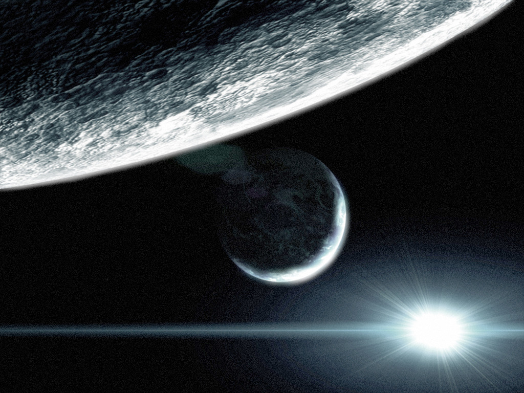
 DKF — Essence of Space

Published: 2004-07-04 12:51:30 +0000 UTC; Views: 18638; Favourites: 230; Downloads: 833
Redirect to original
Description
Had a little block so i tried somethin new. Tried to make some metheors/space debrie with 3dsmax and they turned out pretty nice imo. The rest of the talking is up to you people (Wink)")
Related content


Comments: 49

How did you do the lights on the planet to the left?
👍: 0 ⏩: 1

If i'm not mistaken i copied the planet without the shadow, tweaked it with contrast and applied noise. Then changed the levels, color and saturation of that layer. Something like that.
👍: 0 ⏩: 1
ohh ok, yeah yeah that does make sense! Thanks for that
👍: 0 ⏩: 0

Can I download for free? And if I use on site, must do what?
👍: 0 ⏩: 1
you can download for free but you can not use this on other sites.
👍: 0 ⏩: 0

Straight up love it, this is by far about the closest thing to what would be a realistic image that i've seen around here. Very well done, highly impressed!
👍: 0 ⏩: 0


")


Fantastic image. I really like the beauty of its simplicity. While I love the chaos of spacescapes, some of them go overboard, including my own =o)
Might have to start using 3dsmax now heh
👍: 0 ⏩: 0

"Awesome" is the first word that come to mind, very good job dude
")
👍: 0 ⏩: 0

Awesome job
I love the way the planets are light up
Very simple but great
👍: 0 ⏩: 0


superb job.
it somewhat expresses how empty an lonely space is... a piece of art that makes you think... not so common
👍: 0 ⏩: 0

i like this a lot. the esscense of space is that there's, well, space, so that size and everything is great. all in all it's really well done. the only thing that bothers me is that the background color changes about a fifth of the way from the top. i know i'm nit-picking but it distracted me from what is overall an excellent piece of work.
👍: 0 ⏩: 0

well it's dark, scary, empty, lonely... I LOVE it!!!! And, yes, it would make a killer wallie!
👍: 0 ⏩: 0

IT's dark and simple. Very wallpaper worthy, though that doesn't sound like a compliment because it would take away all the heighth of this image.
👍: 0 ⏩: 0


Awesome, but give the light more detail  (Smile)")
👍: 0 ⏩: 0

Indeed the 3dmax part i really nice.. a bit empty thoug... but still good wokr m8
👍: 0 ⏩: 0


this is unlike any other space pic i have ever seen, but i can't put my finger on how. the meteors are awesome, not jagged like the others i've seen. and the colors are sort of barren... but not at the same time, they add a great environment to the piece.
+fav well done
👍: 0 ⏩: 0

Nice job man. The dark really works in this withthe one flare beaming like that. The lighting is perfet, other then the meteors could use a bit more surface light. Planets look good also. Great work.
👍: 0 ⏩: 0

the title in combination with the pic works... damn good.
👍: 0 ⏩: 1

mate...its very nice.....it DOESNT need to be brighter or include more -too often space pictures have these brightly coloured nebulas or exploding planets or blah blah (and yes they do sometimes look good) but this captures the 'Essence of Space' (i think the essence is shown with all the 'empty' space above and below the planets- this shows that the planets exist, but in the whole picture they are but the smallest element and beyond them is a much larger and more complex world that the inhabitants on these planets probably barely know).
Also think the angle of the debris away from(or towards?) the camera position is good. Textures are wonderful - the planets look so different just because of the textures (ie the main right planet looks of a gaseous form while the main left planet looks more water/land formation similiar to earth.).
Starfield...well once you've done starfields as much as you have you cant really go wrong.
Bah....its been a while since i had a good rant at someones art.

👍: 0 ⏩: 1
tnx mate, you got it exactly the way i think about it.
👍: 0 ⏩: 0

very simplistic/minimalistic, and i like that alot, like the texturing on the planets, as well as the asteroids..... nice job +fav
👍: 0 ⏩: 0

i like it, very simple, but as said the essence of space
👍: 0 ⏩: 0


This is great.... if only it were a bit brighter it'd be perfect. but a 
👍: 0 ⏩: 0

I agree wholeheartedly with Alyns statement bro...A
 (Cool)")
👍: 0 ⏩: 0

great job! the lightening in the peice rocks and the planet textures are amazing, great peice!
👍: 0 ⏩: 0

Asteroids and lighting looks great.
Nice work with the planets too.
Well done
👍: 0 ⏩: 0

Excellent work. I like the meteors, but the overall image is first-rate!
👍: 0 ⏩: 0

the metheors are awesome and i love the lighting on this piece
👍: 0 ⏩: 0

a little too dark and crowded, the planets are too close, but i love the look of it. Maybe some color variations wouldn't make it look so dull.
👍: 0 ⏩: 0

I think it's great, very minimalistic which I like. I'm not sure about the city-lights though, and the immense top border was a little much.
👍: 0 ⏩: 0


maybe some more colors, but the metheors are great and like alyn said: you can have beauty in simplicity
good job m8
👍: 0 ⏩: 0

It's excellent dude, and anyone who doesn't see that needs to wake up. Space isn't all about fancy explosions, pretty colours and aliens trying to kidnap your grandma, you can have beauty in simplicity. The asteroids are perfect, textures are right on target. Once again your planets are amazing, great variety and the city lights are perfect. The diffraction is a beautiful focal point too, extremely well done. And the contrast of the deep background around it really emphasises the "real" quality of this picture overall.
It annoys me when people can't deal with a bit of variety once in a while, excellent work mate.
👍: 0 ⏩: 1

im sorry, but its very empty and doesnt show that much, just a few planets and some rocks, little low for your doing

👍: 0 ⏩: 2

Not everything has to be incredibly complex to be good. It shows exactly what he wants it to show.
I think it's quite good.
👍: 0 ⏩: 0
what can i say, i like minimalism and it was more of a test for the metheors.
👍: 0 ⏩: 1
yeah ok, because its the first time at 3dsmax i can understand it
👍: 0 ⏩: 0

uber would make a gr8 wallpaper! very simplistic
👍: 0 ⏩: 0