HOME | DD
 DragonDePlatino — GBA Mock-Up - Coloratl
by-nc-nd
DragonDePlatino — GBA Mock-Up - Coloratl
by-nc-nd

Published: 2013-10-10 01:53:59 +0000 UTC; Views: 3125; Favourites: 30; Downloads: 6
Redirect to original
Description
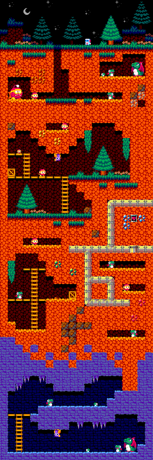
MS Paint, ASEprite and Tiled used. 6 Hours
20 Colors, resized to x2.
Whew! The fastest mock-up I've ever made! This one struck me as an idea during school, so I thought I'd give it a shot. I'm O.K. with how this came out, but it really doesn't look anything like I originally planned it...A little too brightly-colored.
For this mock-up, I was aiming to make it look a lot different than my usual stuff. This pretty much meant going for an even lower color-count than usual (16-24 is my usual goal). I also wanted to try something in the vein of a GBA game. This meant I would have to adopt a new resolution (240x160) and go for some veeery bright colors. The GBA had no back-light, so lots of games for the system (like Fire Emblem) had to use bright colors to compensate for this. The result it something that would look pretty average on the GBA, but incredibly over-saturated on a computer monitor.
")
Unlike many of the other mock-ups I've made so far, this one actually had little almost no planning put into it. Coloratl would let you play as the titular character, the tribal god of color. As Coloratl, you are the first of your kind in several thousand years to lay more than a single egg! This is a joyous occasion, but a horde of black-and-white goblins set out to ruin this. They cast a spell on Coloratl, shrinking her to the size of a person. The goblins set out to eat the eggs of Coloratl, but the colored tribesmen scatter the eggs across the world with a spell at the last moment. Your goal in the game is to carry all of the games back to the tribe where they can be protected. Also, the game would be played with the Gameboy Advance held sideways so that you have more room to see your stack of eggs.
==UPDATE 10/9/13==
- Oops! Forgot to upload it with a higher zoom. Fixed that.
==UPDATE 10/10/13==
- Lowered the contrast of the background. Dithering should look a little nicer.
Related content


Comments: 6

Overall


Vision
Originality
Technique
Impact
Hi there! Firstly, great work! My favorite thing looking at this piece is the colors.
Okay, looking at this piece by piece; I love the blocks. Their colors are great and they're very high contrast so you know people will be able to see them and know where they can and can not walk in this game. The black and white enemy sticks out fine against the purple, however; I feel as if there could be more contrast for the teal enemy. I haven't de-colored the image but I feel like if a color blind person looked at the teal enemy it would be more difficult for them to see than the other.
The sky is an interesting shade of green which I love, but personally I am not a fan of dithering patterns. The rest of the piece is so nicely anti-aliased and meticulously worked, but I feel as if the background was hurried to get finished (probably because of the dithering).
All in all, it was a very expressive piece that not only made me stop and look but made me want to write about it as well! Great work. e.deviantart.net/emoticons/s/s… " width="15" height="15" alt="
 (Smile)")
👍: 0 ⏩: 1

Hi AzKai! I've seen you while lurking around a bit...very memorable avatar. Thank for the crit!
")

I'll go ahead and change the palette of the background a bit...lower the contrast. It'll make the tribesman stand out a bit better. Two birds, one stone, eh?
👍: 0 ⏩: 1
That certainly should take care of two birds with one stone!
One thing I remember reading a while back is that pixel art is really all about the "clusters", and that all pixel art can work with no dithering applied if the shape of the "cluster" of colors is intriguing and gives shape to the object it is trying to portray. Have you tried doing the sky without any dithering at all? It may be worth a shot!
Here's some pixel art skies that I always found inspiring:
azkai.deviantart.com/art/Dream…
azkai.deviantart.com/art/Space…
azkai.deviantart.com/art/Beaco…
www.deviantart.com/art/Dragon-…
www.seyken.com/download/open_b… <-- There is dithering in that one, but, minimal.
Also, thank you for the compliment! ")
👍: 0 ⏩: 1
Huh! That one from Seyken and Fool are just what I was looking for! I haven' put a lot of practice into backgrounds so I know these will definitely help me get the idea. Thanks a ton! ^.^
👍: 0 ⏩: 0

