HOME | DD

Dragonfly22 β€” T w i l i g h t

Published: 2009-04-12 19:21:50 +0000 UTC; Views: 1244; Favourites: 36; Downloads: 61
Redirect to original
Description 
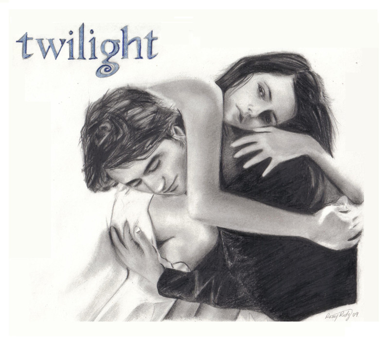
This is a gift for a very dear friend of mine, and also my entry for =witchi1976 's contest.

I'm not a fan of the novels that much, but I think this picture is very beautiful. I especially found the whiteness and contrast of it very interesting to get my hands around.

I hope my friend and you guys like it!
Related content
Comments: 22

TwistedHearts [2009-05-25 02:35:37 +0000 UTC]

Good luck in the contest! .

πŸ‘: 0 ⏩: 1

Dragonfly22 In reply to TwistedHearts [2009-05-25 21:18:30 +0000 UTC]

hehe thanks, although it's already over

πŸ‘: 0 ⏩: 0

MetalNi [2009-05-12 18:28:22 +0000 UTC]

itΒ΄s so romantic :]

πŸ‘: 0 ⏩: 1

Dragonfly22 In reply to MetalNi [2009-05-13 19:26:33 +0000 UTC]

thanks :]

πŸ‘: 0 ⏩: 0

art-fan40 [2009-04-14 22:55:33 +0000 UTC]

Hidden by Owner

πŸ‘: 0 ⏩: 1

Dragonfly22 In reply to art-fan40 [2009-04-17 18:33:45 +0000 UTC]

πŸ‘: 0 ⏩: 0

jennieannie [2009-04-14 06:02:36 +0000 UTC]

This is very beautiful. I love that you chose this pic, it was one of the first pics of those two to pop up in the fandom. The contrast is well done too. I love the soft shading in the skin tones. And yes, the twilight logo was a nice touch, it was a brilliant move to make it a soft, light blue rather than silver, or even red or something. The blue along with the soft shading and black and white composition, makes the entire image feel cool, almost winter like (which works with this series). I really like it. Good luck in the contest!

πŸ‘: 0 ⏩: 1

Dragonfly22 In reply to jennieannie [2009-04-14 22:58:15 +0000 UTC]

Wow, thank you so much! I agree with you there, perhaps what attracted me the most about it was precisely that winter-like feeling it conveys...
To put the letters in red or something occurred to me thank God I didn't follow that first impulse...
Thanks again for your words, they mean a lot

πŸ‘: 0 ⏩: 0

Hurricane-Jeanne [2009-04-13 18:24:44 +0000 UTC]

Beautiful! Love the touch with the logo in the mix as well.

πŸ‘: 0 ⏩: 1

Dragonfly22 In reply to Hurricane-Jeanne [2009-04-13 22:08:43 +0000 UTC]

Thank you! Yeah, I thought it would be nice to add an original detail

πŸ‘: 0 ⏩: 1

Hurricane-Jeanne In reply to Dragonfly22 [2009-04-13 23:25:40 +0000 UTC]

It's a brillant touch!

πŸ‘: 0 ⏩: 0

WitchiArt [2009-04-13 11:00:17 +0000 UTC]

Thank you so much for your contest entry and good luck

πŸ‘: 0 ⏩: 1

Dragonfly22 In reply to WitchiArt [2009-04-13 22:08:57 +0000 UTC]

Thanks to you too!

πŸ‘: 0 ⏩: 0

Ethlinn91 [2009-04-13 08:05:27 +0000 UTC]

ohm... it's beautiful!
good job! i like it!
keep up!

πŸ‘: 0 ⏩: 1

Dragonfly22 In reply to Ethlinn91 [2009-04-13 22:09:53 +0000 UTC]

thank you! *_*

πŸ‘: 0 ⏩: 1

Ethlinn91 In reply to Dragonfly22 [2009-04-14 11:59:39 +0000 UTC]

πŸ‘: 0 ⏩: 0

lilbreeny [2009-04-13 07:39:12 +0000 UTC]

wow your right i love the shapes and the contrast!
its beautiful

πŸ‘: 0 ⏩: 1

Dragonfly22 In reply to lilbreeny [2009-04-13 22:10:45 +0000 UTC]

thank you for your words!

πŸ‘: 0 ⏩: 1

lilbreeny In reply to Dragonfly22 [2009-04-14 12:22:01 +0000 UTC]

its really really cool

πŸ‘: 0 ⏩: 0

NutLu [2009-04-13 04:16:19 +0000 UTC]

Beautiful! Well done!
Good luck with the contest

πŸ‘: 0 ⏩: 1

Dragonfly22 In reply to NutLu [2009-04-13 22:10:56 +0000 UTC]

Thanks Randi!

πŸ‘: 0 ⏩: 0

instantflojja [2009-04-12 20:15:23 +0000 UTC]

wow it's really nice, good job! i like it

πŸ‘: 0 ⏩: 1

Dragonfly22 In reply to instantflojja [2009-04-13 22:11:08 +0000 UTC]

thanks a bunch!

πŸ‘: 0 ⏩: 0