HOME | DD
 drawitout — ...There's Nothing...
Published: 2011-10-02 17:21:01 +0000 UTC; Views: 789; Favourites: 36; Downloads: 18
Redirect to original
Description
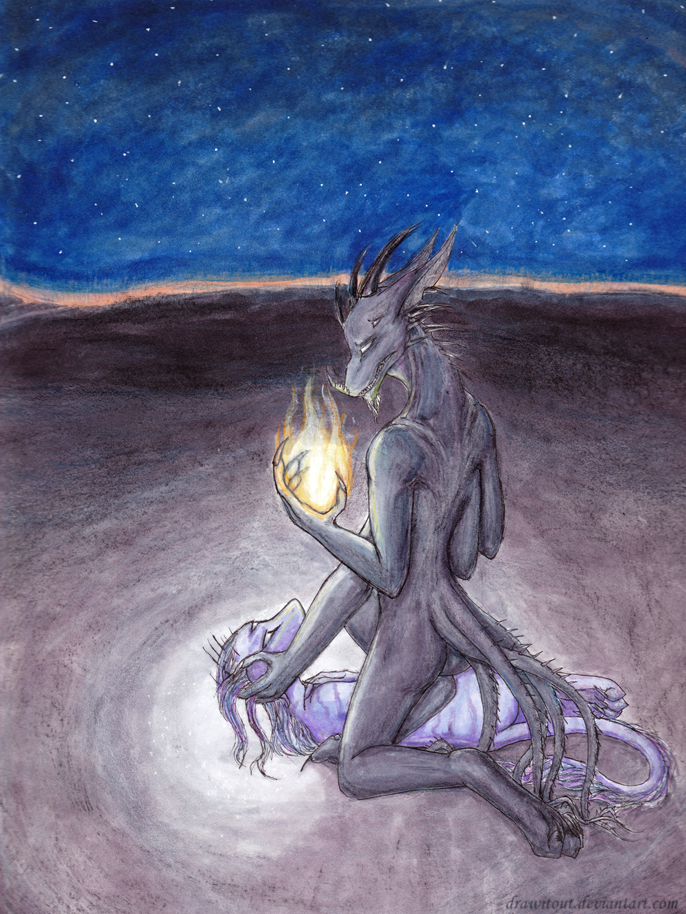
A redraw of the companion art to go with [link] as well as my entry for theme 20 of the #100ThemesChallenge variation 4.I know there are a few issues with this... but at least I can say with certainty it's better than the last version from just under a year ago.

Characters/Designs © *drawitout
Related content


Comments: 9

Pretty nice; I quite like the fire and the light effects from it.
")
👍: 0 ⏩: 1

Thanks so much. n_n
I'm trying to practice with lighting effects and sources in traditional medium more often, I'm somewhat pleased with how it's cast on the characters, themselves, here. I'm looking forward to trying it again, though. I rather like drawing fire, I think it'll be fun working to make it seem more realistic. c:
👍: 0 ⏩: 0


great pic!!! i like the backgrund and the light and shaddows...... awesome!!!!!!! (lol only one sentence^^)
👍: 0 ⏩: 1

Before I talk about the central emotional point of this picture I'll quickly run over the technical aspects. Once again I feel I have to state this is my opinion and nothing more, so keep that in mind:
I agree that this is certainly better than the older version, but only in terms of skill level (more on that later). The lines are crisp; the colouring looks great, especially with those more desaturated tones; the blue starry sky looks excellent (watercolours?); and overall this is a great scene.
A few things, though. Looking at the shape of the horizon and the ground in the area where Tar and the other demon is, the perspective looks off. Given the angle in which the viewer is almost looking down at the two creatures, the horizon should be much further up than it's shown (imagine those perspective grids with the lines and the vanishing point, visualising it like that will help explain it clearer). Also on the angle and positioning of things, Tar's right leg really looks like it should be placed on the ground on the other side of the creature, if you take into account the positioning of his body and how his other knee is so close to that leg. He looks like he's either having to lean at an uncomfortable angle in this (which is jarring), or he should fall over if he's kneeling in this position (unless he's sort of using that leg to lean on the creature, but I'd assume not since leaning on them isn't something you'd do to a dying person).
All of that aside this is indeed a great improvement technically speaking, save for perspective issues, although I'm confident if you looked at one of those grids when drawing like this you could iron those things out pretty quick. The only other things that strike me as being odd are where they are (the background is nice, but it doesn't say much about where they are--I can see that it's akin to the original drawing's, but where are they, still?) and why Tar isn't looking iridescent in the firelight--unless you've changed that, but I can't know, so here I can only see a dark greyish purple.
Now onto the main point which will no doubt piss everyone off--I think overall this is weaker than the original drawing at [link] .
My primary reason for thinking this is that the original felt much more emotional in nature. The picture's composition was very boxed-in, which emphasised the closeness between Tar and the creature, his emotions at the time. The positioning of the characters, too, brought out this aspect of it. Tar was more crouched over the creature, showing a much greater sense of remorse and almost a kind of protectiveness over the dying demon. The way he was holding it in his arms and how it was holding on to him (I could be wrong, but looks like it in the original) really created a spot-on atmosphere to reflect the writing that went with the drawing. It was believable to see Tar choking, cradling the demon, truly despairing at what he had been forced to do. The tiny writing excerpt accompanied it perfectly and really made the atmosphere in the drawing come to life, where you could truly feel Tar's pain.
This remake, while visually superior, I don't feel captures that same emotion. The background is pretty, but it's too large; it makes things seem much more open and takes away from that sense of closeness I mentioned before. The way Tar is kneeling, but not properly holding the demon also doesn't express his regret and sorrow for having to murder the innocent creature. His expression, too, appears emotionally distant. Yes, he does look regretful but I don't feel it is anywhere near reflective of the emotion the writing presented. The way you wrote Tar's feelings, on having to kill, and the way you've depicted him here are very distant from one another. He doesn't look truly emotionally connected to this demon as you alluded to in the writing--he doesn't look like the one who killed the demon, but rather a witness to it. Especially with it being for theme #20, 'Pain', I feel there should be a much more sorrowful look on his face, just something to reflect his despair present in the writing. Yes, the original picture didn't show a true expression at all, I know that--but the beauty in that was that our imaginations could fill in the gap for us, in that certain obscurity we could imagine for ourselves how he was looking at that creature as he caused it to die.
I can fully understand your reasons for wanting to remake an older drawing (I am doing the same thing with 'Reality', so I can understand how carefully emotional writing must be approached when creating illustrations for it), but in its relative simplicity and obscurity, the original got the emotional point across better. Perhaps it is because my imagination could bridge the gaps where the drawing wasn't fully detailing things like facial expression, and I could use the writing to properly visualise the characters.
In any event I'm not bashing this drawing--it is a great improvement, but I feel only if you take it as stand-alone and not as having any of that emotion behind it as portrayed in the writing. I just feel this could have been much more powerful.
May I suggest adding the original excerpt to the description here? It would provide context and maybe help bring out the true nature of this. It was a fantastic little bit of writing and I really think it deserves to be here, too, not just left in Scraps alongside the old drawing. I know you have the full literature posted, but I think it would help to have the original except here.
This is a great picture, don't get me wrong--these are just my thoughts on seeing this as the remake of the original deviation.
👍: 0 ⏩: 1
I mentioned in the comments that I saw issues in this drawing. I know. It may sound unbelievable but the original version of this has quite different shading in the background, though it doesn't negate the errors as mentioned it does look quite a bit different, and better, than the scan.
The pose isn't exactly the same in this drawing because, though it is a remake companion piece to the writing, it depicts just as Tar was letting the demon drop to the ground, instead of right at the "I'm sorry," line.
The sky is done in markers, most of this drawing is, though I had to shake using charcoal and coloured pencils.
I toned down the iridescence of Tar. The original of this, however, does show a hint of it in the firelight. It simply wasn't picked up in the scan and I felt it was unnecessary to try to get it to show.
And, uh... I'll have to disagree with you on the original being better. Maybe the emotion is different, but I don't feel it's conveyed any better through the art from before. You mention it appears the other is holding Tar in the original picture. It's not. Even basic expressions aren't shown. Frankly, I've been considering taking the option to store that old thing for good for a while now. Nevertheless, thanks for sharing your views.
Regarding the background being open, well. I wanted to show that Tar's feelings, his actions, the death of the demon... all are rather insignificant to who is in control. The viewpoint of the drawing was supposed to be Kaya's, silently watching and waiting for the right moment to walk over and try to figure out what that was all about.
As for posting the excerpt in the comments, the thought had crossed my mind previously. I was planning to have a proper read of the literature deviation and see if anything could use some edits before I did so.
👍: 0 ⏩: 1
I am aware you said there are errors. If you don't want them pointed out, specifically state in the artist's comments that you don't want critique. That way, you won't get myself and other people wasting time pointing things out that you already acknowledge.
And that makes more sense if this drawing doesn't depict the exact same scene. However, you imply in the description that this is a direct remake of the original, so it must be assumed it is the same moment--I advise mentioning this in the artist's comments to avoid confusion, as context is essential.
I'd suspected you'd either toned down or entirely removed his iridescence, so that makes sense. Again, you didn't say anything to indicate this, so I had no way of knowing this was any different. Without explanation I'm left to assume it is a direct remake of the original, where he was visibly iridescent.
That's fine that you disagree on that point. You're the artist. However the point of art is that it is to be interpreted by the viewer, and if it comes across weaker in, e.g. the emotional aspect compared to the first version, then you should maybe consider what might have gone amiss even in smaller aspects, because there is clearly something. As I said, it is likely the obscurity leaving details to the imagination that was a large part of the success of the original, so maybe that is a strength of yours that you've not noticed. I wouldn't advise you to store the original, but that's your call. I consider it one of your best.
Interesting point on the background, but it's not something I would have picked up on otherwise, especially the intention of this being seen from Kaya's eyes. That's an extremely obscure point and if it's important to understand the drawing as a whole, I once again suggest you state it in the artist's comments for context purposes, since that's what they're most useful for and without it misinterpretations occur. Again, this may allude to a flaw in presentation--if you were trying to make clear a certain point, perhaps it should have been slightly more obvious, especially since the majority of people won't even bother to read your writing to even know a small fragment of the context surrounding this.
As for the excerpt in the old version's description, it's only a couple hundred words, if that. The original didn't have any major grammatical or other technical flaws, so it should be fine to go in the description. Then again, as I've just learned, this isn't depicting the exact same moment (which should be mentioned, otherwise this is greatly misleading), so I suspect a different section of the writing would be put here instead in any case.
👍: 0 ⏩: 0